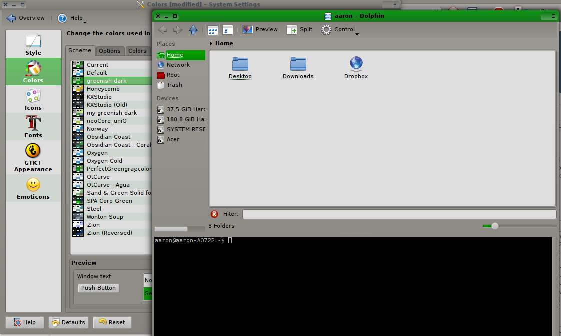
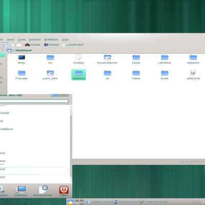
Description: Oriented to be darker overall, but not black, but very compatible with all sorts of things, a good neutral scheme for all purposes.Last changelog:
substantial updates to certain text colors to improve readability
I hope people like this. I couldn't find any color scheme I really liked. I don't want translucent fancy stuff, I want clear, and not too bright. I am sure there is room to improve this. I may have a few quirks here that are odd. I hope anyone who likes this will build on it. Please feel free to give me any feedback!


Ratings & Comments
3 Comments
get v. 1.3, I don't recommend any previous version.
The new update was redone with a different set of widgets, and I think it is much more standard and will get the effect I actually intended!
I hope people like this. I couldn't find any color scheme I really liked. I don't want translucent fancy stuff, I want clear, and not too bright. I am sure there is room to improve this. I may have a few quirks here that are odd. I hope anyone who likes this will build on it. Please feel free to give me any feedback!