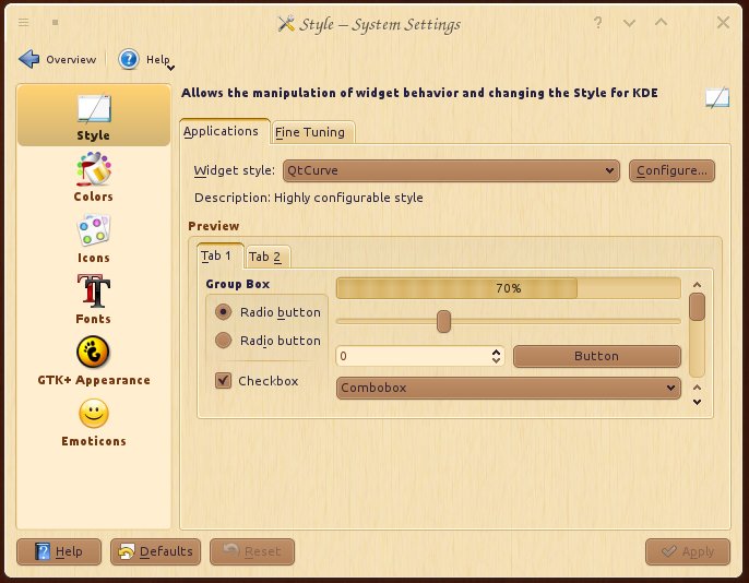
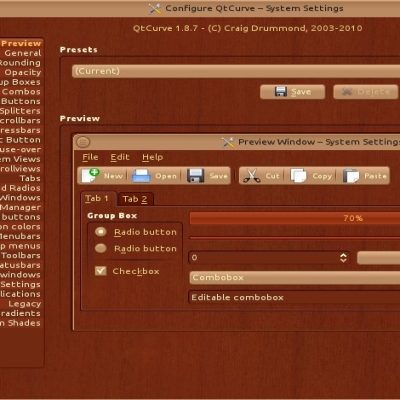
Description: This item is a part of Steam-Powered Linux KDE theme set.
The idea is to apply steampunk style to every themeable part of KDE-based distro. Any constructive feedback is highly appreciated. I will try to implement your propositions/fix bugs once I have spare time.
I like this color scheme a lot but the text in Paste is unreadable. Go to Add Widgets and select Paste (not PasteBin). Add some Names and Paste Text. Ideally the names are visible and the Paste Text is only visible when hovered.
In Firefox when hovering over a link the text is shown on the bottom left. The background is dark and the text is black, making it difficult to read.
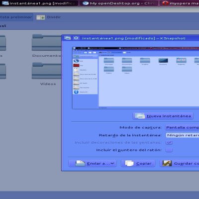
In Dolphin I like to have the background of alternate lines visibly different. This helps me to to not loose my place when I have Dolphin set very wide. In split view mode the active panel should have this while the inactive panel can have the effect muted. In fact this helps me to remember where I am.
I have one Dolphin icon for this regular version and another set as root. In this root version many color schemes are painted differently before one goes into split screen and when you come out of split screen. Yours now does not have contrasting alternate lines but this effect may appear if you introduce contrasting lines.
These changes would make for a very good desktop.
Thanks, George Dvorak
Thank you very much for the feedback. I found it quite difficult to create a color scheme other than black-and-white based that will look good for all applications as there are a lot of application that use their own scheme or even mix their with system's making it unusable in some ways. So I was really hoping for some feedback that will help me to improve original scheme. If you are currently using this color scheme and want to help me improve it, you can play with different colors instead of the one you didn't like and let me know of the results.


Ratings & Comments
3 Comments
I like this color scheme a lot but the text in Paste is unreadable. Go to Add Widgets and select Paste (not PasteBin). Add some Names and Paste Text. Ideally the names are visible and the Paste Text is only visible when hovered. In Firefox when hovering over a link the text is shown on the bottom left. The background is dark and the text is black, making it difficult to read. In Dolphin I like to have the background of alternate lines visibly different. This helps me to to not loose my place when I have Dolphin set very wide. In split view mode the active panel should have this while the inactive panel can have the effect muted. In fact this helps me to remember where I am. I have one Dolphin icon for this regular version and another set as root. In this root version many color schemes are painted differently before one goes into split screen and when you come out of split screen. Yours now does not have contrasting alternate lines but this effect may appear if you introduce contrasting lines. These changes would make for a very good desktop. Thanks, George Dvorak
Thank you very much for the feedback. I found it quite difficult to create a color scheme other than black-and-white based that will look good for all applications as there are a lot of application that use their own scheme or even mix their with system's making it unusable in some ways. So I was really hoping for some feedback that will help me to improve original scheme. If you are currently using this color scheme and want to help me improve it, you can play with different colors instead of the one you didn't like and let me know of the results.
https://aur.archlinux.org/packages/kdeartwork-colorschemes-steampunk-light/