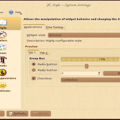
Description: This item is a part of Steam-Powered Linux KDE theme set.
The idea is to apply steampunk style to every themeable part of KDE-based distro. Any constructive feedback is highly appreciated. I will try to implement your propositions/fix bugs once I have spare time.
The text in Paste is unreadable. Go to Add Widgets and select Paste (not PasteBin). Add some Names and Paste Text. Ideally the names are visible and the Paste Text is only visible when hovered.
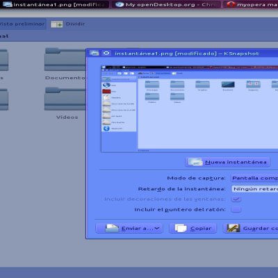
In Firefox when hovering over a link the text is shown on the bottom left. The background is dark and the text is black, making it difficult to read.
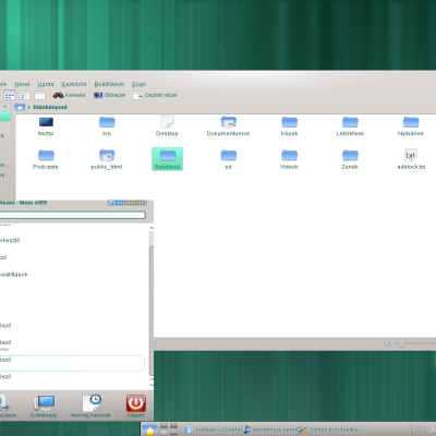
Regular Dolphin is quite good. I like to have the background of alternate lines visibly different. This helps me to to not loose my place when I have Dolphin set very wide. In split view mode the active panel should have this while the inactive panel can have the effect muted. In fact this helps me to remember where I am.
I have one Dolphin icon for this regular version and another set as root. This root version is painted differently before one goes into split screen and when you come out of split screen. Also once you go into split screen the light colored lines have light text and so are quite unreadable.The contrast is almost too strong.
These changes would make a much better desktop.
I love the way this works with the dark qtcurve theme and everything else in this pack, but I have one problem with the dark themes over the light themes.
When using the dark themes, the menu font is hard to read in libreoffice, particularly when inserting a formula. It looks great with the light themes though.
Overall this steampunk pack looks great in Sabayon KDE.
Thank you very much for feedback. Yes, sometimes any color scheme that is different from usual (light background, dark font color) has difficulties with certain programs, that has not-customizable background with customizable font color or vice versa. I ran LibreOffice and saw that it used white background despite selected dark color theme and golden font color. Do you have any idea, how I could fix that?
I don't believe there is anything you can do with the colors to change how Libreoffice behaves because it has its own color scheme, and as far as I know the only window that is giving me a problem can't be changed. The editing window for formulas presents a problem with all dark color schemes, not just yours. Overall I love the colors, and it is the best dark theme I have used in the way of contrast and readability.
I hope you plan to make a light plasma theme to complete the other half.
I'm glad you liked it. Actually, I didn't think about light plasma theme as initially I wanted to make all items of one style with steampunk look - background dark wood and foreground yellow metal. But dark color theme seemed not very confortable for eyes for everyday use. So I created light color/QtCurve theme that feels more comfortable but still look steampunk. Now I use it in this way - light windows/colors and dark plasma/wallpaper. They still look fine together, IMHO. But after your feedback I may consider making light one.


Ratings & Comments
7 Comments
The text in Paste is unreadable. Go to Add Widgets and select Paste (not PasteBin). Add some Names and Paste Text. Ideally the names are visible and the Paste Text is only visible when hovered. In Firefox when hovering over a link the text is shown on the bottom left. The background is dark and the text is black, making it difficult to read. Regular Dolphin is quite good. I like to have the background of alternate lines visibly different. This helps me to to not loose my place when I have Dolphin set very wide. In split view mode the active panel should have this while the inactive panel can have the effect muted. In fact this helps me to remember where I am. I have one Dolphin icon for this regular version and another set as root. This root version is painted differently before one goes into split screen and when you come out of split screen. Also once you go into split screen the light colored lines have light text and so are quite unreadable.The contrast is almost too strong. These changes would make a much better desktop.
https://aur.archlinux.org/packages/kdeartwork-colorschemes-steampunk https://aur.archlinux.org/packages/kdeartwork-colorschemes-steampunk-light
I love the way this works with the dark qtcurve theme and everything else in this pack, but I have one problem with the dark themes over the light themes. When using the dark themes, the menu font is hard to read in libreoffice, particularly when inserting a formula. It looks great with the light themes though. Overall this steampunk pack looks great in Sabayon KDE.
Thank you very much for feedback. Yes, sometimes any color scheme that is different from usual (light background, dark font color) has difficulties with certain programs, that has not-customizable background with customizable font color or vice versa. I ran LibreOffice and saw that it used white background despite selected dark color theme and golden font color. Do you have any idea, how I could fix that?
I don't believe there is anything you can do with the colors to change how Libreoffice behaves because it has its own color scheme, and as far as I know the only window that is giving me a problem can't be changed. The editing window for formulas presents a problem with all dark color schemes, not just yours. Overall I love the colors, and it is the best dark theme I have used in the way of contrast and readability. I hope you plan to make a light plasma theme to complete the other half.
I'm glad you liked it. Actually, I didn't think about light plasma theme as initially I wanted to make all items of one style with steampunk look - background dark wood and foreground yellow metal. But dark color theme seemed not very confortable for eyes for everyday use. So I created light color/QtCurve theme that feels more comfortable but still look steampunk. Now I use it in this way - light windows/colors and dark plasma/wallpaper. They still look fine together, IMHO. But after your feedback I may consider making light one.
Best steampunk colorscheme around :).