


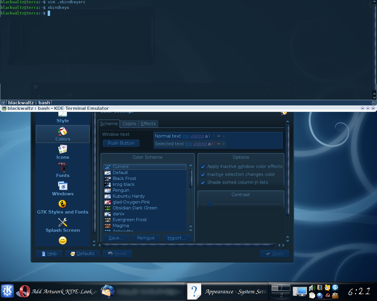


Desaturated
dwidmann


Source (link to git-repo or to original if based on someone elses unmodified work):
Changed a few colors around (I'm sure you didn't see that coming)
In particular
-link colors
-tooltip colors
-probably a couple other things that I can't remember


Ratings & Comments
7 Comments
I'm not such a fan of that shade of blue. But it is a harmonious composition and easy on the eyes.
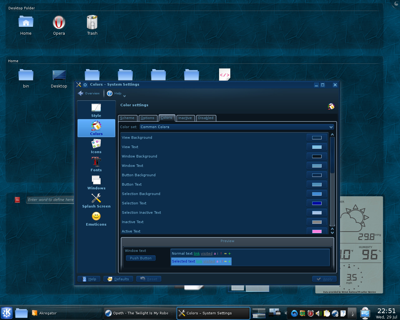
This one is the best color scheme I have ever seen. Great job! One little thing that bothers me (but not so much): The space information that you can activate in Dolphin is sth. like light blue numbers on a light blue bar ...
Yes, I've known about this bit all along, but it's a bit of a troublesome problem to attack. The three colors that affect it are "Window Background", "Selection Background", and "Window Text". I have a similar problem with Amarok 2 also, as it, for the currently playing track, highlights in a similar manner with "Selection Background", and doesn't change the text color to something sane (ie: "Selection Text").
Oh, and by the way, I'm glad you like it :)
The blue used for unread links is really hard to read. For instance undread rss feeds in akregator.
I've taken a look and it seems Akregator forces the blue for the links, you can change it by going to configure -> appearance (I know, not optimal, but what can we do eh?) As per the unreadable Akregator unread on the system tray icon, that I *can* and have fixed, I think. I also decided to fix up the Tooltip dialogs ... Thanks for the feedback, and sorry for not replying sooner (email notification from kde-look.org would have been nice ... oh well.)
a mi me parece un buen tema.