


Neon Icon By Rock
rocknava01


Source (link to git-repo or to original if based on someone elses unmodified work):
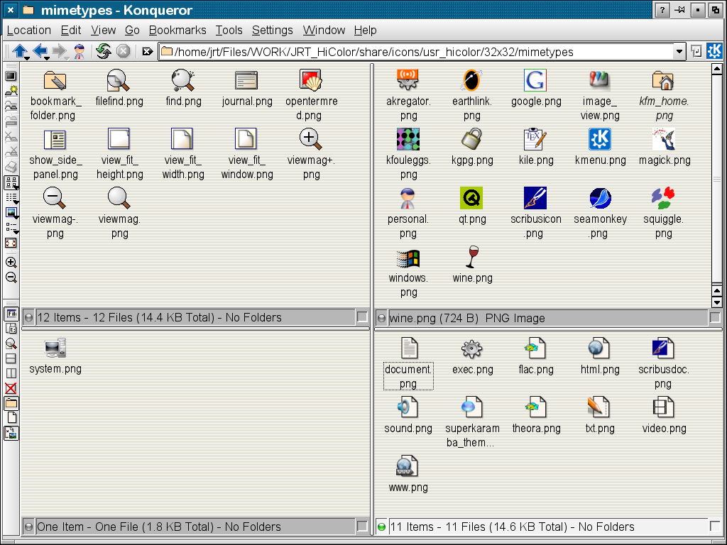
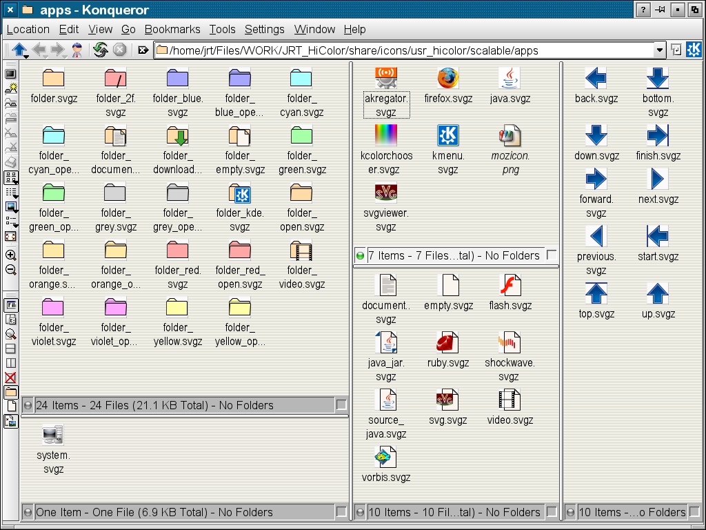
Changing things over to SVG.
New base MIME type.
More changed to SVG.
Changed "vorbis" icon.
Adapted "ruby" icon to HiColor
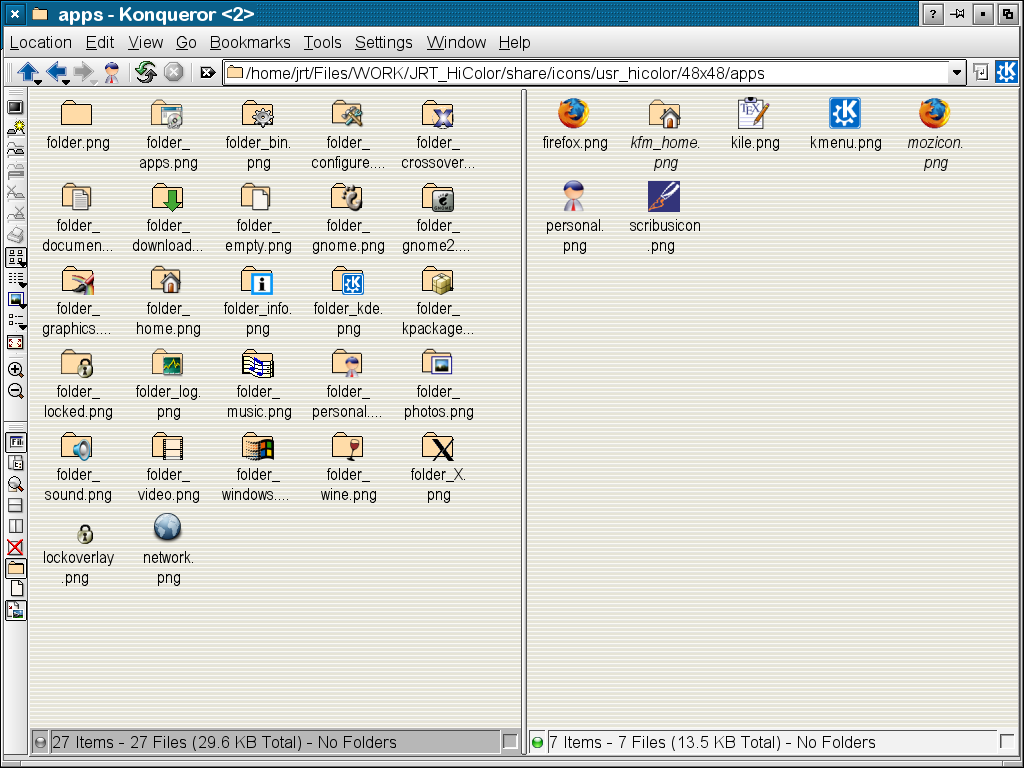
Added DownLoad folder.
Added Firefox PNGs and "mozicon" links
Added Java Jar MIME type icon.


Other Full Icon Themes:


Ratings & Comments
16 Comments
I like this theme: simple, no pointless frills, no nonsense. Just the way it should be.
"The file is not a valid icon theme archive"
Onn't know what an icon theme archive is. Just install as per instructions: To install, unpack the tarball in your $KDEDIR
I like the 3rd screenshot (hate the other two), but I don't like the thick border on the "open" folder icons.
That "thick boarder" is caused by a bug in the KDE SVG icon software. I presume that it will be fixed soon. Then I will update the screen shot.
This has now been fixed and the open folder icons display correctly. :-) See new screen shot.
They're back!
I like the simpliesty of this icon's. But people nowdays all go for eye candy. But this set is good and has many icons in it that others lack. + from me
oha
It look like gnome : (
This theme looks BAD... :-(
nothing against your work but i have seen better i did not vote
I like it, it's nice and simple.
Damn, that is an ugly icon set!!!
Usability does conflict with what some consider artistic. We have CrystalSVG which many consider artistic, but it is lacking when it comes to usability because they lack a full tonal range. We see many other icons which are very artistic, but they have too much detail for even 32x32. Such icons (CrystalSVG and ones with too much detail) render as fuzzy colored blobs in 22x22 and 16x16.
That may be true, but minimalism can be expressed in a visually pleasing way. :)