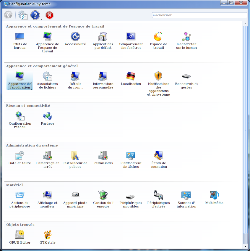
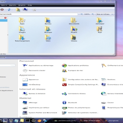
Description: While using other icon themes that were to look like a windows environment, I often felt that if it was ok regarding the desktop icons and more generally, the main icons we use on our average work with our computers, there were a lack of small ones. Spending hours everyday on my system, I came to the point I felt unsatisfied with the 16x16 icons, whatever the theme, 'cause they are mainly the Kde ones. Guys assembling themes concentrate their efforts on the "visible" ones, desktop and file explorer, but I wanted to go deeper in the cloning So I spent days crafting this one, trying, as best as I could, to reassign the windows icons to their new purpose, a linux and K environment. Furthermore, this icon theme is being shared 'cause, as I previously did with the gnome one I crafted months ago (http://gnome-look.org/content/show.php/W7.icon.theme.1.02?content=109359), there happen to be people I've convinced to use (and stay on) Linux on a regular and daily basis 'cause I would give them a way to feel more confortable using a windows lookalike environment! Then , if you have any interest using this icon theme that will kind of look like a known one, feel free to do so. Trollers, please, pass your way. And all kind of haters too, please. As previously said, it's about sharing. Enjoy. PeaceLast changelog:
1st version : 2011.01.10
--- / ---
2nd version : 2011.01.13 Cleaned up a bit. Few unusable or obsolete icons were removed.
---/---
P.S. Well, so far, slowly but surely, downloadings go their way.. Critics and evaluation would be greatly appreciated, for this is a work in progress and need further enhancements to say the less I aim to deliver some kind of standardize whole pack of icons, having, 'till now, tinker on my own, and, obviously, make mistakes here and there. So, if you ever come across one of these, please be kind to point it, I'd like to improve the set.
---/---
3rd version : 2011.04.05 Cleaned up a little bit more Rearranged few things, corrected few mistakes, harmonized some mimetypes icons, and sweated a lot... As previously declared, if you find anything to be improved, please be kind enough to tell me! And again, if you're strong enough to click on the download button, I guess there must be some energy left in this arm and finger of yours to click on the evaluation button too. So if you don't mind... Thanx And if you're too lazy, well, this, I do understand ;-) Thanx & Enjoy
---/---
2011.05.02 - Added a 3rd link for downloading Enjoy!
I really wanted to use these icons, but it seems that the uploader relied on a bunch of sites that got taken down. Like RapidShare and MegaUpload. I also saw another link that doesn't work to some Russian site.
There seem to be no working links to this icon pack anywere. It seems to have been scoured from the Internet.:/
in your screenshots, but please, PLEASE, get this off rapidshare and host it here on KDE-Look.org. They have this wonderful feature that allows one click installation integrated with KDE. I'm getting to the point where I will refuse to install anything not hosted here, and this may be the theme that pushes me over the edge.
I've been downloading from crapidsahare for 20 minutes now, and still have over half an hour to go. I'm beginning to wonder if it's worth it.
Yep.
Precisely, I'm afraid there should be some issues to upload such a massive (+/- 100mo) file on this very server.
I firstly uploaded this on 3 different servers but the US justice department closed some ;)
I'll do my best to upload again on fresh new ones.
And believe me, it's worth the time downloading it. I spent plenty o' time crafting this hell of a theme and the result is cool to the eyes of those used to another OS whose name can't be spoken :)
Thanx for your interest anyway.
Stay tuned. I'll provide new links asap...
You're welcome.
It's been a while since I involved my free time in improving this icon theme,
whilst I'm using it everyday on my computer.
While there are still minor bugs to correct,
this hasn't been such a disturbing thing to me I would've had to rush to correct it.
For the time being, anyway, I think it's pretty enough to be used on a daily basis
without any major inconvenience.
Fixes will be done, sooner or later.
So far, you're welcome to enjoy the theme.
I loved your theme.
Makes sense to use a look that someone
finds on Ruin-dows to make the users to
migrate to Linux. Best of all, makes sense
to create enjoyable icon themes!
Can i ask for one small change?
- In the Application Launcher, the icon
are always the windows logo. Would not be better to change to Kde logo?
Thanks in advance!
Well.
I'm a bit confused 'cause I thought the people who download this theme are aiming to get a system that look as close as possible to another sadly known one, nop?
That's the purpose of this whole thing.
So I'm sorry not get the point when it comes to your request for that matter the goal is to achieve a lookalike as sharp as can be.
Shifting this icon will for sure be more confortable to you, this I can perfectly understand, considering anybody has the freedom to choose the apperance of his OS.
However, it'll just be a step back as far as I'm concerned, the purpose being what it is. I hope you get the idea :)
That being said, you can easily change this icon you dislike, be it in the icon set itself before you install it or once it's upon your system.
There are plenty ways to do so, and on that road to theming (yep, change one or two icons is the first step in theming), google and linux sites are your friends.
So I sincerely hope you won't get mad at me not satisfying this wish, but I'm sure, if you've been clever enough to pass by and not have yell and bark at me for this heresy I'm building, I am rather confident you'll chill out and understand my considerations.
Thanx again for your interest, your involvment and your words.
The dogs bark but the caravan keeps on moving they say, nop? :)
Thanx for your kind comments and your appreciation.
An updated version is on its way.
Stay tuned and don't forget to pass by from time to time.
You sure won't be disappointed if, so far, you've liked what you've seen...
hoihoi,
I think, I won't use it for myself, but maybe for simplifying the change for my parents.
BTW: Renaming all the icons must have been hard work. Thanks for that!
I just gave it a try and it looks really good. I like the mount status indicator very much.
Will you complete the theme? You are omitting 64x64... most used size for me. no matter, the most icon were scaled down and looking good. but e.g. folder-development.png is only in 16x16 and 32x32 and will be scaled up, which isn't really nice... also the status icons kopete contacts are zoomed to 48px and appearing hazy.
will;


Ratings & Comments
39 Comments
This file is lost, rapidshare is dead, the russian serveradm site is dead. Shame.
I really wanted to use these icons, but it seems that the uploader relied on a bunch of sites that got taken down. Like RapidShare and MegaUpload. I also saw another link that doesn't work to some Russian site. There seem to be no working links to this icon pack anywere. It seems to have been scoured from the Internet.:/
Trolled. Hehehee. Winblows. Sorry I could not help myself. :)
I've used previously and these icons are excellent. Could you please provide download them again? The link is not working. Thank you.
I find other download link and share it. http://serveradm.ru/wp-content/uploads/2011/09/Win7.Lookalike.2011.04.05.tar.gz
I tried downloading this and when i installed it, it gave me an error about it being an invalid theme file.
in your screenshots, but please, PLEASE, get this off rapidshare and host it here on KDE-Look.org. They have this wonderful feature that allows one click installation integrated with KDE. I'm getting to the point where I will refuse to install anything not hosted here, and this may be the theme that pushes me over the edge. I've been downloading from crapidsahare for 20 minutes now, and still have over half an hour to go. I'm beginning to wonder if it's worth it.
Greetz. I'm not sure the openDesktop.org can host a file this size, Cheers
Yep. Precisely, I'm afraid there should be some issues to upload such a massive (+/- 100mo) file on this very server. I firstly uploaded this on 3 different servers but the US justice department closed some ;) I'll do my best to upload again on fresh new ones. And believe me, it's worth the time downloading it. I spent plenty o' time crafting this hell of a theme and the result is cool to the eyes of those used to another OS whose name can't be spoken :) Thanx for your interest anyway. Stay tuned. I'll provide new links asap...
really nice theme! thank you. i found a bug, in amarok & kaffeine pause button and stop button look like stop. but anyway great work.
i replaced media-playback-pause.png in /32x32/actions/ now its fine ;)
I'm glad you enjoyed the theme and very happy you'd find a way to get it to fit your wishes. Thanx a lot for your interest.
Really great work . Thanks a lot.
You're welcome. It's been a while since I involved my free time in improving this icon theme, whilst I'm using it everyday on my computer. While there are still minor bugs to correct, this hasn't been such a disturbing thing to me I would've had to rush to correct it. For the time being, anyway, I think it's pretty enough to be used on a daily basis without any major inconvenience. Fixes will be done, sooner or later. So far, you're welcome to enjoy the theme.
I loved your theme. Makes sense to use a look that someone finds on Ruin-dows to make the users to migrate to Linux. Best of all, makes sense to create enjoyable icon themes!
I totally agree :) Thank you for your kind words and for your interest.
Can i ask for one small change? - In the Application Launcher, the icon are always the windows logo. Would not be better to change to Kde logo? Thanks in advance!
Well. I'm a bit confused 'cause I thought the people who download this theme are aiming to get a system that look as close as possible to another sadly known one, nop? That's the purpose of this whole thing. So I'm sorry not get the point when it comes to your request for that matter the goal is to achieve a lookalike as sharp as can be. Shifting this icon will for sure be more confortable to you, this I can perfectly understand, considering anybody has the freedom to choose the apperance of his OS. However, it'll just be a step back as far as I'm concerned, the purpose being what it is. I hope you get the idea :) That being said, you can easily change this icon you dislike, be it in the icon set itself before you install it or once it's upon your system. There are plenty ways to do so, and on that road to theming (yep, change one or two icons is the first step in theming), google and linux sites are your friends. So I sincerely hope you won't get mad at me not satisfying this wish, but I'm sure, if you've been clever enough to pass by and not have yell and bark at me for this heresy I'm building, I am rather confident you'll chill out and understand my considerations. Thanx again for your interest, your involvment and your words.
That's a good point. No problem for me, keep doing your excelent job! Best regards.
Thanks alot for this theme, I love it!
You're welcome. Thanx a lot for you interest :)
...they look awsome in KDE! Thanks for the hard word of porting them. Cheers
Sorry, not "word" but "work" :)
The dogs bark but the caravan keeps on moving they say, nop? :) Thanx for your kind comments and your appreciation. An updated version is on its way. Stay tuned and don't forget to pass by from time to time. You sure won't be disappointed if, so far, you've liked what you've seen...
hoihoi, I think, I won't use it for myself, but maybe for simplifying the change for my parents. BTW: Renaming all the icons must have been hard work. Thanks for that! I just gave it a try and it looks really good. I like the mount status indicator very much. Will you complete the theme? You are omitting 64x64... most used size for me. no matter, the most icon were scaled down and looking good. but e.g. folder-development.png is only in 16x16 and 32x32 and will be scaled up, which isn't really nice... also the status icons kopete contacts are zoomed to 48px and appearing hazy. will;