Description: This icontheme is born after taking the idea from an already existing icontheme for KDE named Lätt Sjö, but not available for download for many months ago. That's why I decided to rip the folders from an original OS X icontheme and mixing it with KFaenza and other minimalistic icons. However, there are still a lot of missing icons. I will eventually be fixing bugs and missing icons.
Orignal Lätt Sjö icons can be found here: http://esxxi.me/archive/
ATTENTION:
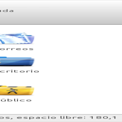
This icontheme requires Oxygen icons installed to work completely, because the theme inherits most of icons from it. It only includes icons for actions, several apps, emblems and places. I'm still working in improving little bugs and adding minimalistic icons, as well as fixing lost links and arranging missing icons.
Credit goes to the respective owners of the KFaenza, Token, Lätt Sjö and Oxygen iconthemes. I DO NOT OWN ANY OF THE ICONS HERE. IT'S JUST A PERSONAL PROJECT I AM SHARING.
(Text copied from the README file included in the package)
I really don't like how Faenza (or KFaenza or anything like that) looks like on KDE SC, that iconset is more for GNOMEish environments like GNOME Shell, Cinnamon or Xfce where do they look great indeed, but I really like the folders, good job.
Thanks for your appreciation. I assume you've read the description and you know perfectly I have just mixed different media.
Anyway, why do you say faenza does not fix well with KDE SC? do you mean applications, action icons...? Explain me why, I'd be pleased of hearing someone's different opinion always in order to improve :)
Thanks for your time!
"Thanks for your appreciation. I assume you've read the description and you know perfectly I have just mixed different media."
Yup :)
"Anyway, why do you say faenza does not fix well with KDE SC? do you mean applications, action icons...? Explain me why, I'd be pleased of hearing someone's different opinion always in order to improve :)"
Well, this is absolutely subjetive but I don't find that style of icons (Faenza) to be native KDE-style icons, it's like trying to use Tango icons with KDE, just don't fit - and that's exactly what I want to say, it 'feels' that they don't fit together, not that either Faenza or Tango are bad, on the contrary they are awesome and I like them but on other DEs/WMs[0] than KDE SC, those icon sets don't looks as stylish and integrated with KDE as Oxygen does...
On the other hand, _there is_ a GNOMEish style icon set I like very much how it looks like on KDE: Silk Icons --> http://www.famfamfam.com/lab/icons/silk/ <--
I love it! It's simple and sharp, have a nice color palette and everything about them shouts "simplicity" - as GNOME's Tango icons are, but Silk is prettier.
I repeat: this is my own and totally personal taste, it means really nothing beyond that.
I actually use KDE SC and I'm amazed with this DE, it's totally awesome, but sometimes I miss the simplicity GNOME/Shell desktop and have :)
Cheers,
Martin


Ratings & Comments
3 Comments
I really don't like how Faenza (or KFaenza or anything like that) looks like on KDE SC, that iconset is more for GNOMEish environments like GNOME Shell, Cinnamon or Xfce where do they look great indeed, but I really like the folders, good job.
Thanks for your appreciation. I assume you've read the description and you know perfectly I have just mixed different media. Anyway, why do you say faenza does not fix well with KDE SC? do you mean applications, action icons...? Explain me why, I'd be pleased of hearing someone's different opinion always in order to improve :) Thanks for your time!
"Thanks for your appreciation. I assume you've read the description and you know perfectly I have just mixed different media." Yup :) "Anyway, why do you say faenza does not fix well with KDE SC? do you mean applications, action icons...? Explain me why, I'd be pleased of hearing someone's different opinion always in order to improve :)" Well, this is absolutely subjetive but I don't find that style of icons (Faenza) to be native KDE-style icons, it's like trying to use Tango icons with KDE, just don't fit - and that's exactly what I want to say, it 'feels' that they don't fit together, not that either Faenza or Tango are bad, on the contrary they are awesome and I like them but on other DEs/WMs[0] than KDE SC, those icon sets don't looks as stylish and integrated with KDE as Oxygen does... On the other hand, _there is_ a GNOMEish style icon set I like very much how it looks like on KDE: Silk Icons --> http://www.famfamfam.com/lab/icons/silk/ <-- I love it! It's simple and sharp, have a nice color palette and everything about them shouts "simplicity" - as GNOME's Tango icons are, but Silk is prettier. I repeat: this is my own and totally personal taste, it means really nothing beyond that. I actually use KDE SC and I'm amazed with this DE, it's totally awesome, but sometimes I miss the simplicity GNOME/Shell desktop and have :) Cheers, Martin