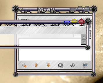
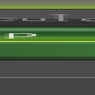
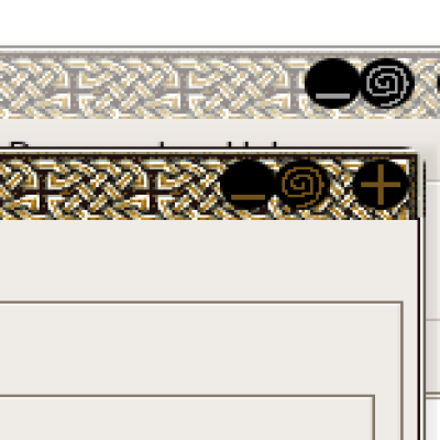
Description: A PNG based theme with an extended industrial border. I'm still not happy with the buttons, but thought I'd go ahead and release to see what everyone thought.
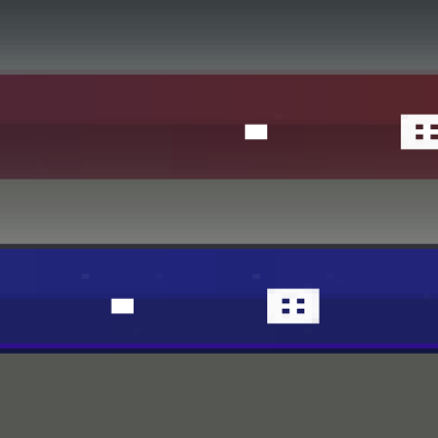
This shows off some of the really customized themes that are possible using the PNG engine. There is even a slight glow around the frame that is embedded within the image files, not generated by the window decorator.
It's a great theme. Well done. My only problem is I will not use it (much if at all) because the gears are very much in your face. But it's a good theme.
I think this theme is very cool, and i agree that linuxer should not make Linux looks like M$ vista. That is really not creative. If you want to use vista, just use it, but don't make our lovely linux became vista like. thats really sadistic.
The most important thing imho is that this theme introduce a new concept in emerald. Transparency with shapes.
I dont understand why lot of people vote negative. He is the first one making something like this. Is really original and a great start for a new kind of emerald themes-
Commonly innovative concept is more important than the final product. I think this theme must be considered like a prototype of a new way to do emerald themes
Sorry my english
Cheers :)
I can't speak for others but I think your work is very creative. Personally, I prefer a more conservative window decoration. One that blends in with the window and doesn't try to compete for focus. On the other hand, it still needs to be pleasing to the eye.
- Chris
I also can't understand why it's been voted down but then tbh i've rarely understood the voting here or thought it bore any relation to whether something had merit or now.
Personally I don't like it in the sense that I wouldn't use it, but that's no reason to vote it down. It's one of the most original and innovative window decorations i've seen in a long time and stands up as having a heck of a lot more merit than 27 versions of the same theme signed off as "different" and voted up because the author changed the opacity level by 2%.
That's not to knock those things, I wouldn't vote those down either, but really, your work shouldn't be getting the voting down that it is doing.
Keep up the good work m8. As long as you like it, that's enough.
I really like the original jobs more than simply changing some fonts or color of pre-made themes. Your jobs are welcome in my PC (I think the Vines are cool too).
Maybe i should make some png decorations also (when i got the time :))
I thought this theme was very creative. I wasn't aware that themes could be done this way, it reminds me of some Enlightenment themes. This has motivated me to experiment.
I'm not really understanding the bad ratings people are giving me on this. Please if you don't like the theme and feel compelled to vote it down, at least post a comment about what you don't like.
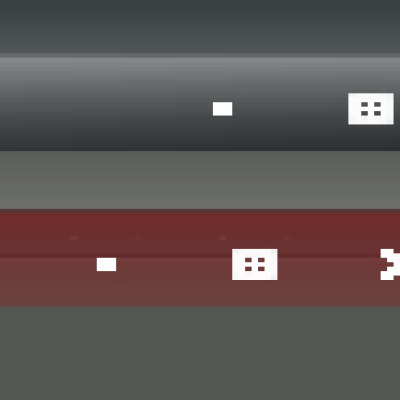
It's extremely playful. The buttons made me vote for "bad", when I first saw the screenshot. I would not vote that way anymore, because I like the transparent gap and the non-conformist style. Go on.


Ratings & Comments
12 Comments
It's a great theme. Well done. My only problem is I will not use it (much if at all) because the gears are very much in your face. But it's a good theme.
I think this theme is very cool, and i agree that linuxer should not make Linux looks like M$ vista. That is really not creative. If you want to use vista, just use it, but don't make our lovely linux became vista like. thats really sadistic.
Your turning out all kinds of awesome things there. Thank you for another. I like the gears, especially good in KDE. Vista is for losers.
As long as it's NOT OUR BELOVED VISTA that Linux community LOVES SOOOO MUCH it will always get low ratings. Don't you understand? Just do what all the others are doing! Copy the style of the MOST WONDERFUL OS in existence (aka VISTA), made by the almighty GOD of all the IT (aka Microsoft) and you will ALWAYS be getting the highest ratings here. Just like these guys: http://www.kde-look.org/content/show.php?content=45690 http://www.kde-look.org/content/show.php?content=51976 http://www.kde-look.org/content/show.php?content=51998 http://www.kde-look.org/content/show.php?content=51955 http://www.kde-look.org/content/show.php?content=51685 http://www.kde-look.org/content/show.php?content=51339 http://www.kde-look.org/content/show.php?content=51237 http://www.kde-look.org/content/show.php?content=51077 http://www.kde-look.org/content/show.php?content=51003 http://www.kde-look.org/content/show.php?content=48652 http://www.kde-look.org/content/show.php?content=49103 http://www.kde-look.org/content/show.php?content=42875 There is more, but I'm tired of Copy/Paste! P.S.: At this point my vote goes to any theme that is NOT an Aero derivative!
The most important thing imho is that this theme introduce a new concept in emerald. Transparency with shapes. I dont understand why lot of people vote negative. He is the first one making something like this. Is really original and a great start for a new kind of emerald themes- Commonly innovative concept is more important than the final product. I think this theme must be considered like a prototype of a new way to do emerald themes Sorry my english Cheers :)
I can't speak for others but I think your work is very creative. Personally, I prefer a more conservative window decoration. One that blends in with the window and doesn't try to compete for focus. On the other hand, it still needs to be pleasing to the eye. - Chris
I also can't understand why it's been voted down but then tbh i've rarely understood the voting here or thought it bore any relation to whether something had merit or now. Personally I don't like it in the sense that I wouldn't use it, but that's no reason to vote it down. It's one of the most original and innovative window decorations i've seen in a long time and stands up as having a heck of a lot more merit than 27 versions of the same theme signed off as "different" and voted up because the author changed the opacity level by 2%. That's not to knock those things, I wouldn't vote those down either, but really, your work shouldn't be getting the voting down that it is doing. Keep up the good work m8. As long as you like it, that's enough.
I really like the original jobs more than simply changing some fonts or color of pre-made themes. Your jobs are welcome in my PC (I think the Vines are cool too). Maybe i should make some png decorations also (when i got the time :))
I thought this theme was very creative. I wasn't aware that themes could be done this way, it reminds me of some Enlightenment themes. This has motivated me to experiment.
the corners and the buttons look too unwieldy. They make the theme pretty ugly. That's most likely the reason for voting down.
I'm not really understanding the bad ratings people are giving me on this. Please if you don't like the theme and feel compelled to vote it down, at least post a comment about what you don't like.
It's extremely playful. The buttons made me vote for "bad", when I first saw the screenshot. I would not vote that way anymore, because I like the transparent gap and the non-conformist style. Go on.