Description: The borders fade from nearly-white ([strike]taken from the background colour of Baghira milk[/strike] taken from my current colourscheme - window backgrounds at 244 grey) at the centre to totally transparent at the edge, with a shadow so that the actual edge of the window is clear.
If anyone wants a version in some colour other than nearly-white, it should be possible to open the border PNGs in the GIMP and change things somehow.
IMHO it looks OK with or without blur on the edges, but I prefer it with (configure in beryl-settings).
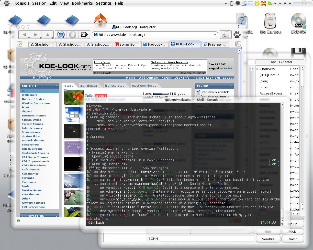
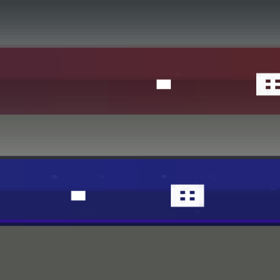
I designed this to fit in with Baghira, milk mode (KDE) and Milke (GTK). See Screenshot 2 for GTK and QT apps (Sorry for the poor quality screenshot. Seems that ksnapshot makes poor jpegs compared with GIMP... I might make a proper screenshot later.).
The button pixmaps are lifted straight out of Baghira. The rest is my own work, so this is GPL.
The widget styles shown in the screenshot are Baghira for the Qt apps and and Milke for GTK apps (lower right). I think these are the best styles to use with this to achieve a consistent appearance.
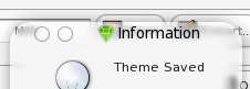
If you vote "Bad", please say why. I'm still improving this.
I really like this theme.
Because it is rounded and looks simple (I mean no flashy colors and stuff that make you go pull your hear out)
But maybe just make them buttons a little more visible.
and some spacing between the top and bottom of the letters and the edge, I think it would look even better.
But it's really good!!!
thx for this theme, was looking for that!!
Um... Does not run? This isn't actually supposed to be executed as such!
This is a theme for Emerald, which is a window manager for hardware accelerated desktops with the Beryl compositing manager.
You aren't supposed to try and extract the archive either. You should run emerald-theme-manager, press the "Import" button, and select the .emerald file from the location you downloaded it to.
This will only work if you're already running Emerald and Beryl. Last time I checked, this generally involved unsupported drivers on Ubuntu, but that may well have changed since then.
Hey,
how did you get the round corners in the controlpanel on the Top?
and how did you get gtk applications run ?
if i start gtk-apps with baghira style they crash :(
I'm not using GTK-Qt for the GTK apps, if that's what you mean.
I'm using the GTK theme "Milke", which matches quite nicely. http://www.gnome-look.org/content/show.php?content=23687
BTW, I stopped using GTK-Qt precisely because it tends to crash with Baghira.
I think the corners are configured in Baghira's config program, under Special widgets > kicker > remove bevel.
However, they are not always rendered correctly when using Beryl, as you can see in the top right of this screenshot.
ok thanks!
but:
i have problems with selecting a GTK theme..
the GTK-QT Kontrol module in the Controlcenter doesn't work.
and if i want to start gnome-contol-center it crashes with this message:
thorsten@towi04:~> gnome-control-center
(gnome-control-center:8022): GLib-CRITICAL **: g_key_file_add_group: assertion `g_key_file_lookup_group_node (key_file, group_name) == NULL' failed
(gnome-control-center:8022): GdkPixbuf-CRITICAL **: gdk_pixbuf_new_from_file: assertion `filename != NULL' failed
(gnome-control-center:8022): GLib-GObject-CRITICAL **: g_object_ref: assertion `G_IS_OBJECT (object)' failed
gnome-control-center: symbol lookup error: gnome-control-center: undefined symbol: g_intern_static_string
thorsten@towi04:~>
Do you know, what i could do ?
There are two standalone programs for changing GTK themes than I know of. The one I prefer is called gtk-chtheme. The other is called switch2, and on my Gentoo box it is provided by a package called gtk-theme-switch.
Yeah it works :), thanks (((=
and the round corners can be activated,
when you have started bab -> right click on the systrayicon and then round corners on screen.
the package, which contains gtk-chtheme is called gtk-chtheme on SuSE 10.1 !
thanks
twi
The widget styles in use in the screenshot are Baghira, in milk mode, and Milke, for the GTK 2 app you can see in the lower-right.
What do you mean by frame buttons?
The three circles in the top left corner of each window are the buttons. Symbols appear on them on mouseover, like the buttons in MacOS X.
There is also a ? symbol, on the far right, for windows which use it.
I've just realised that for some reason, the buttons are missing on some windows in the screenshot. I don't know why that is, they are usually always there. It is possible that I had just restarted Beryl. I don't remember, but I'd better take a better screenshot.
I find it easier than using dark themes. I find there to be very little confusion as to what various interface elements are, whereas with most dark themes I find buttons blend more with the background.
I also find this nicer to use than a normal-looking theme, e.g. Plastik, but that might just be a matter of taste. Plastik is a bit ugly.
Maybe this would be no fun on an LCD. Dunno. I hate LCD screens.


Ratings & Comments
16 Comments
This is the best theme ever, my absolute favorite!
I really like this theme. Because it is rounded and looks simple (I mean no flashy colors and stuff that make you go pull your hear out) But maybe just make them buttons a little more visible. and some spacing between the top and bottom of the letters and the edge, I think it would look even better. But it's really good!!! thx for this theme, was looking for that!!
how do i use it with ubuntu 6.10 . i can not extract it with any gunzip and it does not run it even in theem option
Um... Does not run? This isn't actually supposed to be executed as such! This is a theme for Emerald, which is a window manager for hardware accelerated desktops with the Beryl compositing manager. You aren't supposed to try and extract the archive either. You should run emerald-theme-manager, press the "Import" button, and select the .emerald file from the location you downloaded it to. This will only work if you're already running Emerald and Beryl. Last time I checked, this generally involved unsupported drivers on Ubuntu, but that may well have changed since then.
Hey, how did you get the round corners in the controlpanel on the Top? and how did you get gtk applications run ? if i start gtk-apps with baghira style they crash :(
I'm not using GTK-Qt for the GTK apps, if that's what you mean. I'm using the GTK theme "Milke", which matches quite nicely. http://www.gnome-look.org/content/show.php?content=23687 BTW, I stopped using GTK-Qt precisely because it tends to crash with Baghira. I think the corners are configured in Baghira's config program, under Special widgets > kicker > remove bevel. However, they are not always rendered correctly when using Beryl, as you can see in the top right of this screenshot.
ok thanks! but: i have problems with selecting a GTK theme.. the GTK-QT Kontrol module in the Controlcenter doesn't work. and if i want to start gnome-contol-center it crashes with this message: thorsten@towi04:~> gnome-control-center (gnome-control-center:8022): GLib-CRITICAL **: g_key_file_add_group: assertion `g_key_file_lookup_group_node (key_file, group_name) == NULL' failed (gnome-control-center:8022): GdkPixbuf-CRITICAL **: gdk_pixbuf_new_from_file: assertion `filename != NULL' failed (gnome-control-center:8022): GLib-GObject-CRITICAL **: g_object_ref: assertion `G_IS_OBJECT (object)' failed gnome-control-center: symbol lookup error: gnome-control-center: undefined symbol: g_intern_static_string thorsten@towi04:~> Do you know, what i could do ?
There are two standalone programs for changing GTK themes than I know of. The one I prefer is called gtk-chtheme. The other is called switch2, and on my Gentoo box it is provided by a package called gtk-theme-switch.
Yeah it works :), thanks (((= and the round corners can be activated, when you have started bab -> right click on the systrayicon and then round corners on screen. the package, which contains gtk-chtheme is called gtk-chtheme on SuSE 10.1 ! thanks twi
Whats the style your using? Also where are the frame buttons on your theme?
The widget styles in use in the screenshot are Baghira, in milk mode, and Milke, for the GTK 2 app you can see in the lower-right. What do you mean by frame buttons?
the close, minimise, maximise buttons.
uhhh... thats his theme!! the purpose of him putting it here!
The three circles in the top left corner of each window are the buttons. Symbols appear on them on mouseover, like the buttons in MacOS X. There is also a ? symbol, on the far right, for windows which use it. I've just realised that for some reason, the buttons are missing on some windows in the screenshot. I don't know why that is, they are usually always there. It is possible that I had just restarted Beryl. I don't remember, but I'd better take a better screenshot.
But don't you find it hard to work on an all white screen all day long?
I find it easier than using dark themes. I find there to be very little confusion as to what various interface elements are, whereas with most dark themes I find buttons blend more with the background. I also find this nicer to use than a normal-looking theme, e.g. Plastik, but that might just be a matter of taste. Plastik is a bit ugly. Maybe this would be no fun on an LCD. Dunno. I hate LCD screens.