

OSX theme package
TheBlackKnigth


Source (link to git-repo or to original if based on someone elses unmodified work):
Progress (2006-02-06)
Features in work:
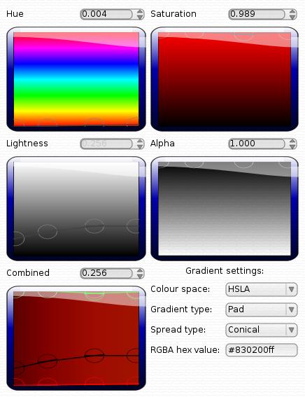
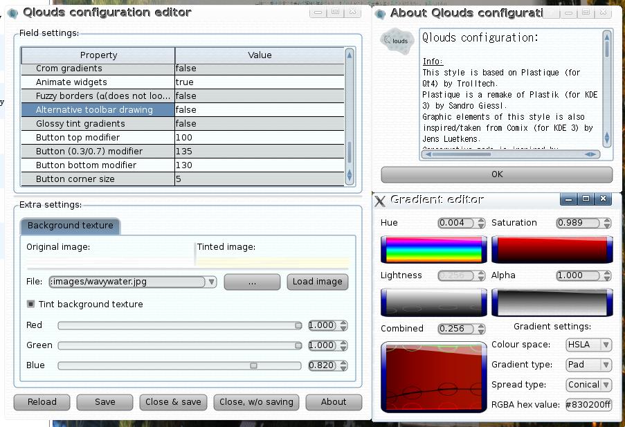
* Configuration gradient editor (made from scratch) for customizeable gradients.
* Qt 4.0.x is not supported anymore, use Qt 4.1.0 or better.
* Editable comboboxes and spinboxes has a new layout
* Group boxes/frames etc. has a partly transparent background, which is combined when multiple boxes are nested.
* Some gradient colour editing options.
* Button corner size option
* Small fixes to the codebase done in the last 4 months.
Qlouds v 0.0.0.6a "Glossy tint" released:(2005-08-24)
New features:
* Glossy widget gradient, which also makes the buttons more round, and gives the border colour an alpha of 110 .
Thanks to Zammi for the idea, and Tomasu which created the mocup which it is based on.
PS! Because this is a minor release please download it (and the screenshot) from the website.
Qlouds version 0.0.6 "Animation madness" released:
Features:
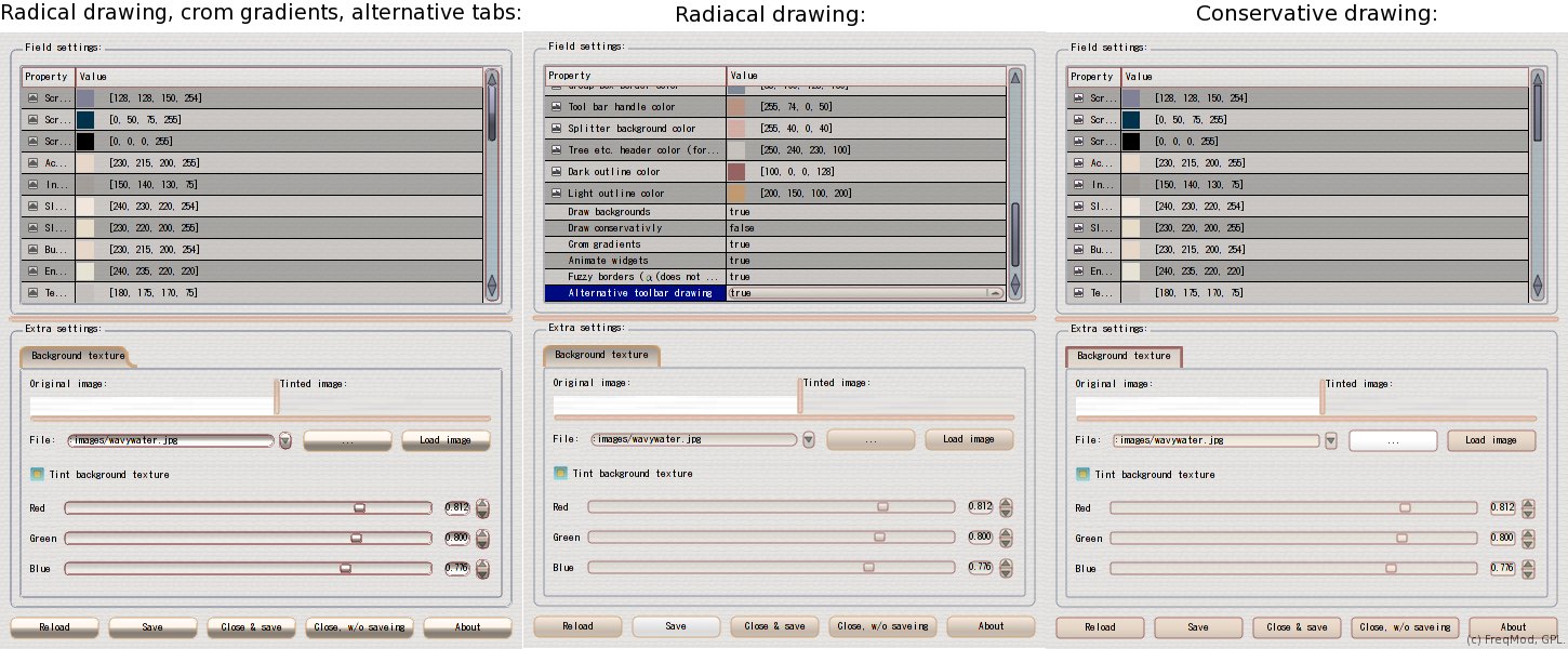
* Animated widgets. Buttons & scrollbars in KDE4&QT4. Progress bars in QT4 only.
The button fades on keybord focus, and when the mouse is over it. The scrollbar & progressbar gradients is shifted gradually.
* Fuzzy edge drawing (including cosmetic errors, disabled by default).
* Crom gradient mode, for everybody who wants their buttons to look like they have been taken from the last Vista/Tiger screen shots.
* Conservative drawing mode, for those who wants their widgets to look more like Luna/Plastik/Clearlooks.
* The style demo program has been obsoleted by the configuration program, it is removed.
Fixed some small random drawing bugs.
See homepage for more and older changes.


Other QtCurve:

Ratings & Comments
2485 Comments
Well, I can't use KDE 4 yet (not enough downloading capacity :-( ), but this style is what I've always been missing when using domino and experiencing it's (very strong) limits. Just from what I can see in these screenshots, it really is what I've been dreaming of. Thank you a lot, as soon as I use KDE 4 I will use this and only this. It's amazing how awesome the next releases will have to be (as even 4.0, which is very unstable and unfinished, is just great). You are making it even better.
It is one of the best layouts I have ever seen! You did a mistake of posting ugly screenshots there. Most of the people judged based upon those screenshots, that's why its ratings are poor. You have done an amazing work to best utilize qt4 architecture! May be its source code would be a learning point for many of developers!
good work release the kde 4 now with all the bug i dont care
why release it with bugs? you can dl it from SVN, and build it, and have all the bugs you want... it is good to experiment with the new features in Qt4.
Hi, Here is a nice mockup I found in kde-artists.org. I like if you could follow something like this. Mockup: http://kde-artists.org/main/component/option,com_smf/Itemid,48/expv,0/topic,403.0
Forgot to mention that you can contact the author: spidernik84@hotmail.com and hope he will like to help you with some more mockups. Further here is the email address for tomasu: innovati@innovatived.ca as well.
I am unfortunatly unable to implement a QT style using normal Arthur drawing routines because of some limitations of the Arthur drawing system and the styling system. It may be possible to draw the style with external drawing routines like the native WinXp style, but I am not good enough to do that. Worst limitations: http://freqmod.dyndns.org/upload/i9.1.png (no transparency between widgets) http://freqmod.dyndns.org/upload/i10.1.png (garbage on screen with transparent top widgets)
KDE 4.0 ?! I don't like big numbering jumps like this one.. Why not releasing KDE 3.5 then KDE 3.6, 3.7, 3.8, 3.9 ... before the KDE 4.0 ! I don't think anything worths moving to a big version number. To me it's a bit silly.
Its because kde4 will use qt4. kde 3.5 is useing qt3x. so i think the big version jump is realy good do point out that qt4 gets used. lg pete
Part of the reason for the 'big jump' is because the KDE developers are changing the API which they only do once in every long while.
Hi, I like to have glossy tint with option to control the gloss. This is a good example (But I prefer it without such translucency): http://fs5.deviantart.com/i/2004/294/a/0/BLiNK_inetrface_concept_by_Tomasu.png
I am currently in my first week at school, so it may take a little while to find time to implement the tinting. I didn't really understand what the "glossy tint" is. Is it the shadows of the widgets, the gradient on the widgets or the white border around the widgets, or am I totally lost and it is something else?
(May you do a quick mocup/sketch in inkscape showing just what it is, then it hopefully, is simple for me to convert it to (QT 4) vector code)
I'm talking about gradient on widgets. Sorry, using the word "glossy" I meant gloss finish widgets.
I have uploaded a version to my Qlouds home page, please check it and tell me if (and how) you think i could have made the gradient better. I think it is a litte diffecult to make it since it is only the surface, and not the shadow. (but the shadow is *much* more work, which i won't do now).
Thanks for the answer. I can't wait for KDE 4.0 to come.
Is KDE 4.0 out??? Or is it just some alpha? I'm a bit confused.
The screenshots are from kde 4.0 SVN. The style is not (nativly) made for KDE, but Qt 4 (as stated in the depends on field). Unfortunatly there are no Qt 4 themes/styles section, so I decided that KDE 4.0 fits better than other/theme style, and putted it here. It is possible to use this style in KDE 4 SVN. The current kde 4 code is very unstable and not useable for coding or other "real" work.
How about making a screenshot with Mac OS X -like "scan lines" -pattern? The ones in existing screenshots are a bit too restless for me. At least I wouldn't consider it as a rip-off.
Good idea. Here is a (LGPL)'ed aqua background pattern, made in gimp. ((95%) white each 4rd point): http://freqmod.dyndns.org/qklouds/img/stripedbg.png Here is a screenshot using it: http://freqmod.dyndns.org/qklouds/screens/Qlouds.0.0.35.jpg
bth2xi http://www.QS3PE5ZGdxC9IoVKTAPT2DBYpPkMKqfz.com
o7ggjq http://www.QS3PE5ZGdxC9IoVKTAPT2DBYpPkMKqfz.com