


[Nota: Hay un tutorial en ESPAÑOL para que tu escritorio quede igual a la captura de pantalla.
 aquí esta ]
http://linuxdesktops.wordpress.com/2009/07/31/kde-how-to-look-like-this-2-kfresh/


Source (link to git-repo or to original if based on someone elses unmodified work):
aquí esta ]


More Be-Shell/Bespin from PoL666:
Other Be-Shell/Bespin:

Ratings & Comments
4 Comments
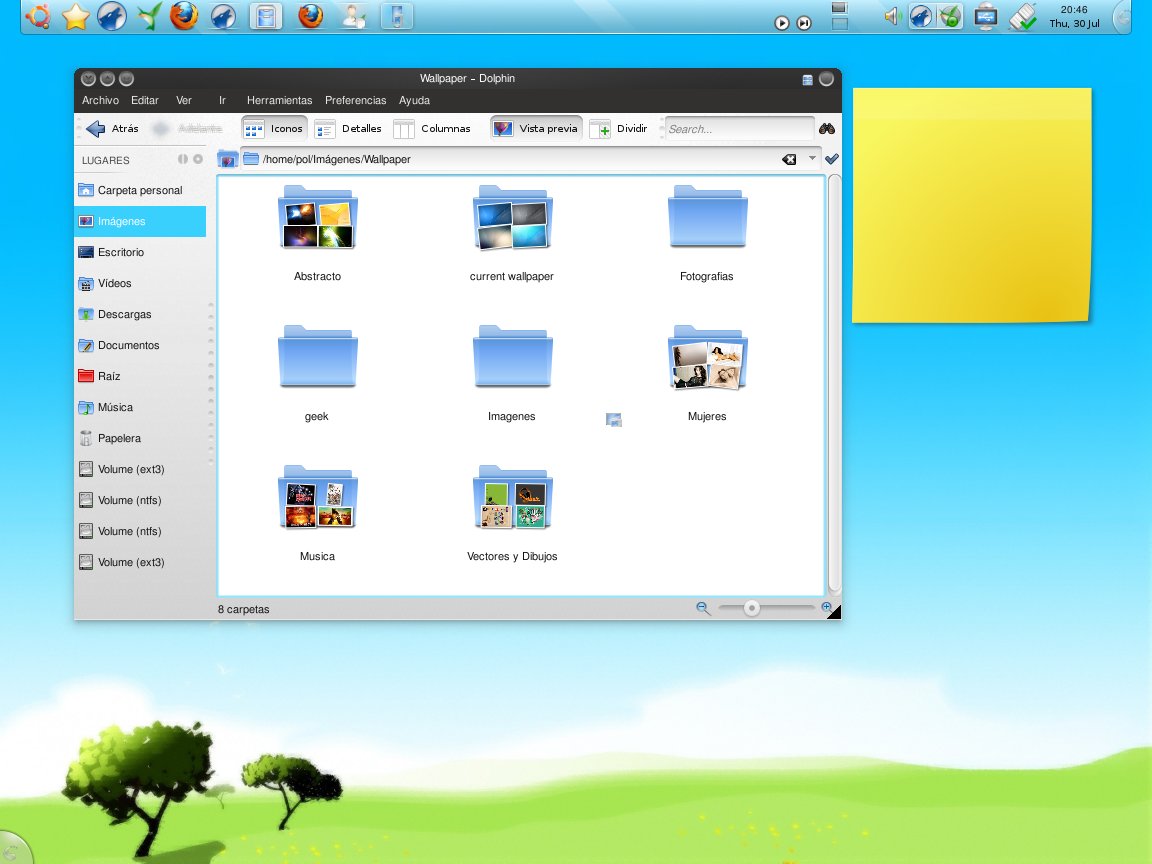
Oh sorry, it's the nitrogen windows decorator.Anyway I think that my screenshot doesn't look so bad.
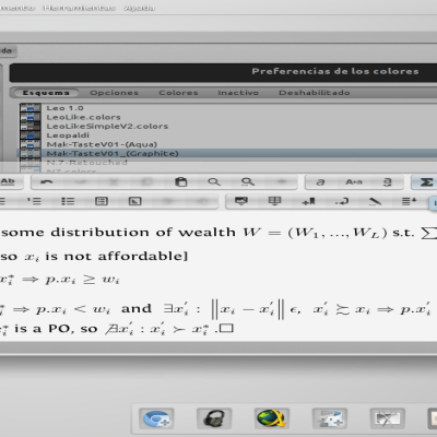
It's spanish but 4.3 isn't totally translated. All that you have said are details from the theme Bespin. (the blur on the row, the cut on the edge of the window )
nope, the cut off is from the deco (which is apparently nitrogen?) - though bespin has a very similar feature other stuff: the disabled icons can meanwhile be blurred, Qt style desaturated or honor KDE icon settings -for KDE apps- the "dots" in the toolbar hint that the toolbar isn't locked (i.e. can be dragged around) -> rmb -> "lock toolbars" folder icons are non of my business, the dockwidgets icons follow the bespin deco (and where created to break with any "x_O-+" from Win or Mac and -scanning his comments...- didi85 is likely a troll ;-P
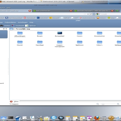
Your "Adelante" looks like a tomato converted into ketchup. The symbols near "Lugares" are senseless and a little bit strange. Why "Search..." isn't in spanish? "Thu, 30 Jul" is not spanish, too! On the side of the "Search.."-field I see big points which don't fits well! The zoom-loupe is too near to the edge and cutted. The Buttons on the Windows-decoration aren't nice. You can see the symbols inside already - shiny but you see it. It's not okay. The folder "Descargas" is totally blured meanwhile "Raiz" and "Carpeta rersonal" are totally different and sharp. It's a light analyse of your screenshot. I see more faults in it, but I think it's enough. What I want say only is, that KDE is on a good way, but perfect already not. It's still a long way ... ;) My hopes goes to KDE 4.5! :D Cheers