


KvTranslucent
tsujan


Source (link to git-repo or to original if based on someone elses unmodified work):
Apr 20 2013
------------
Decreased and tinted the widget darkness just a little to gain sharper shadows and clearer surfaces.
Better selected menubar items.
Tweaked the Plasma theme.
Added the GTK+ dependencies to README.
Jul 12 2013
------------
Use the titlebar settings of normal windows for dock widgets.
Updated the Plasma theme for KDE-4.10.
Updated the GTK+ theme for v3.8.
Sep 17 2013
------------
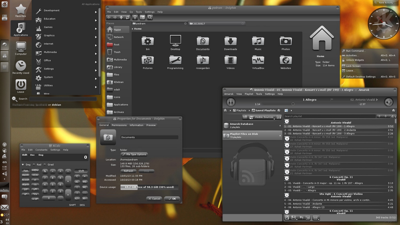
Blended menubar with titlebar.
Some minor changes.
Oct 10 2013
------------
More elegant selected items for menus and views.
Corrected positive text color.
Nov 23 2013
------------
Added yaWP icons compatible with nouveKDEGray to the Plasma theme (remove Plasma cache before updating).
Tweaked the mouse-over effect of the QtCurve theme.
Added a CSS stylesheet for Rekonq.
Removed the GTK2 theme because it wasn't needed (see INSTALL and README-GTK2 for tips).
Removed the GTK3 theme because GTK3 is unreliable (use the Oxygen GTK3 engine instead).
Jan 6 2014
------------
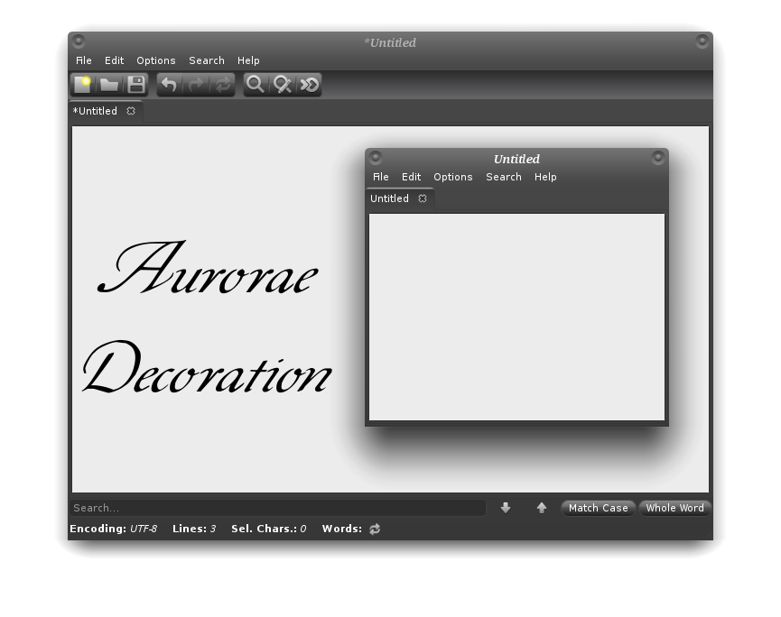
Added an optional Aurorae decoration (second screenshot).
Made the inactive titlebar color the same as the active one.
Took care of Lancelot and made the background color of the Plasma buttons transparent.


More QtCurve from tsujan:
Other QtCurve:

Ratings & Comments
22 Comments
This is absolutely brilliant. Made a small change to increase readability of input fields in Firefox, changed the value of view text in "Colors" to: #ADC3FF Personal preference, I used the Ubudao icon set with it. All in all this is by far the best dark theme that I have used. Keep up the good work.
Thank you very much! I've left it as it is since I made KvDark, which I prefer. Its Plasma theme can be used with KvDark too.
Wonderful.
Thank you!
Really a great dark theme, very usable (not as dark as the most other ones), thanks!!! One wish/question: How can I make that marked buttons more like the buttons shown in the 2nd screenshot (both screenshots are from your theme, some buttons looks like in screenshot 1 which is "1990ish" sorry :), the buttons on screenshots 2 are more flatten and the way to go these days (here). 1) http://i.imagebanana.com/img/em8sbhfr/Auswahl_043.png 2) http://i.imagebanana.com/img/idz8fcu2/Auswahl_044.png Thanks
(1) The easiest way is to select Oxygen instead of QtCurve in System Settings > Application Appearance > Style > Applications (tab). However, the pressed state of buttons isn't easily recognizable with Oxygen when you use a dark color scheme. (2) You could also use Oxygen as above but change System Settings > Application Appearance > Colors > Colors (tab) > Window (drop-down menu) > Normal Background to a bit lighter color. Don't forget to save the changed scheme under a different name and apply. (3) But the best way is to stay with QtCurve, click Configure in System Settings > Application Appearance > Style > Applications (tab), select the Custom Gradients tab and choose Custom gradient 8 from its drop-down menu. Then you could change it in whatever way you like but don't forget to use the Update button after every change. After that, you could also go to the Rounding tab on the same dialog and change "Max rounded".
Perfectly explained! Thanks! (going the 3rd way)
You're welcome.
although I usually prefer bright colors, this one cached my eye. I am trying it right now.
You could use nouveKDEGray with it and you'll like dark themes more ;)
Does this have a windows decoration included? If not do you have one you suggest?
Select QtCurve at System Settings > Workspace Apearance > Window Decorations. QtCurve doesn't need a separate setting for decoration.
Strange, I don't have an option for QtCurve in window decorations?
Perhaps you haven't installed QtCurve window decoration. The name of its package is kwin-style-qtcurve in Debian based system.
Yup that's what I was missing, thanks for the quick response! Great work on the theme too, first dark theme I've found that didn't have some annoying inconsistency somewhere.
You're welcome. I'll add the info to README with the next update.
Many thanks for this theme and icon set. It's about 90% perfect! I had set out to create my own theme because I wasn't happy with anything I had tried so far. I can live with this one, as is, and will only have to make a few tweaks to make it 99% perfect for my needs. If you pushed it into Github I would love to help out with icons and other patches.
You're very welcome and thanks for the kind words. Contrary to GTK+ themes, whose minute details can be set with CSS files, Qt and KDE themes are limited to the current style engines. The most comprehensive one is QtCurve and that's why I chose it for QKDark. However, even QtCurve doesn't provide all those details that can be set with GTK+. I don't think that's a limitation of Qt itself. QKDark is the most I could do with the latest version of QtCurve, although I'll try to make it even better. As far as I know, Github isn't for such projects. Perhaps, if I learn Qt programming and start to make my own style engine, it'll be the most appropriate place.
Github (or git) will handle binaries. If the svzg's were decompressed first and there was a shell script to "build" the repo before installation then I think it would all work just fine. The issue tracker and auto MarkDown markup for docs is worth it alone. I went through the colors and changed all the dark ones to #2F2F2F and that is now 95% right for me. The icons are amazing!
I reached an optimum degree of darkness with GnomishDark (http://gnome-look.org/content/show.php/GnomishDark?content=147290). With the next QKDark upload, I'll decrease the darkness a little for practical reasons (shades, shadows) but will include the darker version in the archive for those who like it.
The plasma theme TranslucyDark is just lovely - i like it alot - look sort of professional - great work !
Thanks a lot for your feedback :)