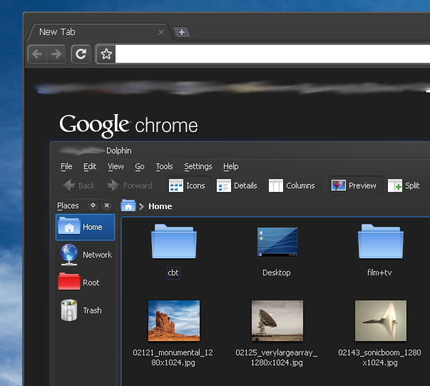
the wrench and document icons on the right side are a little too difficult to see. a light grey for the address bar background would be nice as well.
that being said, this is my new default chrome theme. thanks so much for making a theme that doesn't suck.


Ratings & Comments
5 Comments
Another issue is that it's hard to discern the currently focused tab. They all sort of blend into each other.
Agree. This more or less breaks the theme, sorry :(
This is a early work in progress, so if you have any ideas or suggestions, please let me know!
the wrench and document icons on the right side are a little too difficult to see. a light grey for the address bar background would be nice as well. that being said, this is my new default chrome theme. thanks so much for making a theme that doesn't suck.
Agreed.