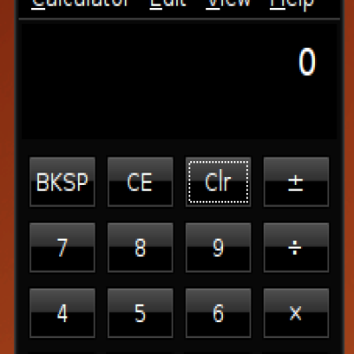
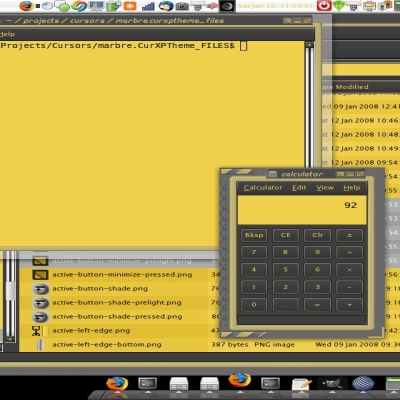
Description: Well, it's finally here! The day you've all been waiting for! The first release of my Firey 1.0 metacity theme!! I worked long and hard through the night to get this done, so you better like it! Well, not really, but you should still like it!
========== I was told by 1 person that this was good enough to become the Gusty (next ubuntu) default!, but tell me what you all think!
========== I've added a darker version because I made it and I liked it, and it's good Last changelog:
0.4 --> 0.6:
-added combined black glossy button look
0.6 --> 0.6.5 --> 0.6.7 --> 0.7:
-slimmed down the window frame -improved the look of the text -smoothed the pushed look for the buttons
0.7 --> 0.8:
-no borders when maximized! -shaded view now has better look! -unfocused shaded look now exists! -Maximized look ensured at best -normal windows, focused and unfocused, look better by 1 pixel! (the missing bit of line in the upper corners of the windows is now filled in!)
0.8 --> 0.9:
-new button icons!
0.9 --> 0.9.1:
-TRUE, borderless maximized mode* (*in previous versions, the would appear to be no borders, but the space was still taken up, now it's really borderless )
0.9.1 --> 1.0:
-added separators for the pill -this (^(up)) in turn lead to fixing the other problem; the "chopped off" button when only the close/close and maximize were present. It's not perfect, but it's done, Hooray!
1.0 --> 1.0 Dark:
-everything (except buttons) darker -slightly different text colours and shape*
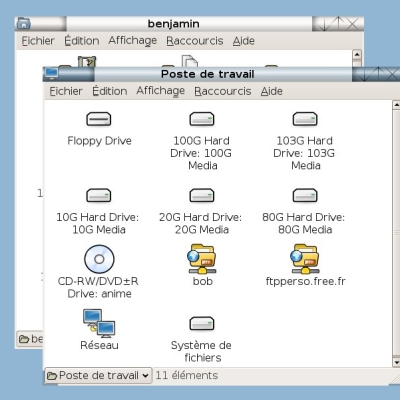
if the screenshot is not up-to-date yet, please to not kill the web developers!
I noticed you all love this theme - if you are planning to mod it, I would recommend upgrading to my new "Energy" engine (xml file). It removes useless code and unnecessary files saving time when moding it! :D
... the engine will be released as an update in the next few hours.
I think your theme is excellent, I think it adds a lot of flexibility to metacity. I've made a few of my own themes based off of it, by purely switching out the pngs, and now I'm starting to play with the xml stuff.
I can get a good looking theme without having to waste processing power on emerald by using what you've done. Kudos.
-Derrick
I think this is by far the best metacity theme I've ever seen. I still think that the pill with the minimize/close/restore looks a tad awkward, I think maybe if it didn't have such high contrast with the rest of the bar. but that's just what I think. I'll probably mod that for myself with it not being too hard.
What I would really like is to have a slider that looks as nice as the top menu.
then I would have complete bliss.
yeah, if you want to change it, it may or may not be a lot of work because there is lots of images, but on the other hand the code is very strait forward and shouldn't be too hard to draw new buttons if you want :)
I know what you mean - it feels "side/corner-heavy" :)
lol your dark version dont even look like mine but it's also very nice.
my dark theme is the stonerphg :
http://www.gnome-look.org/content/show.php/stonerphg03?content=65127
it looks very different but works with your script ;)
I think that this theme is fantastic.
I wanted to use the Ubuntu Human theme but it just wasn't good enough. It didn't look fresh and modern enough to me.
These window borders have completely transformed the overall look of the Human theme.
Well done themer, thank you.
good to here that! That's what I was going for - nothing too radical, but a nice, modern looking theme that would blend into most "defaulty" Ubuntu themes, but not being too boring either! :)
very good looking, but a few small problems:
-needs to be borderless when maximized (this is a must for all themes)
-the close button should be more prevalent. when the mouse hovers over the buttons, the maximize stands out the most. thats not good.
keep up the good work.
I'm glad we agree on some things :)
My list for changes between now and version 1.0 is this:
*borderless for maximized
*perfect button icons
-when not all buttons are present (like some windows only have close), make the close be the 'end of pill, instead of 'dangling'
and this one is optional, maybe for version 1.1 [VERY far in the future :)]:
scroll over the buttons like now to get function, but the icon will always be in the middle of the pill, and when pressed, the whole pill will go down!
Well, I think I've done both your suggestions - thanks for the input!!
Note to everyone:If you've been a frequent updater, do not get your hopes up that version 1 will be out in a few days! If you look above at what I'm trying to do, this is not easy! and then 1.1 will be even farther off, but...
Please continue to suggest new upgrades. If anyone is interested in "making" there "own" theme out of the parts of this one, know this: all of the new (0.9 and after) and old (pre 0.9) buttons will work with the old (pre 0.8) or new (0.8 and after) code!
Some features, like everything listed in the upgrade to 0.8 will NOT work with old (pre 0.8) code!!!


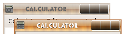
 The first release of my Firey 1.0 metacity theme!! I worked long and hard through the night to get this done, so you better like it! Well, not really, but you should still like it!


Ratings & Comments
16 Comments
I noticed you all love this theme - if you are planning to mod it, I would recommend upgrading to my new "Energy" engine (xml file). It removes useless code and unnecessary files saving time when moding it! :D ... the engine will be released as an update in the next few hours.
I think your theme is excellent, I think it adds a lot of flexibility to metacity. I've made a few of my own themes based off of it, by purely switching out the pngs, and now I'm starting to play with the xml stuff. I can get a good looking theme without having to waste processing power on emerald by using what you've done. Kudos. -Derrick
I think this is by far the best metacity theme I've ever seen. I still think that the pill with the minimize/close/restore looks a tad awkward, I think maybe if it didn't have such high contrast with the rest of the bar. but that's just what I think. I'll probably mod that for myself with it not being too hard. What I would really like is to have a slider that looks as nice as the top menu. then I would have complete bliss.
yeah, if you want to change it, it may or may not be a lot of work because there is lots of images, but on the other hand the code is very strait forward and shouldn't be too hard to draw new buttons if you want :) I know what you mean - it feels "side/corner-heavy" :)
I'm very very picky when it comes to themes, and I wanted something to match the icon set I had chosen. Well, Firey came along and saved the day! WOW!
very nice work ! I did a darker version for my desktop because it's no the same colors.. thank you a lot for this theme
ooo, could you send me it! sounds good - I've been thinking of doing this for a while... :)
never mind, I made one myself and added it! :)
lol your dark version dont even look like mine but it's also very nice. my dark theme is the stonerphg : http://www.gnome-look.org/content/show.php/stonerphg03?content=65127 it looks very different but works with your script ;)
oh, that was your darker version!?! I doesn't look anything like it, that's why I didn't recognize it! :)
I think that this theme is fantastic. I wanted to use the Ubuntu Human theme but it just wasn't good enough. It didn't look fresh and modern enough to me. These window borders have completely transformed the overall look of the Human theme. Well done themer, thank you.
good to here that! That's what I was going for - nothing too radical, but a nice, modern looking theme that would blend into most "defaulty" Ubuntu themes, but not being too boring either! :)
very good looking, but a few small problems: -needs to be borderless when maximized (this is a must for all themes) -the close button should be more prevalent. when the mouse hovers over the buttons, the maximize stands out the most. thats not good. keep up the good work.
I'm glad we agree on some things :) My list for changes between now and version 1.0 is this: *borderless for maximized *perfect button icons -when not all buttons are present (like some windows only have close), make the close be the 'end of pill, instead of 'dangling' and this one is optional, maybe for version 1.1 [VERY far in the future :)]: scroll over the buttons like now to get function, but the icon will always be in the middle of the pill, and when pressed, the whole pill will go down!
Well, I think I've done both your suggestions - thanks for the input!! Note to everyone: If you've been a frequent updater, do not get your hopes up that version 1 will be out in a few days! If you look above at what I'm trying to do, this is not easy! and then 1.1 will be even farther off, but... Please continue to suggest new upgrades. If anyone is interested in "making" there "own" theme out of the parts of this one, know this: all of the new (0.9 and after) and old (pre 0.9) buttons will work with the old (pre 0.8) or new (0.8 and after) code! Some features, like everything listed in the upgrade to 0.8 will NOT work with old (pre 0.8) code!!!
ha ha, looks like it took less time than I thought! - It just came to me as I was dozing off into a programmers daze at my code :)