
Conte
Source (link to git-repo or to original if based on someone elses unmodified work):
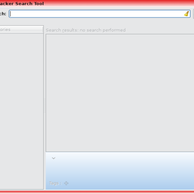
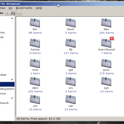
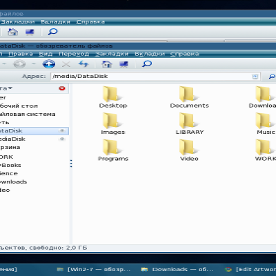
1) New border: focused windows have an outer dark + inner bright border, while unfocused ones only have the outer dark border. Do you like this setup? Do you want back the default behavior? Do you think that the unfocused window should have no border at all (like windows XP?)
2) Symbols on buttons (cross, arrow...): do you think that they should appear only when hovering or that they should visible on the focused window, too?
3) Do you like the rounded bottom corners? Or do you prefer them to be squared?
####################################
Hi folks,
This is my first metacity theme, hope you like it.
All the elements present in this theme are drawn by the metacity engine, and no elements are taken from images (of course except the icon close to the active titlebar).
The buttons idea is taken from a mockup by Neil J. Patel (desktopsearch2).
The theme is not colour dependent, but can follow any colour scheme. In addition, the theme matches very well with my Conte Lien GTK theme.
### Please comment before voting bad, there is a lot of space to improve!
### v1.4
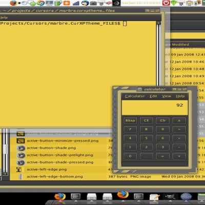
- TRANSPARENCY: RGBA-ready applications (i.e. terminal) support transparent window border with the native metacity engine (see image)
- new title light shadow
- new active/inactive gradients
- new setup for inactive, pressed and hovered buttons
- For artist/coders: Code polishing and theme rewriting: the theme is now complete, well-written, modular and fully defined (i.e. utility and border style_set)
### v1.3
New symbols on buttons (when hovering)!
Lightborder only for focused windows!
New gradient for unfocused windows
Wide code polishing and modularisation
### v1.2
New buttons 3D shadow!
Buttons resized!
### v1.11
Fixed corners issue!





Ratings & Comments
8 Comments
This theme is fantastic!! My compliments for your work: I read the xml and it's really complicated, you must have put a lot of effort in it! I added icons also on unfocused windows, so that the title doesn't "jump" sidewards when the win gets focus. It also looks better in in my opinion :) Back to the questions: 1) I like it as it is now! :) 2) You could maybe add the symbols in grey, I'd prefer it (some windows don't allow all three actions: how do I know which are allowed until I hover the two remaining buttons?) 3) That's really only a matter of tastes. Maybe you can do a variant with square bottom corners ;)
I absolutely love this theme. Clear, crisp and elegant. Goes perfectly with your Conte Lien GTK2+. My thanks for this.
I love your Conte themes (both the GTK and the Metacity; both of which I use!) Keep up the good work. These just keep getting better and better looking. :-)
Thanks a lot... Please give me feedback on how to improve it!
Sleek and purdy. However though, the bottom corners of the metacity looks a bit funny..
Thanks! I do know about the corners! In particular the bottom ones, they have been very hard to draw (Check the code) Any idea on how to implement them better without using .pngs??? Or where to look at?
Working on a solution with arcs... The only thing is they cannot be defined with alpha as the tint command...so I wrote the whole window again without alphas!
I recently downloaded the metacity theme and the bottom corners are still not right. Did you upload the fixed version? thanks.