


OneColor with 4k HiDPI and XXL version
novomente


Source (link to git-repo or to original if based on someone elses unmodified work):
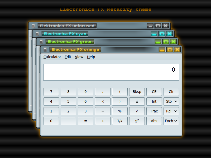
* buttons changed for better shine effect
* modal_dialog of Electronica FX is repaired
* released under GPLv2 and above (instead of GPLv3)


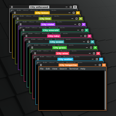
More Metacity Themes from novomente:
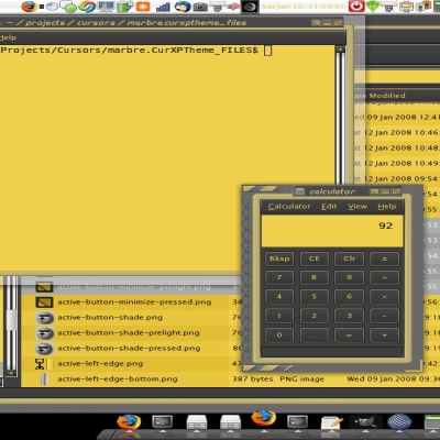
Other Metacity Themes:


Ratings & Comments
11 Comments
10 10 the best
The "Electronica" theme does not work on Ubuntu 20.04 Desktop with cinnamon-desktop-environment installed, nor on Linux Mint Cinnamon 20.1.
I really like your work Mr Novomente I've enjoyed making a few personalized variations of Saturglass and Polaris with the help of your instructions and revolutionary original coding variations, The only thing I want to be able to do is change the Icons rather than resize or recolour them... any advice appreciated.
Change the icon is much more difficult as it is a big change to source XML. My advice is to study Metacity theming. There are nice instruction how to build Metacity themes here: http://live.gnome.org/GnomeArt/Tutorials/MetacityThemes
Thanks for responding. So much for delegation lol :) I'll get round to it soon hopefully _ I messed around with Polaris and got a great "Hud" Like result and another fine variation from Saturglass but the icons just don't compliment my versions sadly... Anyway I hope you get the time for some new stuff again soon. Good Luck :)
I like this very original design. Not a scheme that I would use personally, but it's very, very good. Nice Work!
It really looks good (voted it). I’m using only the metacity, though, not the gtk. One thing: firefox does not go right with it; there’s a white line separating the metacity from the "body" of the app. Even using the gtk theme it comes with. Best regards!
Can you send me a screenshot of that window with the line? And plz note what kind of GTK theme do you use. email: novomente@gmail.com
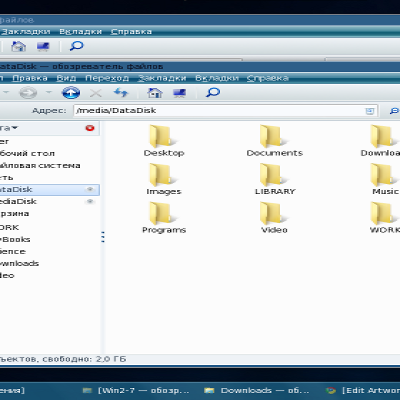
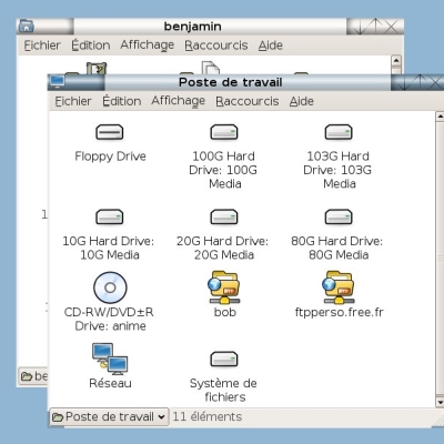
Goes well with my custom colours; it only looks so bright in the screenshots because of his selected item colour Nice and chunky buttons. I like the shine and the glow
Maybe the buttons are too big... and the dark line at the top, is... it doesn't fit well, I think; and the background for the previews is a pain, sorry, but I must say that :) Good work anyway, generally I like it ;)
hmm... I'll think about it. Still it is version 0.8 ;)