


Perfectly Imperfect
Tiede


Source (link to git-repo or to original if based on someone elses unmodified work):
*Fixed sticker position to better align with icons.
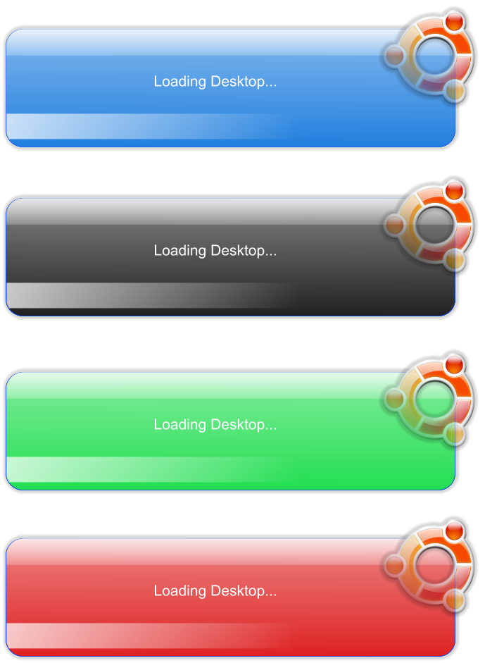
*Added Blue, Black and Red versions.
*Repackaged file for quicker access.
*Made text clearer on the Green, Red and Black splashes.
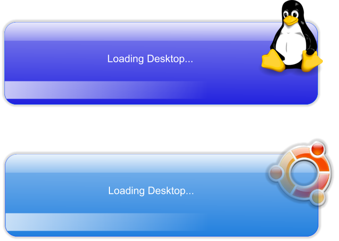
*Added distro independent version featuring Tux, as seen by Larry Ewing and co.
*New Screenshot showing the distro independent version
*Fixed text problem (text will no longer be displayed.)
*removed dead links. Please use the meta package instead.


More Gnome 2 Splash Screens from Tiede:
Other Gnome 2 Splash Screens:


Ratings & Comments
14 Comments
Actually it leaves a blue outline in my laptop :S
I think this looks wicked awesome, but I don't know how to install it. Could someone please explain this to me? Thanks!
i really like this, the best ive seen yet =] though im still tryin to work out how to change to it =[
I know this is late, but for anyone else wondering, here's how to change the splash: Open Gconf (I personally use Alt+F2 and type in gconf-editor) Browse to apps->gnome-settings In there, the splash image directory will be written on the right pane. Change it to point to the theme you wish. Log out of gnome, log back in, and enjoy!
So beautiful !!!
Thumb up ! Your splash is finally very clean, I'm using it with an "all black" themed desktop, and it absolutely contribute to the "rocking feel". Thanks a lot !!
Oh no, thank you. Your comment have made my day!
There's a little problem with the splash. The image file is not "big" enough to let the text appears clearly during boot. For instance during Nautilus launch, you can clearly see the icon but "Nautilus" text is cut in its middle height, only the half upper part of the text is readable... Great job otherwise !
My idea was to make the text "disappear" all together, since I thought it was just futile. I guess I didn't live enough shadow on the bottom to hide it in. I don't know if I should leave the text there or make sure it will not be displayed at all. If only I could put it to vote... Thanks for your input though.
Make the text disappear or show it all ? Just take one side and go for it ! I think both ideas are good, and they're surely way better than "only a vertical-half is displayed". If you chose to hide the text I think you should reduce the image height by a few millimeters at the top and the bottom so it won't appear on the splash even if the system still "genrates" it (will it ?).
yes. It will generate it. The idea is to put it on a transparent part of the background, we I do that, I notice the text all but goes away automagically :)
yes. It will generate it. The idea is to put it on a transparent part of the background, when I do that, I notice the text all but goes away automagically :)
I don't use ubuntu, but just looking at the splash screen it looks great... especially for a first-timer. :-)
Thanks for the comment. I think I'm hooked! I was thinking of doing a distro-independant version, now I can't wait to finish it. :)