


More can be read in DeviantArt ...
Enjoy. :-)
P

!!! It's always best to remove a previous version before upgrading !!!
Donates are very welcome, because I spend many many many hours of time and own talents in this Set...
The source/idea of the folder (48px-svg) was given by K.Vishnoo Charan Reddy. A lot of thanks ...


Ratings & Comments
17 Comments
Good work, careful ... But little seems to me the whole thing without the idea, too old school gnome. Maybe Mimetypes is not genuine. It also bothers me a little weird inclination icon. But no hard feelings that's my opinion. Sorry for bad English. This set often use in my gnome .....
Thanks for your opinion. Always nice to hear others opinons. But honestly... Gnome-icons are the Base-icons on Gnome. It's old-school, but it's what only fits well on a Gnome-System. I explain you: Gnome uses many icons in 16px, 22px and 24px. Only this style make you sure that you can recognize and see well what you get presented in those small sizes. The delevopers of applications makes their icons in the same style of the given base. It means. If your Hires-modern-Icon-Set don't support this application you will see a Gnome-style or similar kind of icon between the rest. The consistence will suffer something or a lot. If you want a whole consistence look on your Gnome-System, you should accept the old-school-style and use Sets like Humanoid, Gnome-Colors, Erectus, ... or simply the original Gnome-icon-Set. ;) Gnome3 will receive a fresh-up in their Icon-Set. All will be slightly more modern and beautiful, but with the same old-school-base as always. :)
Yes, of course, I agree ... I personally use a style icon Humanity, Elementary, Humanoid. GTK Theme Wasp, Sugar. This is the best icon themes for GNOME and environment. Of course, KDE icon here seem very strange and inconsistent. But I thought your icon to be smoother and more contemporary than old school. Humanoid's colors seem to me very sharp. But otherwise there is much doubrou work from you.
--- correct---- But otherwise this is a very good job from you.
Thank you. Yes I sharped the icons in small sizes to their maximum. But some of them was yet sharp as default. ;) I like sharp and recognizable icons more than smooth and overloaded. Gnome with Gnome3 is doing a refreshing in their default-Set and KDE with 4.x is still completing and improving. In the end both Desktop-Managers will have a sufficient good Set as default so that the most of peoples wouldn't search no more better icon-Sets developed by a 3thrd person for their satisfactions. Mhh I hope so, because: Create a whole icon-Set is a lot of work. With time and missing [following] support makes that hard developed Set more and more incomplete etc. A good made default-Set let peoples happy and it's always up-to-date and supported ... ;) Ahoi
Great looking set, thanks.
:) I'm glad that u like my work ... u're welcome.
It's the beast Set so far!!! Very very well done. ***
Maybe you meant "best"!? :D Ha ha ha Thx and u're welcome ... ;)
Looks very good! Thumbs up ;)
Thx. :)
looks very nice. keep up the good work!
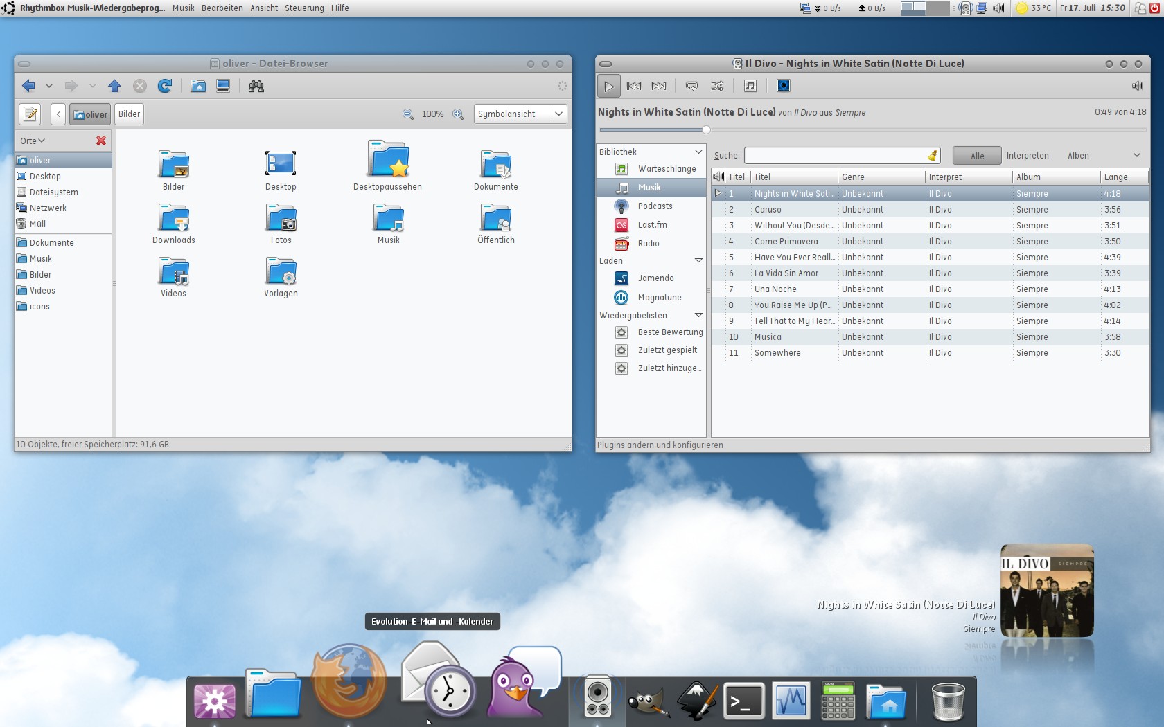
Thx I thought the next update will be the version 2.0. So here I will have all pending things finally inside/finished and I will do a major go-through all the icons what the set contains. Maybe I can make some clean-ups and some icons better or more consistent. Here is waiting already some work on me ... ;) But we could not forget that it's summertime and the maintainer of Gnome-Colors is very active in the last time. :D This I say because apart of my own work I want have it so much up-to-date as possible. :) PD: The folders on the desk aren't links or truth folders. This are "starters/launchers" with the icon changed. Only just for info ...
cool i like how the music and documents folders are different colors, cool idea
:) It's a old idea/stuff. But it wasn't implanted already in gnome-colors ... mhh so I did it. :D u're welcome ;)
Looking good, mate. u know me from UU ;-)
Yes I know u :D