


Please reports Bugs and some Feedbacks would be nice. And if you vote bad, so tell me WHY. Only so I can do the next Version better. Of course I try to do it always better, but with Feedbacks is maybe something more better possible

My Fallbacks are: Tango and Gnome. Change it if you want in my index.theme
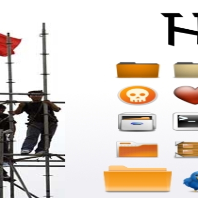
About the Set: This Set grows slowly, very slowly because painting and few daily time I have don't admits more
But I do what I can, when I can
Hope some peoples enjoying it.
Greetings from Spain
schollidesign


Ratings & Comments
36 Comments
Hey guy, i wanted to link you to this page, http://www.iconfinder.com/icondetails/23813/128/box_fusion_icon_icon there it says you are the author of the compiz logo icon.. Please change that on that site or contact the people who run that site.. That icon was created from scratch by graphfreak from brazil, specifically for the compiz project... there were no others involved in its creation. please... out of cortesy,, and respect for the author...have that changed coz
No time and no more lust for continuing painting in this Set. This Set shows how I like MORE or less my Icons and haves many good ideas ;) Would be nice if some ideas will be used in future by new Iconset-Projects ... take a look and good by :D
You have designed a really nice theme.
Thank you my friend :D I remember that I used your Black and White Theme a lot of time before... then I started with Solid and Sevila my own Sets. I was unsatisfied, but I learned a lot of about Icon Design. So it was born Royal! My little own history :D
Thanks for your respect :)
Why not ;) Every work for improving Linux is worth getting some respects :)
Please more feedbacks and voting down, telling me why. Only so I can improve something more ... At moment I am doing all without suggestions and support. It's boring and demotivating. ... and one ask! Somebody use this Set?
Your icon set is great. I'd give constructive criticism of some sort, but honestly, I wouldn't know what to say. Keep up the good work; this is one of the only original-looking sets out there.
Thank your for your comment. :D Unfortunately this Set have a big Problem. The Applications! For AWN my idea was to do it in monochrome and simple. The Apps I use are painted yet. But there are many Apps and this will need more time to come finally to the 1.0 Release. ;) At moment I have the impression that peoples votes down, because monochrome Icons in mix with coloured Icons don't fits very well. But maybe the haven't see or forgot that's a Preview already :D But step by step. Till to the Release 1.0 will happens a lot ;)
Awesome theme. Don't care about votings ;)
ha ha ha, MrNonsense I like your NickName :D Yes I will ignore it. I see it like motivation but like your NickName... it's Nonsense :D :D
very,very good
Thank you much. But voting down and no feedbacks etc. shows me that all this work goes for nothing. Seems the majority of people don't like it. I not willed to continuing. 4 months painting for come to this version makes me quite sensible. I really don't know what I should do?! But this version is in a enough good stadium for enjoying. So enjoy ;)
be water my friend... Project will be continued. For peoples who likes or loves it ;) Sorry for my down!
Good work. Evolution top! Differente e interesante. Vote: 80-85%
mhh .. Gracias.
But, wallpaper? and emerald theme? thx
Thank you. The wallpaper is a problem. I catch it form gnome-look a long time before? Look for it in the older Wallpapers ;) The Emerald-Theme I developed a long time before, too. But I let continuing this stuffs, because I have enough with the Icons to do. http://gnome-look.org/content/show.php/NextG-Refit+by+schollidesign?content=86594 The Theme I don't know it fit's well with this Icons. But Emerald is nice ;) A very good Metacity you will find in the Dust-Theme. Metacity (Dust) and a bright Theme looks well with Royal. Only a idea you can try ;) Enjoy
thx very nice!!!
What? Icons? Emerald? Metacity? All all of them? Nothing... it's okay. Enjoy :D If you have Wlan, so you can (if you want) try the light improved Version 0.91.1 ;)
All, all of them!!! especially the emerald theme!!!
You have really really talents. It is not a Icon Theme only copying and sharing around the world. This is a true work and a perfect style for my bright Theme. Keep up your good work!!!
:)
Hi, I very much like these icons, thanks for sharing them. Can you tell me how to change the icon on the Applications menu from Ubuntu to Gnome? I tried renaming start-here_gnome.png to start-here.png but that didn't work. Cheers.
Yes it works. Maybe you renamed only one of them. So go to 24x24/places - 32x32/places - 48x48/places and do this in all this folders. Then leave the session and log in again or restart. But this Gnome-Icon is old and untested... sorry. Maybe, if you think it don't fits well, you can search for another Start-Icon and replace them instead the existing Gnome-Icon. It's only a Preview and let me in your mind then I let out finally the Version 1.0. I think you will like them much ;)