


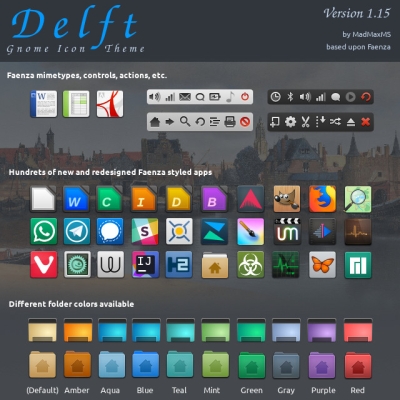
Delft
madmaxms


Source (link to git-repo or to original if based on someone elses unmodified work):
1.3.1
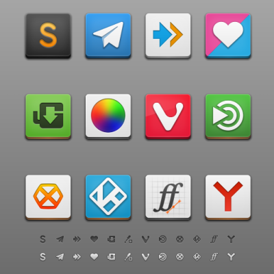
* New weather symbolic icons
1.3
* New apps: UbuntuOne Music and Ubuntu Online Accounts
* New designs for Twitter, Spotify and adressbook
* Icons for system settings categories on Ubuntu
* Fix some missing links
1.2
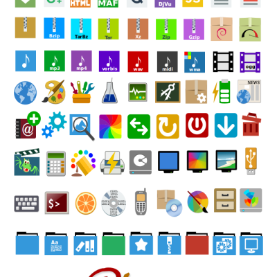
* New apps: Desura, Gajim, Google Music Frame, Mail notification
* New icons sizes: 64x64 and 96x96
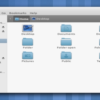
* Fixes the specific folders icons replaced by the standard one
* Fixes some missing links
1.1
* New apps: Gnome documents, Gnome contacts, Gnome online accounts, Gnome freecell, Clementine, Onboard, preferences-color, Screenruler, Scribes, Steam, Tracker, Wunderlist, Xterm
* New devices: tablet, network wired, network wireless, VPN, system harddisk
* Some reworked icons (Baobab, Gparted, Time-admin, Gconf editor, all folders)
* Emblems are more homogeneous
* Some new status icons and two new themes (Faenza-Ambiance and Feanza-Radiance) for a better integration with Unity in Ubuntu 11.10
1.0
* New apps: preferences-desktop-wallpaper, SEtroubleshoot, system-switch-java, Fedora autoplus, Fedora-release-notes
* New status icons: nm-device-wired-secure
* Some reworked icons
* A wide bunch of new symbolic icons for Gnome Shell
* Better support for XFCE
* All applications in 16x16
* Fix some missing links
0.9.2
* New logos: Gentoo, Slackware
* New actions: folder-move, folder-copy
* New apps: libreoffice, workspace-switcher, wine notepad, winetricks, stellarium, mypaint
* New mimetypes: application-pgp-keys, encrypted
* New status icons: gsm 3G network, wireless secure network, bluetooth paired, weather icons in 24x24
* Color or opacity changes for some status icons
* A new design for Ubuntu One
* A few new 16x16 applications icons
0.9.1
* A new Faenza-Darker theme with light monochrome icons for (dark) panels and menus and dark monochrome icons for toolbars. This theme can be used with elementary-dark, for exemple (don't forget to hide the buttons icons if they are in 16x16).
* Fix some wrong or missing links
* A few new 16x16 applications icons
0.9
* A new "darkest" theme with status and actions icons both in light grey
* A wide bunch of old and new devices and actions in all sizes
* New applications: debian software center, deja-dup, dc++, dvdrip, GCStar, guake, haguichi, Me TV, meld, file manager, nautilus actions configuration tool, tvtime, xine, zim
* New status icons for Cover Gloobus, Me TV, zim, guake, keepassx
* Highlight borders have been modified for all squared icons in 22x22 and 24x24
* All monochromes icons have been reworked for smoother contrast
* A new design for most of actions in 32x32 and above
* Some reworked icons for applications
* Subtle change in folders colour
* Some fixes


Other Full Icon Themes:


Ratings & Comments
590 Comments
9 9 excellent
8 8 great
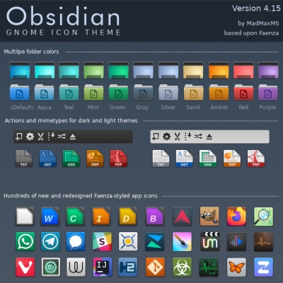
Obsidian and mostly Delft are modern icon themes based on Faenza, but they share the same squarey trash icon.
10 For many years I used these icon theme. Por muchos años he usado este tema de íconos.
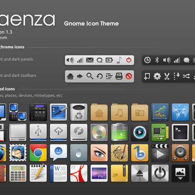
9 I love this icon pack and been mainly using it for the last few months, but there are just 2 icons that I don't like, and they bug me every time I see them: the Computer icon and the Trash icon. I do understand that the theme of this pack if "squares", so everything has to be squary. But I feel like these two icons are squary to the point of looking nothing like what they're supposed to resemble. The computer icon resembles more some kinda tablet. It would really benefit from having like a little handle on the bottom or a keyboard, something to distinguish it as a computer. You have some other icons that don't entirely adhere to the square shape, and they look fine! Discord icon, for example, fits very well with the rest. In fact, the Monitor icon looks very much how a computer icon should look. The Trash icon is just weirdly shaped. I think it should either be given a bit more dimension or the rear wall of it needs to go. I don't have an exact image in my head of how it could be improved, but the current variant is just not great. And, I know, I'm speaking from the position of ungratefulness. But I really do appreciate your work. This is one of the best icon packs out there. And I would appreciate it more, if my minor issues with it were addressed. I could even consider a small financial support (I'm pretty poor, but can probably afford a dollar or two in monthly donations). But, regardless of my minor issues, it is still a brilliant theme! Great job!
10 10 the best
the best old school
10 10 the best
10 10 the best
10 10 the best
10 10 the best
9 9 excellent
10 10 the best
9 9 excellent
3 Insufficient amount of icons. Those that exist are nothing special.
9 9 excellent
9 +
9 +beautiful
9 +
9 +
9 +
9 +Faenza is excellent - as is Faience (Faience has a better battery icon...)
9 faenza = linux
9 +
9 +