Description: Solus Blues gtk theme(originaly based on Zuki Blues) Author: Daniel Molnar(danodymake on deviantart) Gtk-3.0 version of the blue theme based on Zuki Blues theme. This theme was created for Gnome 3 Classic and is optimized for the Fallback Mode. I normally hate when Gnome 3 Classic is called "Fallback" because the gnome panel is universal thing. Gtk-2.0 version of this theme is Zuki Blues. Zuki Blues gtk-2.0 theme is improved (fixed buttons for GIMP, Synaptic, etc.)
Credit for GTK-2.0 version of this topic is going to lassekongo83 (on deviantart, original creator of Zuki Blues gtk-2.0 theme) Credit also goes to Ikey(SolusOS founder) for Gnome 2 panel theme.
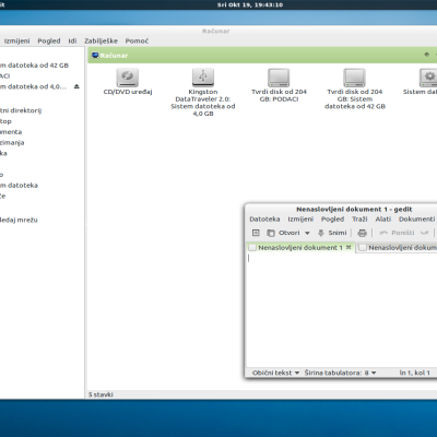
Note: Use panel.png for Gnome 2/3 panel (set the size of the panel, according to your choice)
Need to do: Make XFCE theme and fix some little things
Theme require Faenza-Dark icon theme.
License: GPLLast changelog:
ver 0.1 --------
Repaired gtk-2.0 theme, and the initial shell of gtk-3.0 theme
Thanks for a good theme. Running in ubuntu 12.04 gnome fallback with overlay scrollbars removed:Four things please:-
1) In Nautilus the drop down menus are white on pale gray and are not easy to read.
2) When cascading along the menu, the pop up boxes that tell you about the programs are in dark gray on black and difficult to read
3) There is very little differentiation between tabs- for example on Gnome "Panel Properties" there is very little difference between the "General" and "Background" tabs
4) (This is largely personal preference) I think the scrollbars would be better if double the width.
Respect ubuman. I'm glad that you reported these issues related to my theme. I will fix the tabs background and scroolbars width. I currently use Linux Mint 12 (based on Ubuntu 11.10). But, I don't see these issues in Nautilus and pop up boxes. Perhaps this is due to differences in the versions of Gnome(Gnome 3.2 vs. 3.4) or maybe Ubuntu .
This is definitely a difference in versions. I'm not sure what is in question here, Unico engine or Gnome, but I'll try for a couple of days when Ubuntu 12.04 will be out. See you soon and good luck


Ratings & Comments
7 Comments
Thanks for a good theme. Running in ubuntu 12.04 gnome fallback with overlay scrollbars removed:Four things please:- 1) In Nautilus the drop down menus are white on pale gray and are not easy to read. 2) When cascading along the menu, the pop up boxes that tell you about the programs are in dark gray on black and difficult to read 3) There is very little differentiation between tabs- for example on Gnome "Panel Properties" there is very little difference between the "General" and "Background" tabs 4) (This is largely personal preference) I think the scrollbars would be better if double the width.
Thanks for a good theme. Running in ubuntu 12.04 gnome fallback with overlay scrollbars removed:Four things please:- 1) In Nautilus the drop down menus are white on pale gray and are not easy to read. 2) When cascading along the menu, the pop up boxes that tell you about the programs are in dark gray on black and difficult to read 3) There is very little differentiation between tabs- for example on Gnome "Panel Properties" there is very little difference between the "General" and "Background" tabs 4) (This is largely personal preference) I think the scrollbars would be better if double the width.
Respect ubuman. I'm glad that you reported these issues related to my theme. I will fix the tabs background and scroolbars width. I currently use Linux Mint 12 (based on Ubuntu 11.10). But, I don't see these issues in Nautilus and pop up boxes. Perhaps this is due to differences in the versions of Gnome(Gnome 3.2 vs. 3.4) or maybe Ubuntu .
Can you send me screenshots of your system in relation to these problems.
Hello Daniel Thanks for your quick response. I have done some screenshots. I am new here. How do I get them to you please?
You can send me an e-mail (daniel4molnar@gmail.com) Insert images in a zip file or something similar.
This is definitely a difference in versions. I'm not sure what is in question here, Unico engine or Gnome, but I'll try for a couple of days when Ubuntu 12.04 will be out. See you soon and good luck