Description: Originally constructed by lassekongo83 under the name Zukitwo http://gnome-look.org/content/show.php/Zukitwo?content=140562
Then later morphed by Karashata into Zukitwo-Colors http://gnome-look.org/content/show.php/Zukitwo-Colors?content=146290
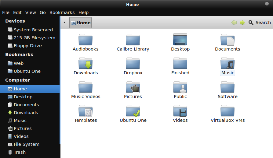
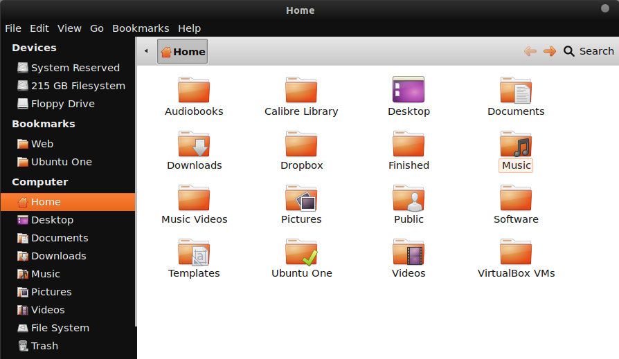
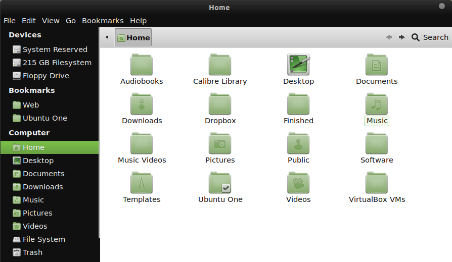
Lastly, here we have Zukitwo Hybrid. This theme includes 3 variants as indicated in the screenshots. Each one yielding a different color scheme to compliment several popular icon themes. Icon themes from the screenshots:
Love it!
Thank you very much, I use the green with Faenza Mint and the default Gnome Shell theme under Fedora, because I don't like the transparant toolbar.
The new red variant appears a dark dirty orange not red . Is this the intended color or is the theme not working properly for me ? I like the themes other wise . Thank You !
Well, I had done the color mock ups on my laptop when I uploaded them initially. Later on I downloaded them on my desktop. Since then I've had mixed thoughts on which route to go for both red and orange. The orange, I feel, pops a bit too much, while the red is a bit too tame. I need to find some time to iron out a middle ground for each one. I suppose the low lighting when I was on my laptop contributed to me at the time thinking "that looks good."
Keep your eyes peeled for an update. This should be an easy fix. I just have to play with the color wheel a bit and plug them in to see how each one looks.
Er... bright light, not low light. My laptop has an unusually bright back-light at higher settings, which I normally use when I'm out and about, so I think that contributed to the off-set red last time. Low light would have only made it more obvious!
Anyway, I just updated the red. It's a rather bold shade, but I think I kind of like it. I left the orange alone, as the more I used orange on a regular system the more I felt as though the orange was decent as is.
I also edited the Gnome Shell themes to match their corresponding color schemes. I had forgotten to do that with the last update.
Let me know what you think!


Ratings & Comments
9 Comments
Where can I get the official Zukitwo Dark GTK theme?
Best till now. Using it... im glad.
Nice, nice. Hope you enjoy it!
Love it! Thank you very much, I use the green with Faenza Mint and the default Gnome Shell theme under Fedora, because I don't like the transparant toolbar.
Good deal - glad you like it!
The new red variant appears a dark dirty orange not red . Is this the intended color or is the theme not working properly for me ? I like the themes other wise . Thank You !
Well, I had done the color mock ups on my laptop when I uploaded them initially. Later on I downloaded them on my desktop. Since then I've had mixed thoughts on which route to go for both red and orange. The orange, I feel, pops a bit too much, while the red is a bit too tame. I need to find some time to iron out a middle ground for each one. I suppose the low lighting when I was on my laptop contributed to me at the time thinking "that looks good." Keep your eyes peeled for an update. This should be an easy fix. I just have to play with the color wheel a bit and plug them in to see how each one looks.
Er... bright light, not low light. My laptop has an unusually bright back-light at higher settings, which I normally use when I'm out and about, so I think that contributed to the off-set red last time. Low light would have only made it more obvious! Anyway, I just updated the red. It's a rather bold shade, but I think I kind of like it. I left the orange alone, as the more I used orange on a regular system the more I felt as though the orange was decent as is. I also edited the Gnome Shell themes to match their corresponding color schemes. I had forgotten to do that with the last update. Let me know what you think!
The red looks good to me now . Thanks Again !