

Flatts_09022014
nale12


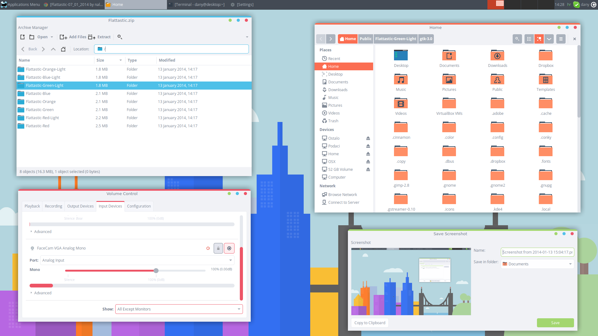
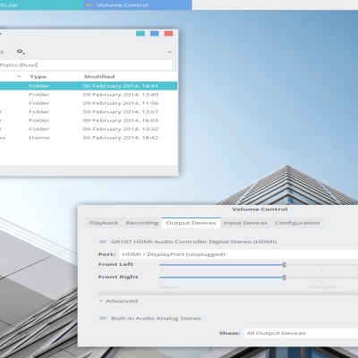
Source (link to git-repo or to original if based on someone elses unmodified work):
07.01.2014.
* Fixed problems with MATE panel and added marco theme.
* Fixed bug with combo menu in Flattastic gtk3 themes.
13.01.2014.
* Increased font-background contrast.
* Fixed many bugs in gtk2 themes.
11.03.2014.
* Fixed bug with treeview.


More GTK3/4 Themes from nale12:
Other GTK3/4 Themes:


Ratings & Comments
18 Comments
9 +
Hello, I'm using Ubuntu Gnome 15.10. I've extracted the folder with blue version and moved it to the /usr/shared/themes folder. I can select the theme (under the GTK+ option) and it works fine however I don't see it listed under shell theme option so the min-restore-max icons on the windows remain unchanged unlike whats shown in the preview imagine. Have I missed any steps or is there a compatibility issue?
Great theme. How can I modify one of them to let's say purple? Thanks
Hi! I think your theme is great, I love it, it's looking perfect on Ubuntu 14.04. I made a personas theme for firefox, you can find it on personas website, the name is the same: flattastic. (theme pendig yet for verification, sonn it will be free to download) Firefox looks great with this unity theme and personas theme.
in firefox,some web's font color may be gray,it's hard to read http://tieba.baidu.com/p/2986447022
Nice work! But the contrast is off, the white is to bright and the text not so visible, please make it a little darker and it will be really great!
It is low contrast theme.
I think it might look better to have the Unity Panel (unlike the XFCE panel in the screenshot) in the same color as the titlebar because when you maximize a window the Unity Panel also becomes its titlebar and the present bgcolor is inconsistent with the rest of the window.
I have not much dealt with Unity, because I am not using Ubuntu. If you think it is better that way, you can modify theme.
OK, done it: for the record, I just borrowed unity.css from Mint-X theme ;-)
Hi, It is possible to make buttons not rounded? Regards, gjm
For gtk3 see : gtk-widgets.css .button /*leftmost button */ /* rightmost button */ border-radius: 5px; You can check the border-radius arguments. use gedit. For gtk2 see the buttons folder. XD
This is indeed one great looking theme! It even looks nice on Java applications like JDownloader. However in all QT4 applications (no matter which theme you chose in qtconfig) the fonts are white. Would be great if you could resolve this issue!
Nevermind, I've just read your statement on the deviantart page regarding that issue. Kinda disappointing, the "dark" theme looks much better in my opinion. :/
It would be nice if you could somehow force the qt applications to use light version. I didn't looking for that options,maybe I will. The light version is by-product,created as a result of bad fonts of qt apps.
I think, this theme has a great potential, looks extremely nice! Although, text is too bright and keyboard focus is not highlighted.
This is low contrast theme. Low contrast theme = the look beyond usability.
Good job, but it is relatively unusable in XFCE4. Indeed GTK3 fonts applications appear very bright white. It is unreadable. In addition, the color (gray) fonts LibreOffice is disturbing. Please fix it.