

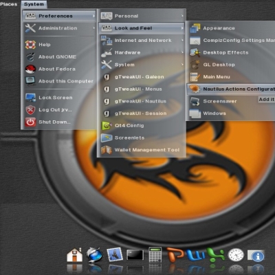
Cristal-Black-M
pete333


Source (link to git-repo or to original if based on someone elses unmodified work):
2.04 Re-design combo buttons for Font menu.
Redo gradient.
2.03 Change fg[NORMAL] color
Change color of some built-in icons
Redo Menubar prelight.
2.02 Fixed prelight Arrows
Re-design scrollbars and progressbars.
2.01 Adjust grayscale hue.
2.0 Change almost everything.
2.0.0 Corrected the folder name. (CatBrass)


More GTK2 Themes from pete333:
Other GTK2 Themes:


Ratings & Comments
4 Comments
Like all your themes and this one, is the icing on the cake! Especially enjoy the matching menu. Very refreshing and unique.
Love this green. Thre's way too much blue and gray everywhere, so this is a good change.
sorry man there are just a couple of things I don't like about your theme... The first one: the color - it's too much dark and to much yellow-brown like (sorry the bad description but I really don't know how to make you understand what I'm saying)... The second one: I really don't like themes full of things, buttons, things everywhere... It's a total chaos, I prefer something like blue gradient and everything at its own place. Anyway this is just my thought, and your theme is wonderful as long as you like it! :) Sorry if I've been so hard, I just like to comment why I don't like it, without being aggressive. Byeeee
I like the color style! keep your work continue.