

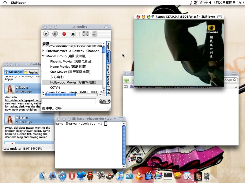
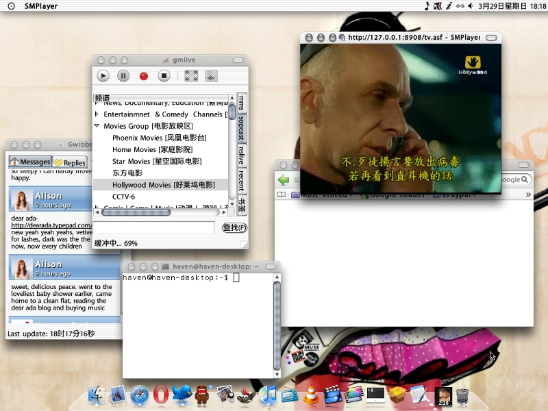

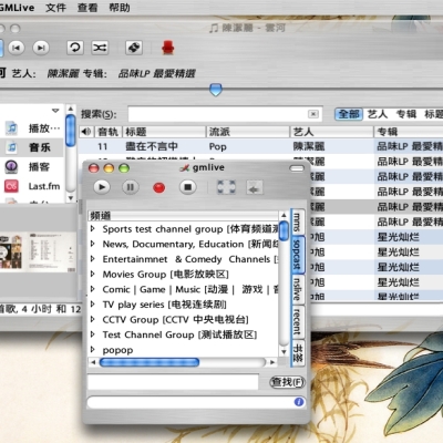
Panther & Graphite gtk2 theme
jcase008


Source (link to git-repo or to original if based on someone elses unmodified work):
update 03.14.2009: fixed up titlebar menu button color and position.
change qt application background color to suit aqua interface.
update 03.18.2009: some detail changed.
update 03.21.2009: fixed up openoffice toolbar icon space.
update 03.29.2009: remake metacity entirely. lots of detail fixed.
update 10.13.2009: remove mainmenu arrow.


More GTK2 Themes from jcase008:
Other GTK2 Themes:


Ratings & Comments
4 Comments
wow nice theme 10/10 on that very good well done
Hi, jcase. First of all, sorry for my poor english. I am Brazilian. :) Your theme is beautiful, but the icons take up too much space. In OpeOffice, for example, they are so large that there isn't enough space on the toolbar and many of them are hidden. If you fix that, I'll use your theme for a long time, because it is the most beautiful I have ever met here on Gnome-look. Congratulations and keep up the good work!
thanks for you favour. it had been fixed.
Wonderful! Now it is my favorite theme. :) I'll just make a few more suggestions (and I really mean suggestions, because it is excellent as it is now): - The border that separates the left and right panels in Nautilus could be thicker, more visible; - The buttons "Close" and "Help" (among others) have no icons on the windows (which could be from the icon theme defined by the user); - The buttons on the lower panel (the opened programs) could be 3D or glossy. But as I said before, these are only suggestions, not criticism. The way it is now is excellent. My sincere congratulations for your work!