


tarkless
Digit


Source (link to git-repo or to original if based on someone elses unmodified work):
version 0.1 was just the first 4.
version 0.2 was the original 4 plus the set extended to 10 gtk themes.
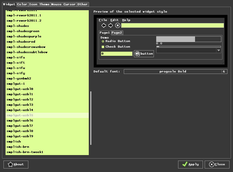
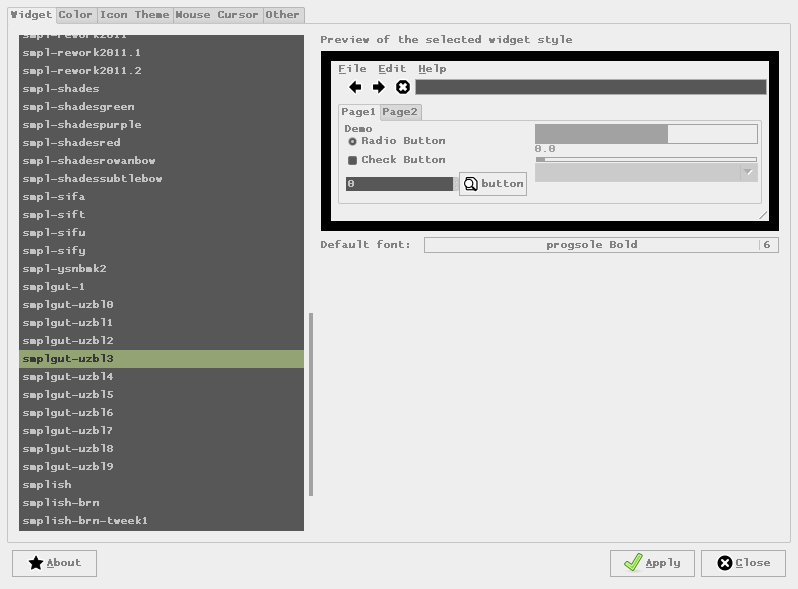
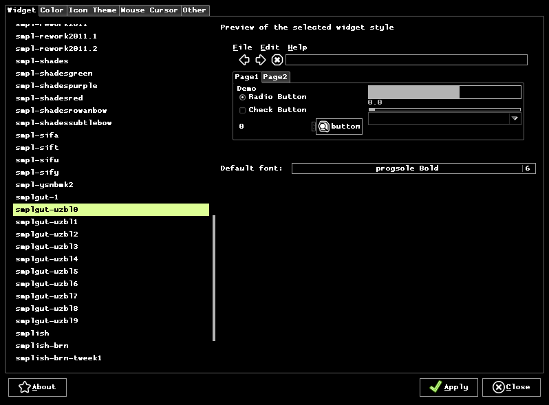
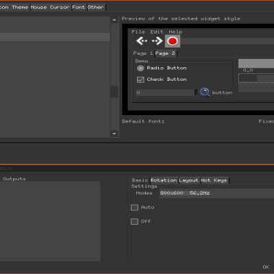
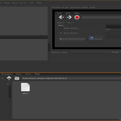
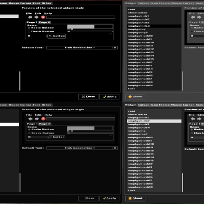
(added 3 screenshots attempting to show a crossection of the kind of themes available in the set of 10)
version 0.3 the set of ten, plus 5 new ones, several designed specifically to overcome shortcomings of previous ones in some areas.
more planned...


More GTK2 Themes from Digit:
Other GTK2 Themes:


Ratings & Comments
10 Comments
hm. i'm not using mint-fluxbox anymore but these ugly shadows seem to be part of the gtk engine in question. with gnome color chooser (this is a great customization app; the name is pure understatement!) i can play around with the engines and the ugly shadow goes away.
hm. disabled items fonts are shadowed white which looks really horrible - is there a way to remove this, or a workaround to make it the same color as the bg? i looked into the config and changed some stuff but didn't get anywhere. also, radio buttons and checkboxes are minuscule, can that be changed? otherwise, great theme!
...anks! i just opened an account here to say thanks, this goes great with my isadora fluxbox!
I'm trying to decompress the file with Xarchiver, but it gives error.The file downloaded is: 142979-smplgut-uzbl-gtkthemeset-0.3.tar.lzma Any idea?
solved
Great idea to use the color scheme of uzbl. Now my desktop looks as I like it to work. Keep working!
Please add a screen shot !!
there ya go. added three. doesnt show all the themes, but gives at least some idea of what's in there.
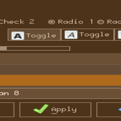
lovely, with interesting to excellent colorschemes :) i have a few petty objections though :D the raised gradient-looking thing on tabs, it seems out of character with the rest of the theme. i'd prefer it all flat. a notebook style might be in order to better define gedit tabs and such. and foreground is not visible in progress bars, but then again that's likely a feature ;) however all these are easy to fix/tweak, which is what i'll do. thanks for sharing your work, overall i like it very much.
thnx for the feedback. i'll look into that. :)