i wouldnt spend time removing the text. since its against a solid background, its easy enough for anybody to simply paint over it in the gimp, or even the basic kde paint program.
also, why did you move the colored versions to different wallpapers? the website stays less cluttered if you put them all in a tar, and all in the same "wallpaper." for only four (counting the transparent version) wallpapers, its not as bad as 20 (like some people seem to do), but it would help...
great wallpapers though...
... you are right about both topics. Ok, removing the text is easy enough since it is a solid background.
And you are propably right about bundeling the wallpapers. But.
1.) As you said, four Wallpapers are not as bad as some things we have seen here lately. I consider myself hard on the edge (and to some degree feel guilty about it) but not yet over the edge. When you have four things to share and only three previews are available.... what do you do? I decided to upload them seperately. Sorry to have flooded.
2.) I try to make it as easy as possible for people to get these wallpapers. Most people seem to have 1024x768 resolutions on their desktop, so that is my default preview. Click, Save. For those with a higher resolution the download is available. Click, Save. Not everyone wants to go through the trouble of a tar-file.
3.) If one or the other gets voted down terribly bad I can delete it with little effort, sparing the others.
4.) Yes you are right. I could have, but I didn't. Shame on me. I'll keep it in mind for future releases. The transparent 800x600 is going to get bundled with the 1280x1024 one.
Thanks for your reply.
Soyburg
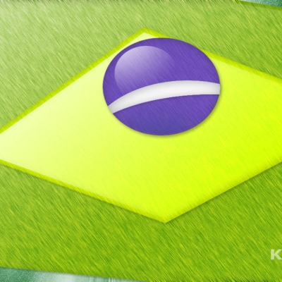
I'd like to have that nice K as a tranparent png because in KDE you can then define your own bg-colour and even gradients and other crazy stuff.
A good example for this is kde_box.png shipping with newer KDE-versions.
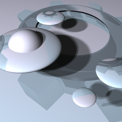
...but propably this evening. The rendering for the blue one finished late last night. These previews were just studies, there is no actual download. As stated in the description.
i like it - sad though I never got to see the subtext *shoot*
did you place every gear by hand or did you have some directives in povray place 'em for you? That'd be interesting to have one include file which could do the job on any string/with different objects and all
your opinion?
subtext read:
"Providing state-of-the-art technology for the tired, the poor, the huddled users."
(The first words of the inscription at the base of the statue of liberty are: "Give me your tired, your poor. Your huddled masses, yearning to breathe free, ..." = The New Colossus by Emma Lazarus)
Regarding the placement of the gears and an include-file: It embarasses me to say so, but i suck in programming, so i actually placed every gear by hand. I tried to automate it, but it just didn't work.
But i agree. Having an include-file for strings would be nice. Although i predict difficulties concerning any letter which needs circles or semicircles (B,C,D,G,J,O,P,Q,R,S,U). Besides - the K isn't typographically correct either. The perspective hides the fact that the diagonals are much longer than they are supposed to be. Which is due to the fact that the gears have a defined diameter.
for supplying the original subtext (suppose I would have wanted it removed, too - yeah - I know *gg*)
as for the include file - you got me started.
actually something like a Q shouldn't be that hard to do (take a #while, some rotates and then cos and sin in translate, wait then minutes, stir it up lightly and taste before serving)
for a D though one should be satisfied with a clipping shape...
I hope you'll let me know of your advances with the inc-file.
I have to admit that sinus and cosinus have completely left my memory. You wouldn't happen to know of a good math-tutorial, (with lots of graphics) which covers basic stuff, on the web?
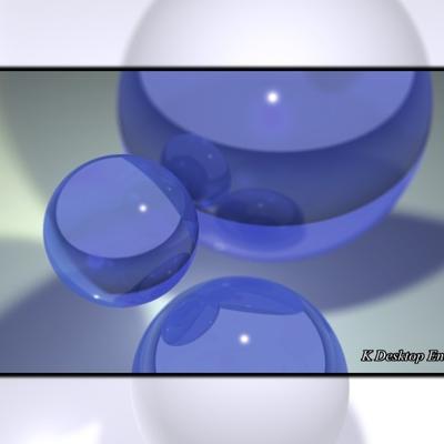
Oh yeah, and which one is b? The blue one or the orange one?
from top to bottom a,b,c *gg*
I'll look for a tut *gg*
..think I still got something on a self-compiled cd (don't know yet, I'll take a look)
--> shouldn't be to large to send it by mail
--> might take a while though (got exams I've to prepare for on the 20th and 22nd of Feb)
--> ..and first I think, I'm gonna do the include, I'll keep you posted...
for your exams and good ideas for the include. If you really do have a tut somewhere on cd i'd really like to have it (as long as it is written with idiots in mind). But this is _not_ really urgent.
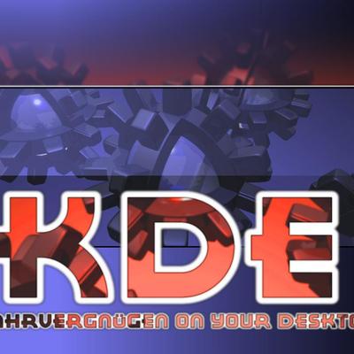
remove the black big-mouthed sub-text. "desktop environment" is enough - i think.
also i'm not sure about colors, but it's pretty subjective. anyway the idea is great and imho original!
i just don't understand the title. my nick for this wallpaper would be rather something like "Kroller" ;-)


Ratings & Comments
16 Comments
i wouldnt spend time removing the text. since its against a solid background, its easy enough for anybody to simply paint over it in the gimp, or even the basic kde paint program. also, why did you move the colored versions to different wallpapers? the website stays less cluttered if you put them all in a tar, and all in the same "wallpaper." for only four (counting the transparent version) wallpapers, its not as bad as 20 (like some people seem to do), but it would help... great wallpapers though...
... you are right about both topics. Ok, removing the text is easy enough since it is a solid background. And you are propably right about bundeling the wallpapers. But. 1.) As you said, four Wallpapers are not as bad as some things we have seen here lately. I consider myself hard on the edge (and to some degree feel guilty about it) but not yet over the edge. When you have four things to share and only three previews are available.... what do you do? I decided to upload them seperately. Sorry to have flooded. 2.) I try to make it as easy as possible for people to get these wallpapers. Most people seem to have 1024x768 resolutions on their desktop, so that is my default preview. Click, Save. For those with a higher resolution the download is available. Click, Save. Not everyone wants to go through the trouble of a tar-file. 3.) If one or the other gets voted down terribly bad I can delete it with little effort, sparing the others. 4.) Yes you are right. I could have, but I didn't. Shame on me. I'll keep it in mind for future releases. The transparent 800x600 is going to get bundled with the 1280x1024 one. Thanks for your reply. Soyburg
I'd like to have that nice K as a tranparent png because in KDE you can then define your own bg-colour and even gradients and other crazy stuff. A good example for this is kde_box.png shipping with newer KDE-versions.
hi I voted good, so I like it. What about some funky colors (orange, blue, white, etc.) for the gears?
You made it. Thanks. Have a nice day.
The images in the preview not avalaible for download... or is it me?
...but propably this evening. The rendering for the blue one finished late last night. These previews were just studies, there is no actual download. As stated in the description.
i like it - sad though I never got to see the subtext *shoot* did you place every gear by hand or did you have some directives in povray place 'em for you? That'd be interesting to have one include file which could do the job on any string/with different objects and all your opinion?
subtext read: "Providing state-of-the-art technology for the tired, the poor, the huddled users." (The first words of the inscription at the base of the statue of liberty are: "Give me your tired, your poor. Your huddled masses, yearning to breathe free, ..." = The New Colossus by Emma Lazarus) Regarding the placement of the gears and an include-file: It embarasses me to say so, but i suck in programming, so i actually placed every gear by hand. I tried to automate it, but it just didn't work. But i agree. Having an include-file for strings would be nice. Although i predict difficulties concerning any letter which needs circles or semicircles (B,C,D,G,J,O,P,Q,R,S,U). Besides - the K isn't typographically correct either. The perspective hides the fact that the diagonals are much longer than they are supposed to be. Which is due to the fact that the gears have a defined diameter.
for supplying the original subtext (suppose I would have wanted it removed, too - yeah - I know *gg*) as for the include file - you got me started. actually something like a Q shouldn't be that hard to do (take a #while, some rotates and then cos and sin in translate, wait then minutes, stir it up lightly and taste before serving) for a D though one should be satisfied with a clipping shape...
I hope you'll let me know of your advances with the inc-file. I have to admit that sinus and cosinus have completely left my memory. You wouldn't happen to know of a good math-tutorial, (with lots of graphics) which covers basic stuff, on the web? Oh yeah, and which one is b? The blue one or the orange one?
from top to bottom a,b,c *gg* I'll look for a tut *gg* ..think I still got something on a self-compiled cd (don't know yet, I'll take a look) --> shouldn't be to large to send it by mail --> might take a while though (got exams I've to prepare for on the 20th and 22nd of Feb) --> ..and first I think, I'm gonna do the include, I'll keep you posted...
for your exams and good ideas for the include. If you really do have a tut somewhere on cd i'd really like to have it (as long as it is written with idiots in mind). But this is _not_ really urgent.
and b up there is pretty good, concerning color, I think..
remove the black big-mouthed sub-text. "desktop environment" is enough - i think. also i'm not sure about colors, but it's pretty subjective. anyway the idea is great and imho original! i just don't understand the title. my nick for this wallpaper would be rather something like "Kroller" ;-)
I removed the black subtext and changed the name to your suggestion (thanks).