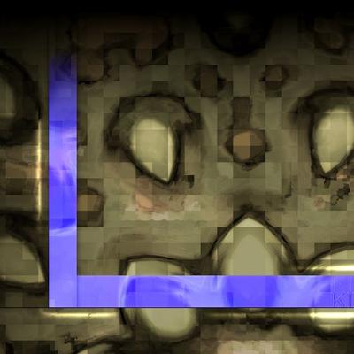
Description: sorry, messed some things up here - the teardrop one was supposed to be 1600x1200, too, but it turned out to be 1280x1024 - hope it doesn't look to ugly on 1600x1200 then...
thanks for these beautiful wall papers. I only wished they hwould have not the comment design...! It seems to me distractive. Simplicity enhances the beauty.
I vooted good.
please all u users see the
SAVE KDE-LOOK
submission and sign it
i am not willing to go on, if there are trolls with unconstructive criticism and the inner need to tear everything down here instead of helping out to brighten this site
fellow people already left, removing their bookmark to the site :((
if not soon something will happen, I'll stop submitting things, too
(and if that is not, what those people want??)
it's a shame...
if n
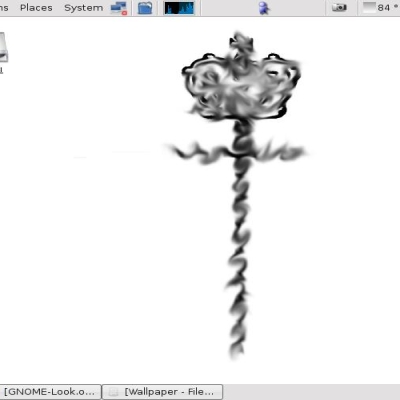
or does ewery1 see the resemblance to pussy :o)
check the thire one out its like a women with her legs up and her pussy folded but showing the hole.
time for a cold shower me thinks.
nice wallpaper :))
I somewhat agree with the comment about these being a bit much for using as a allpaper, but I think they will look awesome as backgrounds for the login screen!
use am as a login, if u find them useful ...
i'm still considering different colors and/or textures...
... got up this morning and suddenly had a vision (blahblah) no, I can see now why one would not want a reddish backgr
please keep voting people,
if trolls are voting multiple times, why cant u? for the plus side,
but no, don' do it - would be as stupid to fight fire with oil
point is, you shouldn't depend your download on the votes the images got so far but rather on how U like the preview
on LCDs it might be better to decrease the color depth to 16bits intead of 24 - I experienced some difficulties there
note on gamma:
if you get to see a sharp cut in the b-like shape from the design image (it suddenly falls to black, although it should slowly gradient into the dark) then you might want to gamma correct the image, try 0.9 then 0.8 ... you'll figure things out, even if you're unexperienced ;-)
this is hard to fix (have to retouch), due to the quartic polynom, I used. the other images shouldn't have such pitfalls.
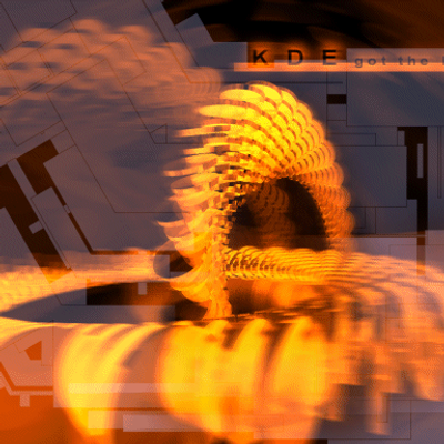
used povray, and fiddled for hours with quartic polynoms *grin*
--> about the red color (obviously I like it):
one could easily change that, just use gimp and and change the hue of the image :-)
.. I'm thinking about new renders though, with new colors, also tried textures, but I didn't like the outcome :(
good for now
c ya


Ratings & Comments
15 Comments
thanks for these beautiful wall papers. I only wished they hwould have not the comment design...! It seems to me distractive. Simplicity enhances the beauty. I vooted good.
fakt perfektna roboticka...
Nice, i voted 'good' btw.
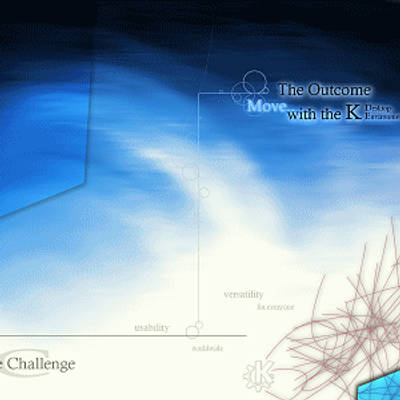
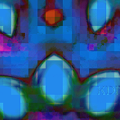
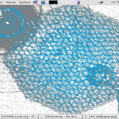
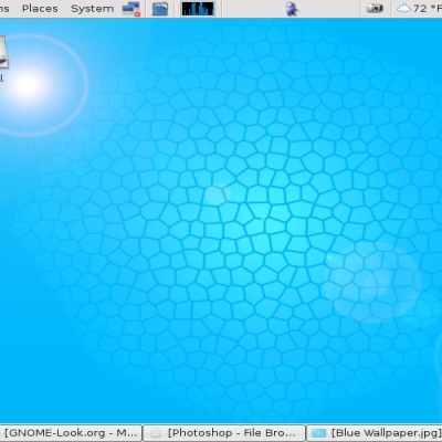
i like it, although it won't fit my current style. what about this one in blue
please all u users see the SAVE KDE-LOOK submission and sign it i am not willing to go on, if there are trolls with unconstructive criticism and the inner need to tear everything down here instead of helping out to brighten this site fellow people already left, removing their bookmark to the site :(( if not soon something will happen, I'll stop submitting things, too (and if that is not, what those people want??) it's a shame... if n
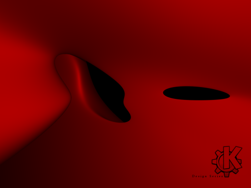
or does ewery1 see the resemblance to pussy :o) check the thire one out its like a women with her legs up and her pussy folded but showing the hole. time for a cold shower me thinks. nice wallpaper :))
interesting interpretation you have, concerning that it is just a quartic polynom rendered here ;-) took the cold shower yet? *gg* chris
I somewhat agree with the comment about these being a bit much for using as a allpaper, but I think they will look awesome as backgrounds for the login screen!
use am as a login, if u find them useful ... i'm still considering different colors and/or textures... ... got up this morning and suddenly had a vision (blahblah) no, I can see now why one would not want a reddish backgr
your wallpapers look the best deepweep. but do none of them ever make past the 60% rating mark? :((
...that there seems to be a guy, that rates everything new bad, no mater how it looks. See the crap comments to some earlier submittals.
please keep voting people, if trolls are voting multiple times, why cant u? for the plus side, but no, don' do it - would be as stupid to fight fire with oil point is, you shouldn't depend your download on the votes the images got so far but rather on how U like the preview
on LCDs it might be better to decrease the color depth to 16bits intead of 24 - I experienced some difficulties there note on gamma: if you get to see a sharp cut in the b-like shape from the design image (it suddenly falls to black, although it should slowly gradient into the dark) then you might want to gamma correct the image, try 0.9 then 0.8 ... you'll figure things out, even if you're unexperienced ;-) this is hard to fix (have to retouch), due to the quartic polynom, I used. the other images shouldn't have such pitfalls.
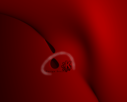
Although i wouldn't want a red desktop, i really like these wallpapers. Especially the third one. What tools did you use to render this?
used povray, and fiddled for hours with quartic polynoms *grin* --> about the red color (obviously I like it): one could easily change that, just use gimp and and change the hue of the image :-) .. I'm thinking about new renders though, with new colors, also tried textures, but I didn't like the outcome :( good for now c ya