


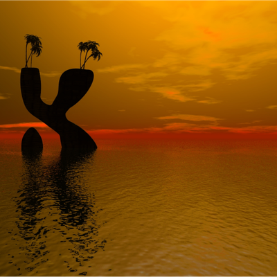
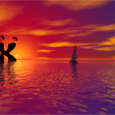
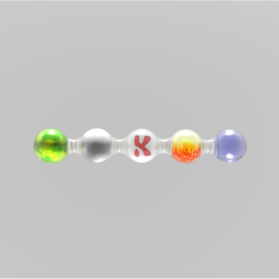
Gorilla K Wallpapers
oovvaavvoo


Source (link to git-repo or to original if based on someone elses unmodified work):
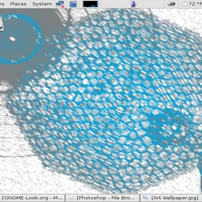
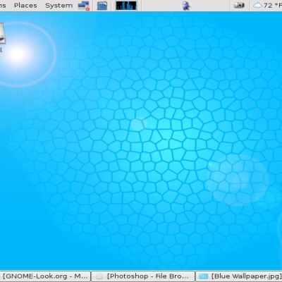
Added new blue 'K' with blue sky. This one is 1280 x 1024.
Zip file contains both images but the yellow one is still only at 1024 x 768. If I get many requests then I'll try and do a bigger version.
Many thanks to those that have already left comments.


More Wallpaper Other from oovvaavvoo:
Other Wallpaper Other:


Ratings & Comments
6 Comments
Thanks to everyone who left a comment. Don't think I'll be doing anything more with the 'K' - pretty poor rating and all that. Cheers.
That would make a good theme for the Xp-Like KSplashML splash screen: http://www.shadowcom.net/Software/ksplash-ml/
That would make a good theme for the Xp-Like KSplashML splash screen: http://www.shadowcom.net/Software/ksplash-ml/
That would make a good theme for the Xp-Like KSplashML splash screen: http://www.shadowcom.net/Software/ksplash-ml/
yeah, this is good. i always thought that the gear-K was a little too funky. nice to get a slick K. ditto the above comment about colors.
looks nice. a few different colors (as you suggested) would be nice, to match various color schemes. also, it would be nice to have at a higher resolution. but i really like the design. keep up the good work.