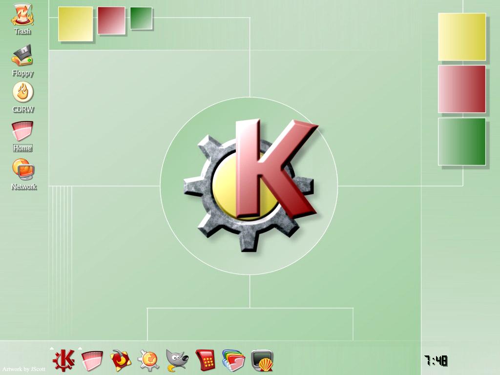
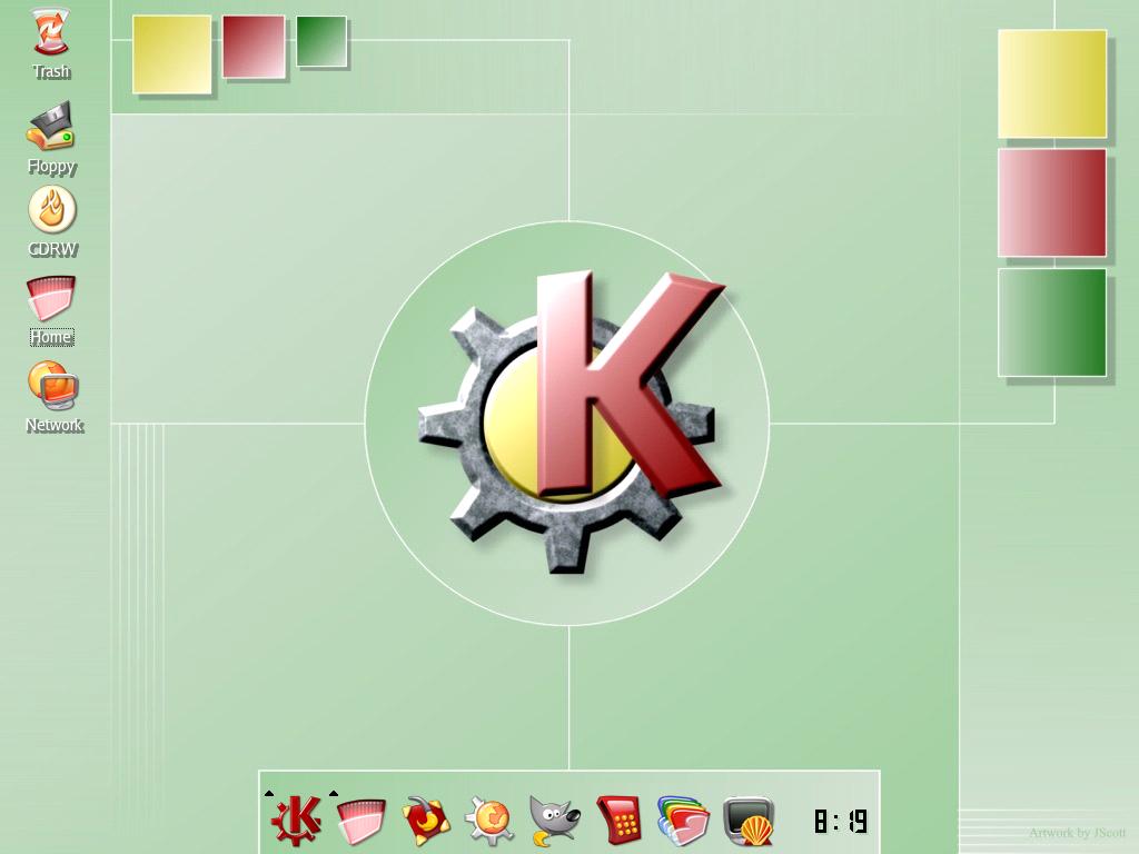
Description: There is so much on this site with a blue theme that I needed something different. This is the "mint" version from the "It's Not Blue" series. The icons used are the Noia Warm Theme.Last changelog:
Minor Modifications to the wallpapers and updated screenshots.
I can't wait for your whole theme to be complete! I have nothing against blue... but it just so... well... default :) This Not Blue Theme is a refreshing change.
HD
I've been hoping KDE designers would get beyond the "blue, blue and more blue" phase for awhile. The design is very clean and not too busy. It would definitely have a place in my collection of themes.
I've been hoping KDE designers would get beyond the "blue, blue and more blue" phase for awhile. Thi design is very clean and not too busy. It would definitely have a place in my collection of themes.


Ratings & Comments
8 Comments
Very nice! fresh and clean!
Very nice! Could you please make a highres version too, e.g. 1280x1024 ?
I can't wait for your whole theme to be complete! I have nothing against blue... but it just so... well... default :) This Not Blue Theme is a refreshing change. HD
I've been hoping KDE designers would get beyond the "blue, blue and more blue" phase for awhile. The design is very clean and not too busy. It would definitely have a place in my collection of themes.
I've been hoping KDE designers would get beyond the "blue, blue and more blue" phase for awhile. Thi design is very clean and not too busy. It would definitely have a place in my collection of themes.
Great!! How long for the rest????
where are the icons and all other stuff??
Reminds me of candy. I am not a big friend of red icons, but I like the idea nonetheless. : )