


preview is 90% optimized jpeg and the download file is better quality/larger png file...
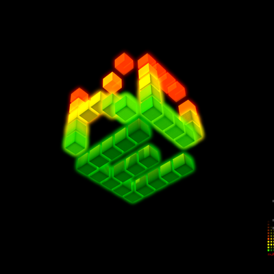
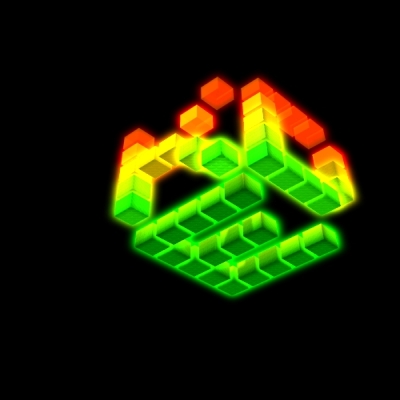
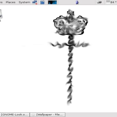
v3 is probably the best of the 3 versions i made... imho


Source (link to git-repo or to original if based on someone elses unmodified work):
i deleted v2, because this is simply better and v2 was not so much different
i decided to delete the darker version too, cause nobody seems to like the dark
(just kiddin - there was actually almost no download activity)
1.2 - some changes on wallpaper as you can see


More Wallpaper Other from luci:
Other Wallpaper Other:

Ratings & Comments
17 Comments
you are the best here! dave >>
sure it's nice to hear this from you but i don't think i'm the best one here about myself ;) here are much more creative ones (and much more rated good ones ;) and i really like e.g. Konstellation and other your artwork stuff too!
you are the best here! dave >>
Hi, you said it was a thing you did together with a gimp tutorial but it was only in .cz. Would you translate it? It seems very interesting if you can make such a great background image of it :) Bye, Sebastian
sorry sebastian, but i have no time to manage this now... any czech speaking volunteer here?
great! only one thing: I think the letters on top look a bit too sharp
great! only one thing: I think the letters on top look a bit too sharp
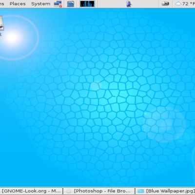
that there is no 1600x1200 version of this wallpaper. I would have made its way to my desktop.
Man! This has got to be some of the best wallpaper work I've seen around here. In fact, better then what I've seen on deviantart.net as well, and I check in there on a daily basis. Keep up the good work. I'm looking forward to seeing more of your work using this pixelish like design. It's simply excellent. My Nickel and Dime
..but I'd like to have 1600x1200 version for my desktop :)
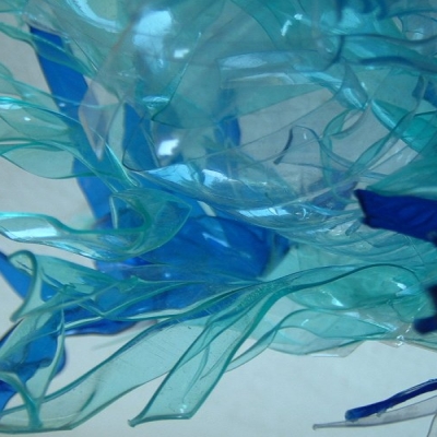
...everybody want a bigger version but this is a problem. why? simply cause i have not bigger image of the butterfly and resizing it up degrades the image quality. give me a bigger resolution copyright-free butterfly image and i will try my best to make ya all satisfied ;)
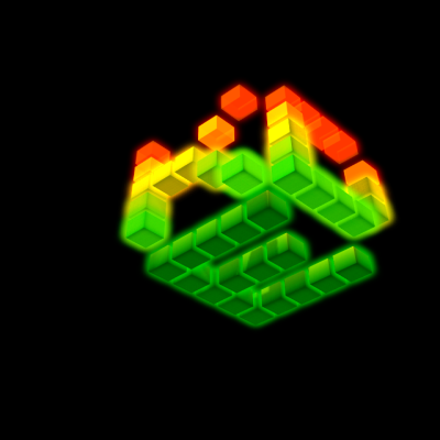
wow.. nice colours.. and I like the block effect.. but 1010101010 is a bit used idea, and what does the text in the bottom mean? .b
..with u that the "null-ones" is much used idea and it is subject to change ;) about the text: there is a bit hidden "K" over all the space of wallpaper followed by "dimension environment (digitally manipulated)" what means for me that it looks like from another "inseKts dimension" for me and the image is digitally manipulated by computer graphic tools ;))
I'll have to agree with the changelog comment from luci. V2 (to me) didn't seem to be that big a deal. V1 is a bit to dark for may tastes. V3 is perfect. Perfect blend of color and still not being overkill. Well done!
really good stuff, I'm impressed ;-) keep going
... but this one _is_ good! Hell, i love it, it's very springlike, colorful but not too irritating... it's phantastic. Have you ever considered doing more and complete KDE artwork;-? BTW, i can't give you a "better" smile than the one given...
well done. I especially like the colors. Maybe the butterfly could be improved by sharpening its edges (but not too much) It's in the bottom right corner. That's where the eye always ends up when looking at a picture. So why not give it something to focus on?