


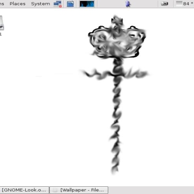
ATTN: a lot of people have emailed me, asking if they are allowed to use this graphic in derivative works. My answer is always the same: I am VERY happy to have other people take this and use it in new and creative ways. It thrills me when someone takes my work and builds upon it or enhances it. This is exactly the phenomenon that makes open source the best philosophy for development of ideas. So please, use this image in any way you see fit. All I ask is that you don't try to "steal" credit by saying you created it.
Also, upon request, I will email anyone the original layered image for this picture.


Ratings & Comments
15 Comments
I made some icons based on your work for my kmenu button... http://www.kde-look.org/content/show.php?content=57796
Scope this URL: http://www.kde-look.org/content/show.php?content=1828 for a really cool logout / shutdown screen that uses the gear bubble in this graphic. Keep is up guys! I am loving the derivatives of this work! :)
...who want a softer version of this image, someone made a VERY nice mod to this image. You can check it out here. :) http://www.kde-look.org/content/show.php?content=1654
I had thought about doing that, but it's not very likely to find stipples that will look good for any given color. I'll give it a shot though. :)
I think you should make it into an icon. It could probably be a nice replacement for the standard K button.
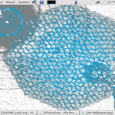
http://www.kde-look.org/content/preview.php?file=1601-2.png (You have to use this URL because the kde-look people seem to not like wall paper people offering content thru the screenshots.) Anyway, you guys asked and hopefully I got it right. I dimmed the background a bit. I am not quite sure if I like it (I'm a big fan of "bright" on my display ;) but I will make another attempt at darkening it with a better look tomorrow (when I am not so tired). :) Suggestions? I was actually pondering a black background with blue stiples...
If you keep the central figure, but make the rest of your graphic transparent, then people can use whatever background they like, rather than you having to hard-code a small selection. There are several examples of this in the standard KDE 3 artwork.
Ahh... Thanks I missed using grey, this fixed it.. I can see again!
Good work, but i must say it makes my destop look too "flat" Probably better if it looks more like: http://kde-look.org/content/show.php?content=1606 (sorry i called it a screensaver :) Btw that's just an elliptical blend with a greyish colour.
If you want, ask mosfet or look at his/her (what is it anyway? sorry...) liquid theme code...
Looks very familiar to something I did(‘nt finish). http://www.kde-look.org/content/show.php?content=960. Nice concept and execution none the less.
I'm going BLIND! It's too bright even with adjustments. How about something similiar but with a much darker background?
I'm using it on a laptop, and it's perfect! I haven't used it on a CRT yet...
I assume it was made using the GIMP? :) Looks great!
This is a great backdrop and by using elliptic blending can be made to look even better (takes the bright white away without losing the feel).