


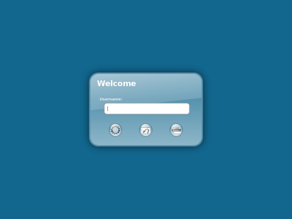
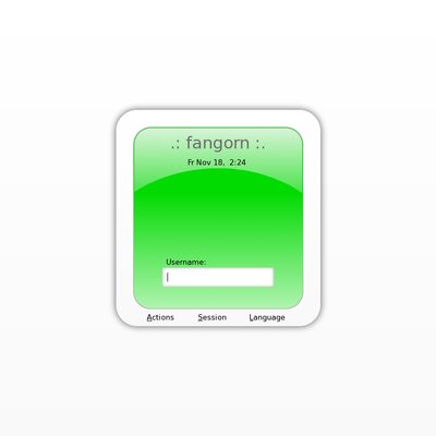
As obviously everybody agreed that icons instead of the button labels will look better (and they are right
 here is the version with icons.
I uploaded an alternative version with a slight border around the glossy part (as someone suggested me to try out). Dunno if it looks better, but at least it doesn't look worse...


Ratings & Comments
16 Comments
Do you (or does anyone reading this) happen to have the old version with text labels around? I'd like to check it out.
Is there really no theme which is smooth and slick like this? I really like this kind of stuff. Reminds me of the iPod lol. TO ALL THEME CREATORS, DO SOMETHIN LIKE THIS!! In different colours if possible ^^
very nice gdm theme! :)
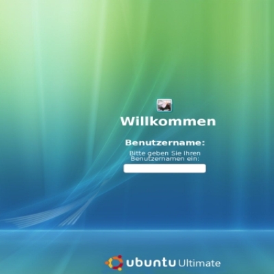
The Glass effect on the login box looks somewhat unbalanced - perhaps you could either make it so that the midway point of the slant is half way up the textbox? Also, a nice background by default would be nice.
I actually don't see the imbalance you mention. The edge is intentionally left in the upper half of the login box. As for the background image, I had one first but changed it to the simple single-colored background to make it, well, simpler. The background I tried was the following one, if you want to try it for yourself: http://www.kde-look.org/content/show.php?content=25331
The colours are great, thinking how to best create a matching gtk theme.
A matching GTK theme would be great! :)
Heh, someone was faster, the xubuntulooks theme fits pretty well: http://www.gnome-look.org/content/show.php?content=42515
Yep, thanks for the tip.
I really like it, but i think a version with icons instead letters would be better :-)
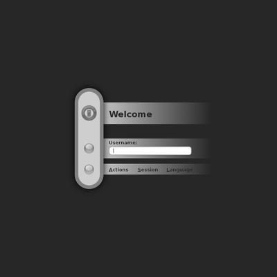
Yeah, definitely change the buttons. The style looks good, but I couldn't help at laughing at the "ASL" thing... it seems too AOL. :P
Well, the ASL was kind of intended as a joke... ;-) Anyway, gonna change that.
I do like the changes. It looks more professional, and it probably won't attract newblet 13 year olds. hahaha.
ASL is commonly used online as a shortcut to "Age, Sex, Location" for people chatting... ICONS or complete words would be better. Nice theme
Yeah, this would be prefect if you replaced the letters. Also, on a lighter note, and another reason to replace, is that the letters spell ASL, which is a common acronym for "American Sign Language." I don't think that's quite what you were going for.
Never heard of that acronym before... I'll work on it the next days or so, icons should make the theme fit better for other languages as well (something I completely forgot this time).