

If anybody can figure out how to get the face browser working the way he drew it, let me know.
enjoy


Source (link to git-repo or to original if based on someone elses unmodified work):
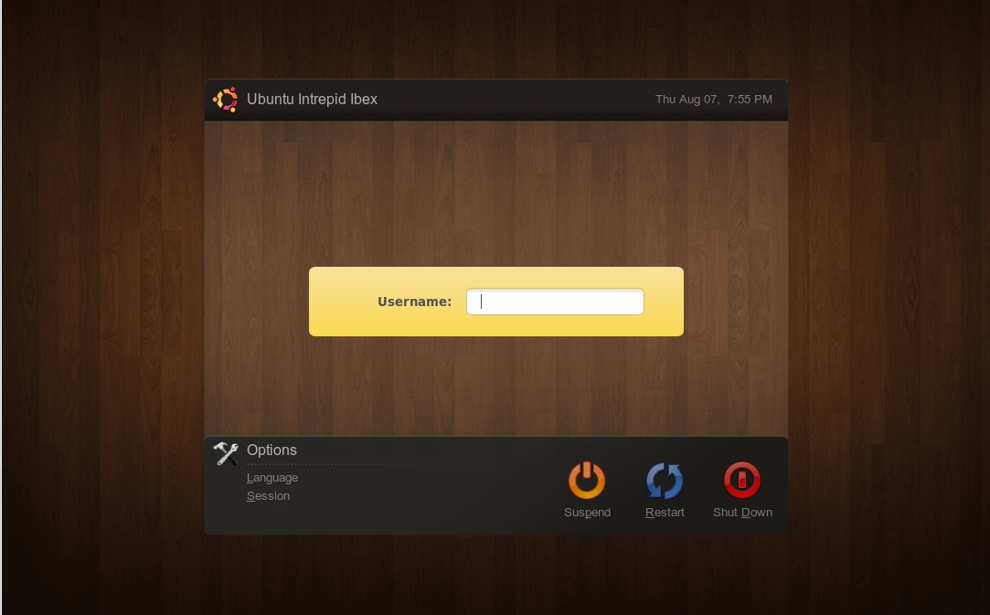
8/8/08(v0.7.2)
+ fixed logo placement error
+ should work even better with polish, etc translations
+ distro logo can now be changed easily
+ packaged as a tar.gz inside a zip
8/7/08(v0.6)
+ moved buttons to be more accurate to original
+ cleaned code
+ added more polish
8/7/08(v0.5.1)
+ distro label and "options" can now be changed in XML
+ Little polishing touches
+ options icon
8/7/08(v0.4.1)
+ quick fix for Spanish speakers
+ added some more highlighting
+ obtained more accurate and higher resolution wallpaper
8/6/08(v0.3)
+ added options list
8/6/08(v0.2)
+ updated icons
+ changed icon spacing
+ added gradient to top portion
+ darkened gradient on bottom
+ fixed caps lock warning


Other GDM Themes:
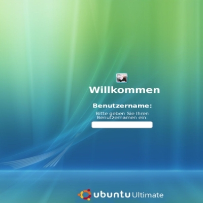
Ratings & Comments
46 Comments
great . congratulations !!!
I've noticed the power/reset buttons don't really work. Both just reboot the GDM. Were you aware of this bug?
no, I wasn't. I'll see what I can do...
Are you sure you don't maybe have an older version of GDM? Everything is spelled correctly in the XML file, and I just tried it. It worked perfectly for me.
I found the problem. When I was setting up this GDM I unchecked by mistake the 'Show actions menu' option. This disabled the reset/power down functionality of your GDM. Thumbs up once again!
please give the face browser please :):):):):)
I removed the face browser because it looked like crap. Currently it doesn't support alpha transparency.
by far one of the best GDMs I've seen on this site! keep the awesome work coming =D
Hey... What happends with face browser? It was great.. :(:(
wow, it rocks. great work
Changing the font to Petra (size 9 or 10)makes this look a lot more like the mockups IMO ;)
Thanks for the tip!
hmm imo that gdm looks fine fore more ppl then me and author ( look AT rate over 80 ).. if u have ur own idea how II should looks do ur gmd and other such things and show us ur point of view.. btw thats link how looks it pl ur gdm .. now looks pretty well . think about it how to fix reboot what i mention above. 1 suggestion , if its possible move little bit user name on right plz :> http://img228.imageshack.us/my.php?image=gdmpk4.jpg gj
I moved the user name more right. but I still can't figure out what to do with that restart button without dramatically increasing the spacing.
Awesome GDM theme. Thank you very much and continue your great job :)
Great job!
I'm sick of people posting crap that, well...looks like crap! How can you stand those awful dark browns, black, and baby poop oranges??? Ibex had better offer some alternate themes if this is what they have up their sleave for the default. Yuck!
Sorry, I don't have the power to change ubuntu's color scheme, or I would. Will's mockups are the best looking use of Ubuntu's color scheme around, and that's what this is based on.
if you don't like, you can use another theme, it's the advantage of Linux, you can decide which theme you use. It's not necessary insult people's ideas
now user name works fine ( in polish ) but still there is problem with reboot ( uruchom ponownie ) is too close to icon ( almost the same position) but anyway thx for fixing whats happens with icon of ubuntu ... now is located in left upper corner
okay, I fixed it! thats what I get for only testing in one resolution! :)
I don't know how to fix the reboot icon without dramatically effecting the theme in ways that would suck for other translations. I'll play around with it.
This is a nice one, but some errors when loading in Xnest... the distro logo is out of place... you can do something for this?
OH NO!! lol sorry, theres a lot of code to keep track of!
Nice! I hope this theme will be used as default in the next ubuntu version