Panel background is in the folder: arbeit->gtk-2.0 and you will have to set it by yourself. I think anyone knows how to do that
Metacity is not made by me! It`s Elementary-remake and credits goes to elementart Art Team and Marcelo Acosta.
!! Instalation: Drag and drop any of Arbeit.tar.gz versions to theme manager,
or you can unpack Arbeit.tar.gz and the folder "Arbeit" move to .themes folder .
Ok. I think that`s all.
Enjoy!!!Last changelog:
!! 17.VI.2010 -Check out new Arbeit soft grey! A lot of changes!
!! 15.VI.2010 -Update: now each package contains background for bottom panel.
-New package contains three versions of arbeit - Blue, Dark and Grey.
-And minor bugfixes.
!! NEW Mod - Arbeit Soft Grey
14.VI.2010 -I have two possible menubars and i can`t decide which one is better. If anyone like any of them - please tell me, if you don`t like both of them - also please tell ;-).
"It`s pure murrine! You don`t need aurora or equinox." And you need Ambiance too... some people don't use Ubuntu remember. It's a bit of a shame as it looks nice, but I'm not going to install Ubuntu to try it ;-)
it's not bad, but:
a) That blue menu bar looks awful to me. I use global-menu, so i don't care, but if i do not use it I would never use this theme;
b) you should use an screenshots in which we could see the scroll bar, is one of the most important parts of a gtk theme, and
c) the scroll bar should be better, maybe thinner...
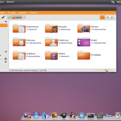
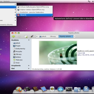
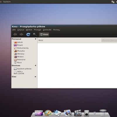
On the other hand, it looks really good con nautilus-elementary, and the tabs-using GUIs looks great.
It's just an opinion.
Thanks for your opinion :-)
I`ve made a modification for Arbeit - Arbeit black. For now i`ll post a screenshot - i`ve changed menubar and made thinner scrollbar - what do you think about that?
Thanks once again.
Whoa!, i have just tried de Arbeit Grey and i love it. I don't like so much the window border and buttons, specially its colors, but i like the gtk theme.
I can criticize just one detail about the gtk: the lines are a little too thick, it gives it a slight retro feel that i don't want... but it is still one of the most interesting contents i have lately seen over here.
Thanks again :-)
And i have question:
by lines do you mean lines around buttons or those under menubar, toolbar and around
tabs? Or maybe both buttons and menubar/tollbar/tab?
I`ll make another mod "soft" with softer lines ;-)


Ratings & Comments
11 Comments
"It`s pure murrine! You don`t need aurora or equinox." And you need Ambiance too... some people don't use Ubuntu remember. It's a bit of a shame as it looks nice, but I'm not going to install Ubuntu to try it ;-)
Very nice theme! I like dark one the most !
Thank you :-)
Very nice! I like the different color bar, has many posibilities
Thank you very much :-)
it's not bad, but: a) That blue menu bar looks awful to me. I use global-menu, so i don't care, but if i do not use it I would never use this theme; b) you should use an screenshots in which we could see the scroll bar, is one of the most important parts of a gtk theme, and c) the scroll bar should be better, maybe thinner... On the other hand, it looks really good con nautilus-elementary, and the tabs-using GUIs looks great. It's just an opinion.
Thanks for your opinion :-) I`ve made a modification for Arbeit - Arbeit black. For now i`ll post a screenshot - i`ve changed menubar and made thinner scrollbar - what do you think about that? Thanks once again.
The Arbeit Dark Download link doesn't work for me...
Whoa!, i have just tried de Arbeit Grey and i love it. I don't like so much the window border and buttons, specially its colors, but i like the gtk theme. I can criticize just one detail about the gtk: the lines are a little too thick, it gives it a slight retro feel that i don't want... but it is still one of the most interesting contents i have lately seen over here.
Thanks again :-) And i have question: by lines do you mean lines around buttons or those under menubar, toolbar and around tabs? Or maybe both buttons and menubar/tollbar/tab? I`ll make another mod "soft" with softer lines ;-)
all of them xD