hi horst,
as you can see, I'm still here.. :)
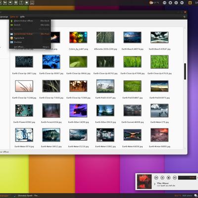
I'm using your theme everyday and I've found some tricks that maybe, for me at least, would improve the overall usability of sigma-dark..
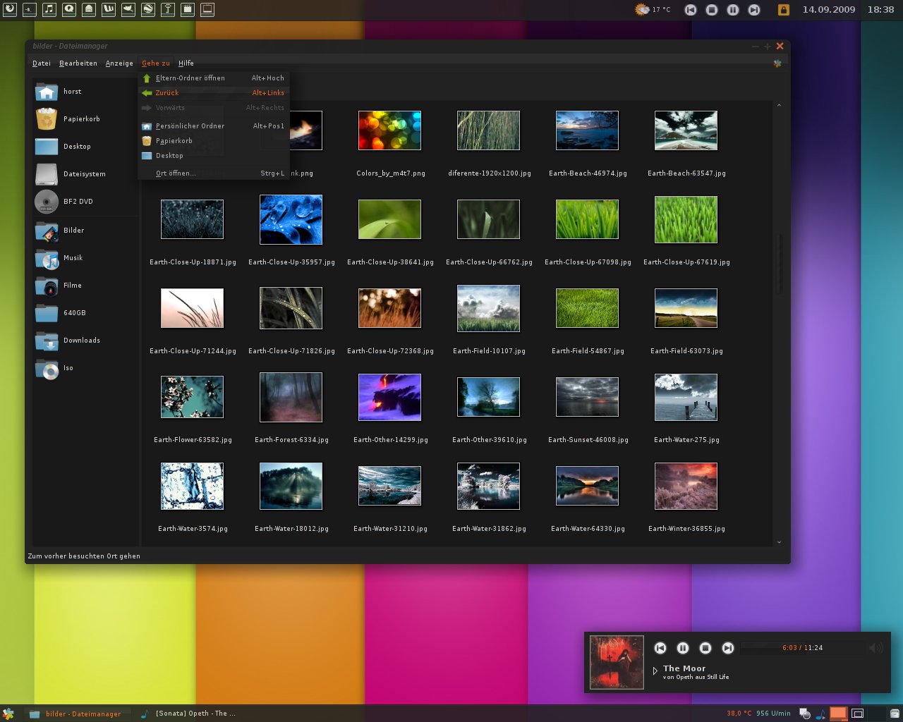
I'm talking of the sliders of the volume, for example.. I think they could be much more visible by adding some contrast on the sliders.. don't you think?
Another difficult that I encounter using sigma-dark is the xfwm4 decoration, which is of the same identical background color of the windows.. This confuse windows, in my opinion, and make more difficult to distinguish one from the others..
I hope those suggestion could be useful for you.. if you are not agree with me, not a problem..
The last thing: have you ever think about a colored progression bar? Colors of sigma style, obviously: something like black and orange, maybe.. Haven't you?
Ok, I'll stop now, don't worry.. :)
@brainvision
Thank you for your help to make this theme better. It's always good and helpful when people report bugs. I had the same issue when I changed the panel size to 18px, but I hope it's fixed now.
@foursakentears
Yes, there will be an Openbox theme. As well I'm thinking about a
Metacity and Fluxbox theme, maybe bmpanel.
simply great!
really, I think this one could became one of the best theme ever.. you've done it in a while and in my opinion is just quite perfect..!
Really nice!, compliments..
And to demonstrate my gratitude I would suggest you two think that I found not in theme with the rest of the work..
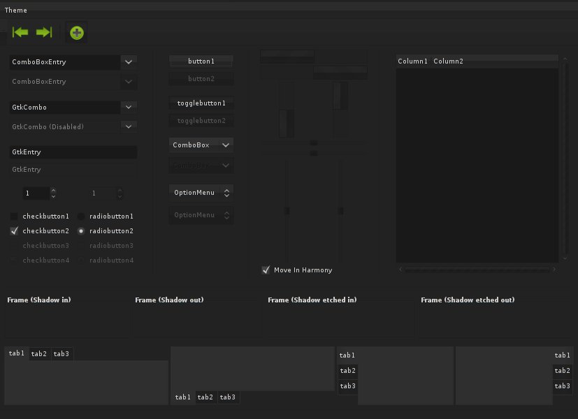
The default selected button and the pressed button color are one of the think I personally don't like..
And then when there a place with check and radio items.. those ones are too much clear.. always in my opinion..
I'm sending you 2 screenshots..
http://img179.imageshack.us/img179/513/pressedbutton.jpghttp://img179.imageshack.us/img179/513/pressedbutton.jpg
I hope this can help you!
Please keep working on this!
Good work!
oops, I'm discovering just now that the second sreenshot's link is wrong, being the same as the first one! I'm sorry!, what I wanted to show you was there: http://img32.imageshack.us/img32/8938/checkgt.jpg..
But I see that in this updated you just solved it, so there's really no need to give a look at it..
About this second version..
I like Sigma very much, I hope his development could go on, for now I'm using it with a lot of fun! I'm a big fan of dark theme, as you can imagine..
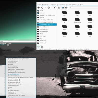
Just a question: I'm using xfce.. when I set my panel to a 18 pixel dimension, some icons in the process list bar are not shown entirely.. I'm asking if is there a minimal dimension for the icon, maybe the problem is here..
I hope that my english sounds good.. if not shame on me and excuse me very much!


Ratings & Comments
7 Comments
hi horst, as you can see, I'm still here.. :) I'm using your theme everyday and I've found some tricks that maybe, for me at least, would improve the overall usability of sigma-dark.. I'm talking of the sliders of the volume, for example.. I think they could be much more visible by adding some contrast on the sliders.. don't you think? Another difficult that I encounter using sigma-dark is the xfwm4 decoration, which is of the same identical background color of the windows.. This confuse windows, in my opinion, and make more difficult to distinguish one from the others.. I hope those suggestion could be useful for you.. if you are not agree with me, not a problem.. The last thing: have you ever think about a colored progression bar? Colors of sigma style, obviously: something like black and orange, maybe.. Haven't you? Ok, I'll stop now, don't worry.. :)
Yes, thank you. I will do some experiments with the colors and see what works best, but for now I don't have much time because of school -.-
@brainvision Thank you for your help to make this theme better. It's always good and helpful when people report bugs. I had the same issue when I changed the panel size to 18px, but I hope it's fixed now. @foursakentears Yes, there will be an Openbox theme. As well I'm thinking about a Metacity and Fluxbox theme, maybe bmpanel.
... any chance of an Openbox theme?
simply great! really, I think this one could became one of the best theme ever.. you've done it in a while and in my opinion is just quite perfect..! Really nice!, compliments.. And to demonstrate my gratitude I would suggest you two think that I found not in theme with the rest of the work.. The default selected button and the pressed button color are one of the think I personally don't like.. And then when there a place with check and radio items.. those ones are too much clear.. always in my opinion.. I'm sending you 2 screenshots.. http://img179.imageshack.us/img179/513/pressedbutton.jpg http://img179.imageshack.us/img179/513/pressedbutton.jpg I hope this can help you! Please keep working on this! Good work!
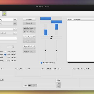
I'm glad you like it and thank you for you suggestions! I uploaded an update where I improved some things.
oops, I'm discovering just now that the second sreenshot's link is wrong, being the same as the first one! I'm sorry!, what I wanted to show you was there: http://img32.imageshack.us/img32/8938/checkgt.jpg.. But I see that in this updated you just solved it, so there's really no need to give a look at it.. About this second version.. I like Sigma very much, I hope his development could go on, for now I'm using it with a lot of fun! I'm a big fan of dark theme, as you can imagine.. Just a question: I'm using xfce.. when I set my panel to a 18 pixel dimension, some icons in the process list bar are not shown entirely.. I'm asking if is there a minimal dimension for the icon, maybe the problem is here.. I hope that my english sounds good.. if not shame on me and excuse me very much!