

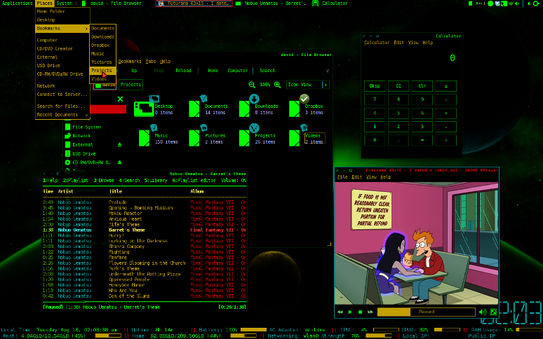
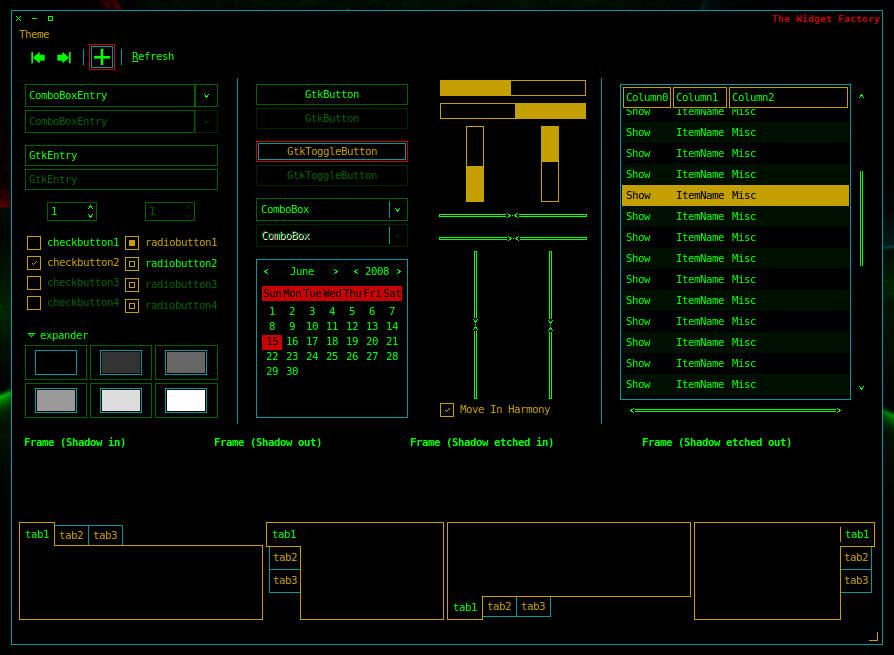
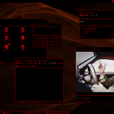
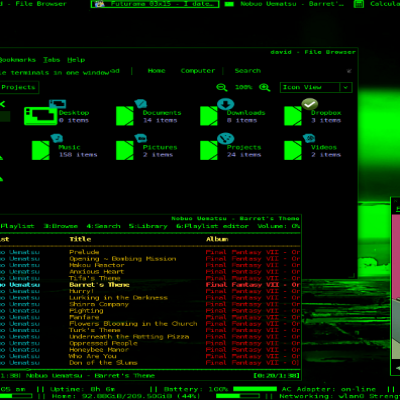
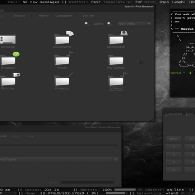
terminus-red
Dawei87


Source (link to git-repo or to original if based on someone elses unmodified work):
1.8 - added xfwm4 theme, updated list-headers, removed ACYL icon theme dependency.
1.6 - finally fixed cursor when renaming items in nautilus (sorry it took so long).
1.4 - a few color changes
1.2 - initial release


More GTK2 Themes from Dawei87:
Other GTK2 Themes:


Ratings & Comments
15 Comments
8 8 great
I love this theme however the received message color on pidgin is black on black.
This is a great theme, maybe a tron spin on it?? I have a great font for it!!
Possibly an Icon set for it
The theme is great , but try changing green (too strong ) with yellow :) .
really thanks for considering my request and this is a suprise, with in one day you made xfwm4 theme and released it as update.when i first saw it today evening i am completely suprised.Before you released the xfwm4 theme i was using orange door hing(xfwm4) theme it did not fit in the place(i had to adjust with that odd look) but now i am completely satisfied and though there are some icons missing in acyl icon theme it has 90% of all icons that are used in xfce.so no problem with icons.you may if time permits you try to port acyl completely for xfce(just hoping) thanks for making xfwm4 request
i have been using this terminus theme in my xfce but i havent found any XFWM4 theme that matches this please consider my request i checked this entire site but i did not find it once again terminus with acyl icon theme rocks
hmmm.. i've never made one before, but give me some time. ill look into it and see what i can come up with.
It's great..... It reminds me sub7
It's really perfect! keep it up .
you simply rock perfect combination been looking for a long time for this you have a real taste of a cyberpunk keep it up
When I change a file's name , I can't see the cursor , it's all black . Hope you can change it a little.
thanks for letting me know. i missed that. ill get to work on it as soon as i can.
I created an account here just to comment on your theme. Amidst a billion clearlooks colour shifts, this one stands out. I like dark, high-contrast themes (for readability) and this one has a nice 80's hollywood computer interface style.
im glad you like it. yea, i kinda like the way this one is easy on the eyes. im actually working on one that will hopefully resemble tron, but its a ways away i think.