

BarbPink
samriggs


Source (link to git-repo or to original if based on someone elses unmodified work):
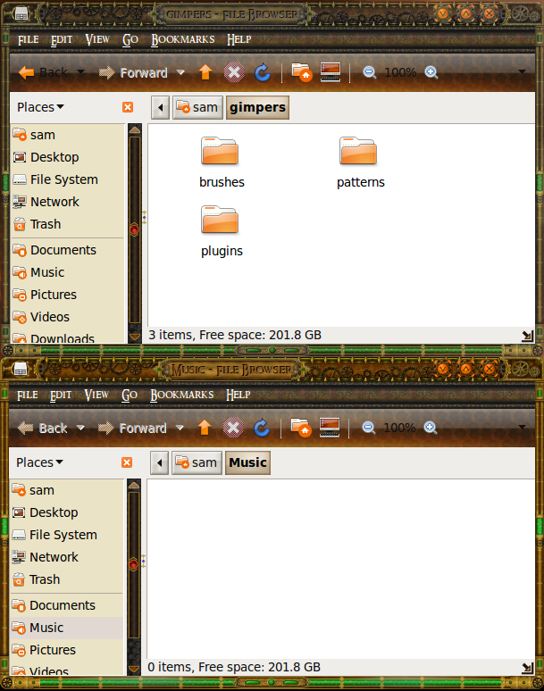
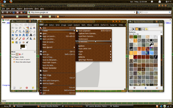
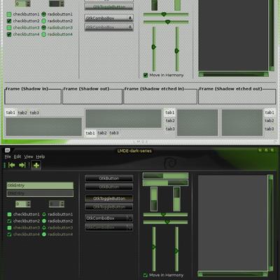
I added the gtk to this
As shown in the second screenshot.
It is a gtk I used for my other theme that also fit this theme as well.
I added instructions to get and install ubuntulooks gtk if you don't have it already and also added the font I use if you want it.
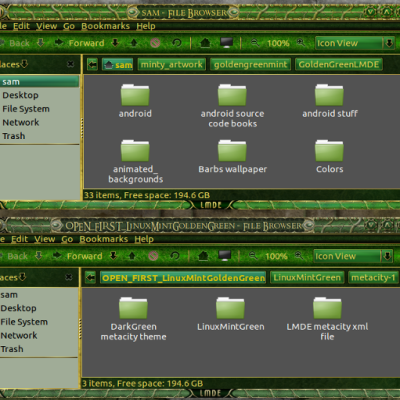
this one is complete now.
Enjoy.


More GTK2 Themes from samriggs:
Other GTK2 Themes:


Ratings & Comments
26 Comments
Fix the zip file!!!
whats wrong with the zip file I just downloaded it and its fine
I like to tell you my first word when I applied the theme ... it is WOW!!!!! thanks for your exclusive art!!
Glad you like it, hopefully >I'll have the gtk and finished artwork soon. Been a bit busy lately doing other stuff, but I will have the finished work done soon hopefully :)
Hello, I must say your themes are original and amazing, great job! I have just one thing, if you don´t mind. The green collor doesn´t fit very much to this kind of theme. I reccomend to change it to somethink yellow-orange-brownish OR just make two versions. But that´s just my opinion Many regards :)
thanks for the comments I am making different versions for it :) Aslo psycholinuxuser already made a brass version of it, heres the link http://browse.deviantart.com/customization/#/d2yc3lm
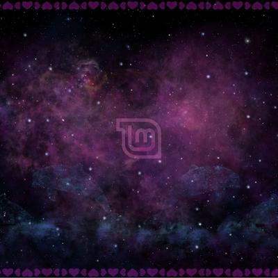
nice wallpaper did you make that too? check this site out its awsome! http://brassgoggles.co.uk/forum/index.php/topic,3217.msg581222.html#msg581222 my tag is ~mrgoldthrite
The wallpaper was actually the background for my new website I'm in the process of making, I just thought some folks might like it so I extended it and made it into a wallpaper also (yuppers I made that also, I do all my own art with the help of some brushed and filters of course, the blimp took me about 15 minutes from scratch. (I do it for a living and at home also) I'll put it up on the website hopefully tonight so folks can download it if they want it.
well i guess you didnt like my friendly suggestion. all im saying is the green clashes with the rest of your beautifully made theme...
Howdy psycholinuxuser lol you still hate green I see lol. I was trying to make it look like some biohazard ooze flowing through the tubes, plus green and browns/oranges work good together, I was thinking blue instead which might work better actually because of the contrast as they are opposite colors I might try that to see how it looks but then it would take the biohazard ooze out of the equation :( I have the gimp files still for the green buttons for the oldsam theme if you want them to change them around. Let me know and I'll put them on the oldsam theme as a download, they are bigger as I mentioned I do all the artwork bigger than shrink them down but it might be easier for you to switch them over to yellow. Let me know :) I am making a new website so hopefully I can get all the gimp files over there as downloads soon, Im still playing with the theme for the site right now its ugly lol.
hey hey, dont worry... lol I LOVE it especially the way the cogbuttons rotate! awsome... i did change the colors already, i just didnt want to do the work lol... i wish i were as creative as you with these themes, wow...! if you would like me to post it i will but i wont until you authorize me. Id give you full credit! thanks for such an awsome theme!!!
post away :) there is no limit or license with these at all, do what you want, I wouldn't mind seeing what you did with it. I am going to make one blue, one yellow also and upload those, I'm curious to see how they will look like myself now with the ooze different colors I will make the title the same color to match also, I'm taking padsters advice also and try to make the title stand out more also, I still want to make it engraved as part of the metal backing but hopefully it'll work out :). I was thinking of making the scrollbar as an old rack and have bill gates stretch and shrink on it as a joke but I have a feeling I'll get in trouble for that one so I'll come up with something else instead :) lol
here it is... http://browse.deviantart.com/customization/#/d2yc3lm
cool I love the brass look :) when I get the gtk finished for it, you can package it if you want as a complete theme and make it a download, or just make that a download now if you want, give folks more choices other than the green :) I am going to make the blue and yellow/gold versions as a download here soon, but please feel free to add that also as a brass. I check out the site you mentioned, Cool site :) thanks for the link. I see the oldmedievalsam one is on there too :) that wasn't intended as a steampunk one but the change that was done on it looks nice also on that site. If you want to make that one a download also feel free to do so you dont need my permission as you said on the site :)
i found the titles somewhat hard to read. so i edited your code, and implemented my title outlining. here: http://s2.kimag.es/share/81143134.jpg what do you think?
wow you can sure read the title now :) looks good. I just like that font I use, its been one of my favorites for a couple years now. I guess I can change the color of the center to a brighter orange but I was trying to make it subtle, maybe too subtle eh? :O I'll fool around with some brighter colors and see how it looks. Thanks for pointing that out :)
Oh I forgot to add about the title also. I was trying to make the title look like it was impressed into the metal look, thats why I added the highlight (subtly) pointing bottom right and the shadow top left, I should move the shadow just a hair up though its too level with the top of the title, it should be just above it instead. and maybe a tint lighter, it might be too dark on mine., the bottom highlight on mine should be fine enough though I tried a lighter shade on the highlight and it stood out way to much :(.
oh, sry, i just found it kind of hard to read. hmm... it does kind of look like it's extruding a bit...
no need to apologize I like your suggestion a lot :) it is hard to read the title, I made it way to subtle, even the wife says so lol. I'm gona work on the colors to see if I can make it look more engraved into the metal instead and make it stand out more also, I'll also make the ooze blue and one as yellow for the green hater lol Plus Im curious to see how it will look now with those colors :) and oops I called it oldmedalsam it should be oldmetalsam I'll change that right now :)
oh, well, you can use the font, i just don't switch fonts around much, so i was just trying out the outlining. you can change the colours however you want. i think i'll use outlining for all my metacity themes for now on :-) it looks good and is easy to read. and i came up with it myself, too. here's how i do it: pretty much it's like a grid. you have 3 blocks with 3 pieces in each. one block has x=0, with 3 parts y=0, y=1, and y=2. you do the same thing for x=1 and x=2. well except in the middle (x=1, y=1) that's the main colour. here's the code from yours if you want it: for active: <title color="shade/#2c1701/0.7" x="((width - title_width) / 2) + 0" y="(((height - title_height) / 2)+0)" /> <title color="shade/#2c1701/0.7" x="((width - title_width) / 2) + 0" y="(((height - title_height) / 2)+1)" /> <title color="shade/#2c1701/0.7" x="((width - title_width) / 2) + 0" y="(((height - title_height) / 2)+2)" /> <title color="shade/#2c1701/0.7" x="((width - title_width) / 2) + 1" y="(((height - title_height) / 2)+0)" /> <!--<title color="shade/#2c1701/0.7" x="((width - title_width) / 2) + 1" y="(((height - title_height) / 2)+1)" /> /--> <title color="shade/#2c1701/0.7" x="((width - title_width) / 2) + 1" y="(((height - title_height) / 2)+2)" /> <title color="shade/#2c1701/0.7" x="((width - title_width) / 2) + 2" y="(((height - title_height) / 2)+0)" /> <title color="shade/#2c1701/0.7" x="((width - title_width) / 2) + 2" y="(((height - title_height) / 2)+1)" /> <title color="shade/#2c1701/0.7" x="((width - title_width) / 2) + 2" y="(((height - title_height) / 2)+2)" /> <title color="#985308" x="((width - title_width) / 2) + 1" y="(height - (title_height - 3)) / 2" /> for inactive: <title color="shade/#3f2007/0.7" x="((width - title_width) / 2) + 0" y="(((height - title_height) / 2)+0)" /> <title color="shade/#3f2007/0.7" x="((width - title_width) / 2) + 0" y="(((height - title_height) / 2)+1)" /> <title color="shade/#3f2007/0.7" x="((width - title_width) / 2) + 0" y="(((height - title_height) / 2)+2)" /> <title color="shade/#3f2007/0.7" x="((width - title_width) / 2) + 1" y="(((height - title_height) / 2)+0)" /> <!--<title color="shade/#3f2007/0.7" x="((width - title_width) / 2) + 1" y="(((height - title_height) / 2)+1)" /> /--> <title color="shade/#3f2007/0.7" x="((width - title_width) / 2) + 1" y="(((height - title_height) / 2)+2)" /> <title color="shade/#3f2007/0.7" x="((width - title_width) / 2) + 2" y="(((height - title_height) / 2)+0)" /> <title color="shade/#3f2007/0.7" x="((width - title_width) / 2) + 2" y="(((height - title_height) / 2)+1)" /> <title color="shade/#3f2007/0.7" x="((width - title_width) / 2) + 2" y="(((height - title_height) / 2)+2)" /> <title color="#665645" x="((width - title_width) / 2) + 1" y="(height - (title_height - 3)) / 2" /> ___________________ i hope you know what i mean. ^^
cool :) thanks for the code I'll be fooling around with that one Thanks again :) now if I can sort out that gtk issue with the menubar I would be a happy man :) I'll have to do some experimenting and research, hopefully I can find an answer, if I do it should work for all inactive states in the gtk as well, which would make it perfect to match the metacity framing. If you ever see an answer for this problem please let me know :)
why does the download say ubuntu?
Thanks for the comments Padster. I don't know why I always add ubuntu, I guess its because I use it and I know it works on it, but it should work on all the rest of the linux versions as well, I'll change that in the future :) Hopefully I can get the gtk to work as I have in mind and the artwork to work as I want as well, I tried 3 different buttons on the metacity but there was so much detail it all got lost when I shrunk them down :(. I do the artwork at about 100 to 200 pixels high then shrink them down so what looks great at a big size looks like a blob when I shrink it down. I might add all the gimp files when this one is complete as well so everyone can fool around with them.
okay, yeah, i can imagine how most of the quality is lost when shrinking down 10x or so.
that's so great! i was actually looking for a steampunk setup right now. this is definitely the best one i've seen :-D