


Invert2
pizzach


Source (link to git-repo or to original if based on someone elses unmodified work):
1.0b:
Readded buttons. They are also a bit better looking now to boot. I quickly tweaked a gnome firefox theme to work with dark backgrounds but I'm not sure if I should post it or not and what would be the best way. Not to mention this text left centered version of the theme I have.
1.0a:
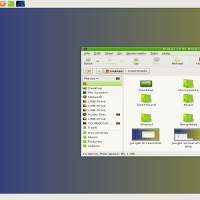
Reinstated theme after fighting with the gnome-look webpage. I also tested the theme more and made many small modifications. I like how rhythmbox looks in my theme now.


Other GTK2 Themes:


Score 5.0

Score 5.0


Ratings & Comments
9 Comments
almost perfect, especially with Katiola xfce style, but try to read anything in for eg. VLC (Video Lan Codecs) media player window, is it a bug or a feature ? (or am I retarded) ;/
Most likely a bug. I haven't used VLC so much as I usually bring mplayer up from the terminal. I've gotten stuck on a lot of small bugs I just don't know how to work around. :/
Thats a nice theme Pizzach
This theme was made for the people who have window focus follow the mouse.
I you use this theme. You will enjoy it much more if you have the monitor contrast jacked up all of the way. Otherwise you cannot see the smaller details. I just realized this when I installed the theme at a computer lab with a okay contrast ratio.
Not rating it bad, just curious as to why you don't like buttons?
No no no. Nothing against you or anyone out there. The remark for people who didn't know what they were getting into and didn't read. :) You know, the people who are going right now, "OMG!! I can't close my window!!!!" I'm actually pleasently surprised at the grading so far. Nothing against buttons. I just realized that I don't use them now that I use the keyboard so much. On the next release there is a 99% chance I'll put in an option for both. Right now is play time phase where I'm trying random things out. I had the sudden realization that the buttons in the corner or just an unused vestigal appendage good for decoration only to me. (9_6) Plus it give more room for title bar text. Was wondering what the waters were like in the public without those basic buttons.
Just open gconf-editor and remove the string in /apps/metacity/general/button_layout. Then you can even add the buttons back to the theme. :)
Thank you. I was secretly hoping for a reply like that. :) My way was much more messy.