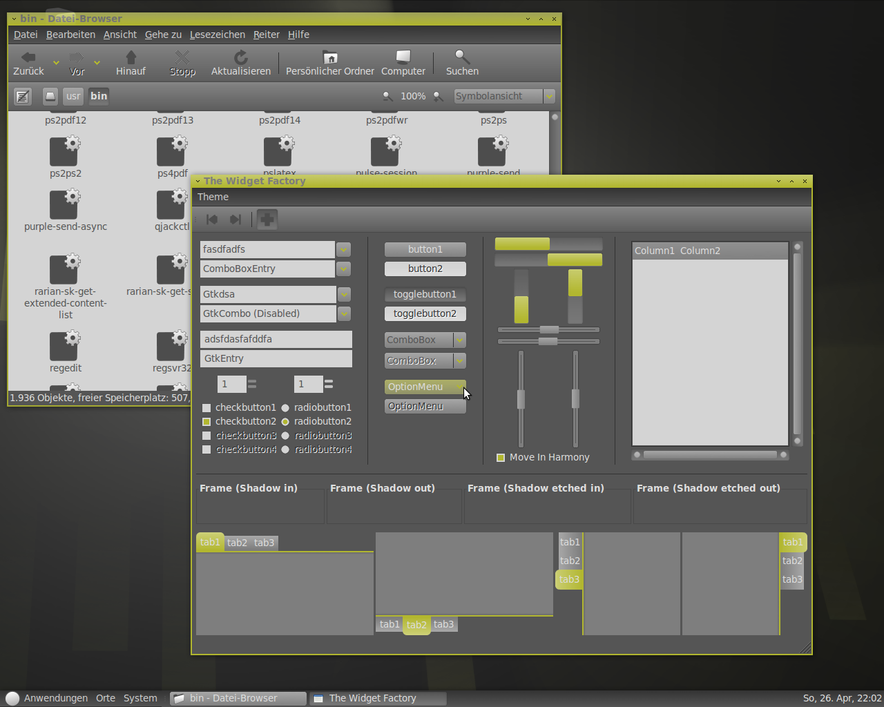
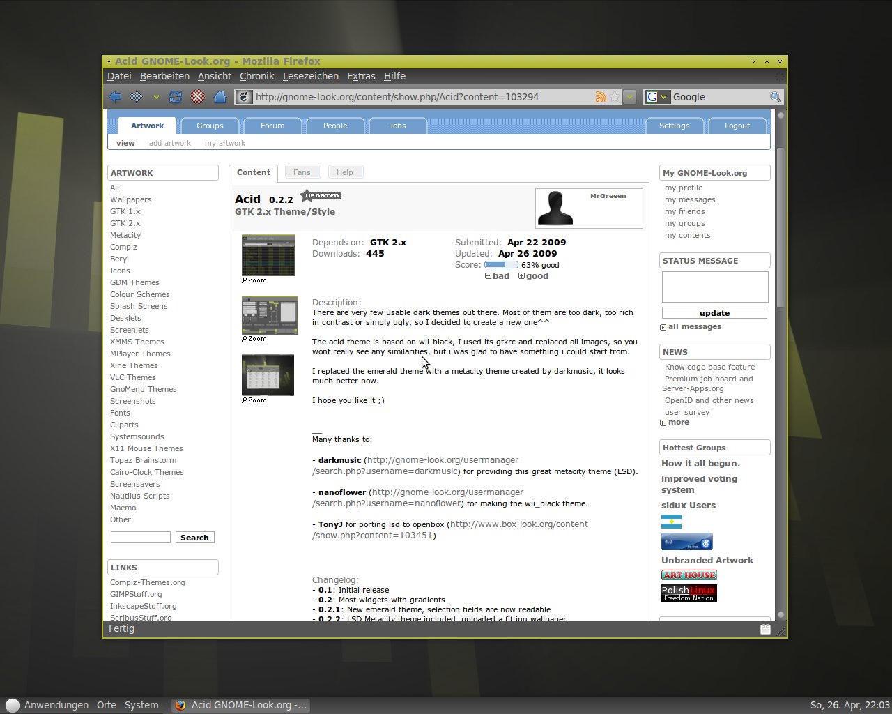
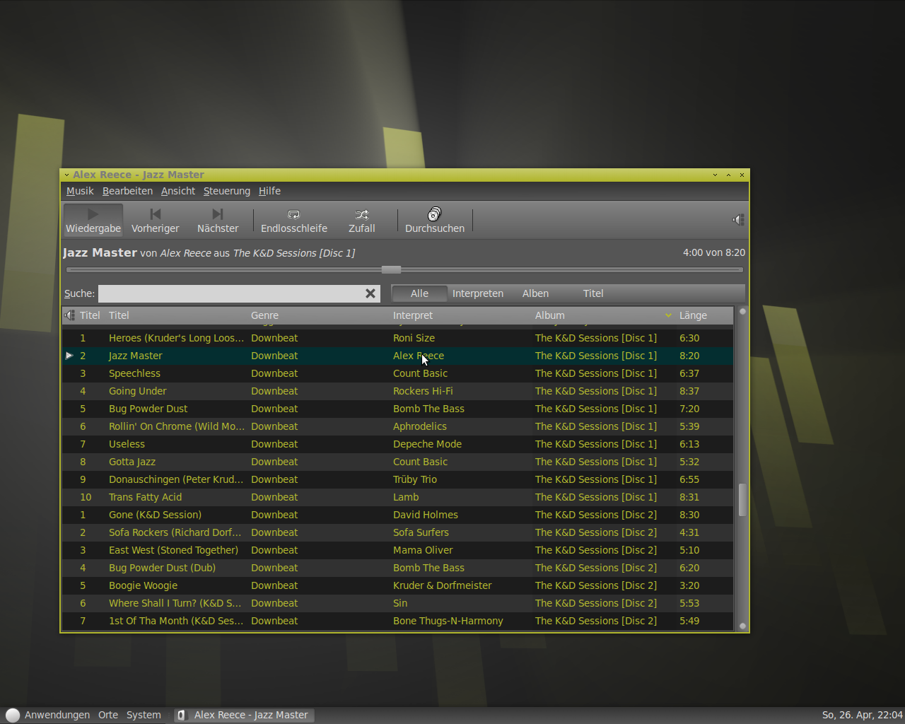
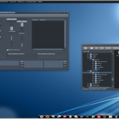
The acid theme is based on wii-black, I used its gtkrc and replaced all images, so you wont really see any similarities, but i was glad to have something i could start from.
I replaced the emerald theme with a metacity theme created by darkmusic, it looks much better now.
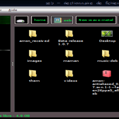
The icon theme used in the screenshots is "simply grey" (http://gnome-look.org/content/show.php/SimplyGrey?content=93674)
I hope you like it
__
Many thanks to:
- darkmusic (http://gnome-look.org/usermanager/search.php?username=darkmusic) for providing this great metacity theme (LSD).
- nanoflower (http://gnome-look.org/usermanager/search.php?username=nanoflower) for making the wii_black theme.
- TonyJ for porting lsd to openbox (http://www.box-look.org/content/show.php?content=103451)







Ratings & Comments
29 Comments
Hi! I`m impressed! It is the best theme I`ve ever seen!!! It`s fresh, it`s new, it`s just GREAT !!! I have registered on this site just a few seconds ago, only for say how much I like Your theme (and it`s not the first time I`ve visited this site). Regards :) , Kate
i love your update. especially adding the gradient where the flat yellow used to be (tabs)... [votes +good] keep it up!
one suggestion... maybe you should use a darker color for the text on the active tabs. because of the new gradient, the background is lighter than it used to be and this might make it easier to read... just a thought.
well the new version looks great, the new panel window selectors look great, but I am still having trouble with my larger panel (32 pixels), the gradient that you have chosen for the panel background does not work on bigger panels. I don't know much about making themes, but maybe there is a way to use a larger image and have it scale to the actual panel size? Other than that issue the theme is looking great.
yes, i know what you mean, but i dont know how to fix it. Maybe someone here could give me a hint, how to do it^^ The related code is this: style "panelbg" { xthickness = 0 ythickness = 0 bg_pixmap[NORMAL] = "Panel/panel-bg.png" bg_pixmap[SELECTED] = "Panel/panel-bg.png" bg_pixmap[INSENSITIVE] = "Panel/panel-bg.png" bg_pixmap[PRELIGHT] = "Panel/panel-bg.png" } I think there has to be an attribute like stretched or something like that, but as i said, i dont know^^
I fixed the problem for the time being by just replacing the panel background and menubar background with a non gradient background. You may want to do this so it is compatible with larger panels, you could include the gradient panel background as an alternate background also.
Heh, theme for openbox linked: http://www.box-look.org/content/show.php?content=103451
thank you! i linked you theme in the download section :)
Added Openbox theme based on LSD, I can't view Metacity so it is based on the screenshot. Feel free to package it along with everything else (your wall, metacity, acid gtk and openbox themes).
This theme looks awesome, I have found two small problems though. I use a larger panel on the top of my screen 32 pixels, and your graphic for the panel leaves a green line running through the middle of the panel. Also the active window selector on the panel is way to light for the window that is active and also when that selector is pressed. Maybe you could change them to make them look more like the dark grey used in the main menu high lighting. Thanks, Josh
yes, youre right. i think i will completly remove the yellow line, and darken the panel buttons. thanks for your feedback, i will upload the new version as soon as possible.
if you don't mind, i've done you the honor of creating a Metacity theme specifically for this theme. I called it "LSD" but i basically just took another theme I had and changed the colors... I want to send it to you so you can include it in your theme... can I email it to you?
I forgot to add: instead of copying the color of your emerald theme, I took the colors from your buttons (very slight gradient). the metacity theme looks very badass and will match your theme perfectly!
Thanks a lot, your theme is amazing! I completely replaced the emerald theme, because it looked to bad compared to lsd^^
Thank you for doing an original and futuristic theme for gnome. Most of theme makers are just trying to reproduce OS X or Vista, it is a shame for independent people. Keep working this way ! I think the Emerald part need a new buttons.
NIce them and original
I really like this, apart from the very dark text in the columns. At least for me, that makes it unusable at the moment.
While it is usable to me I do agree the text in the selection fields are a bit too dark and could be closer to white. I like he gradients, would having a verticl scroll bar with more rounded ends (ends more similar to Dust GTK or Oxygen's rounded scrollbar ends) be a tad better? In any event I really like this theme.
Go in to theme directory and open gtkrc in favorite editor. Go to line 1622 and uncomment, this line can change the colors you mention without altering the other text. You may also change the color code to something you prefer.
Thank you very much! I dont know how long I would be searching without your hint xD I'll upload new version soon.
Any feedback would be great!
are gradients so that it's not entirely flat. I think you could actually pull off an entirely flat theme if it were slimmer and had sharper edges. Either way, the color scheme rocks and I can't wait to see improvements!
Thanks a lot for your feedback! I wont make something glossy in this theme, because IMHO its really difficult to create a decent glossy dark theme(and i don't like glossy themes^^), but i am thinking about making everything a little bit more plastic, to look like this: http://img205.imageshack.us/img205/4331/acidpreview.png I think they are definitely looking better, so i will probably use them.
yup... looks like you're gonna add some simple gradients. thats what I try to do and I think its a great effect. (plus its a lot easier... hahaha) rock on!
This theme looks very nice I can't believe it was getting voted down? Anyways rated good!