Description: Good day! This GTK theme is not my work at all! Credit goes to:
Uknown author Sabco - who created the Woodbuntech theme (gtk, emerald, woodbuntu icons), I only changed the color of the text to make it readable! As I said, the theme contains emerald theme, I highly reccomend to use it, it looks pretty good (check the screens).
Gnome-look.org user migedith - I´ve used his window border "Slickness brown" (only changed a window title color a little)
AFTER INSTALL: (I don´t have english version of ubuntu, so pardon me if something is not exactly right) Go to random nautilus window and click Edit-> Backgrounds and Emblems Click the first button "Patterns" Click "Add new pattern" Browse to folder you downloaded and find Stripes.png Click Open Now you have the pattern loaded, all you must do is to grab it and drag it to nautilus window.
-------------------------------
To be honest, I don´t really know how do the licences work. If I am doing somethink wrong or illegal, please tell me and I will remove it immediately.
-------------------------------
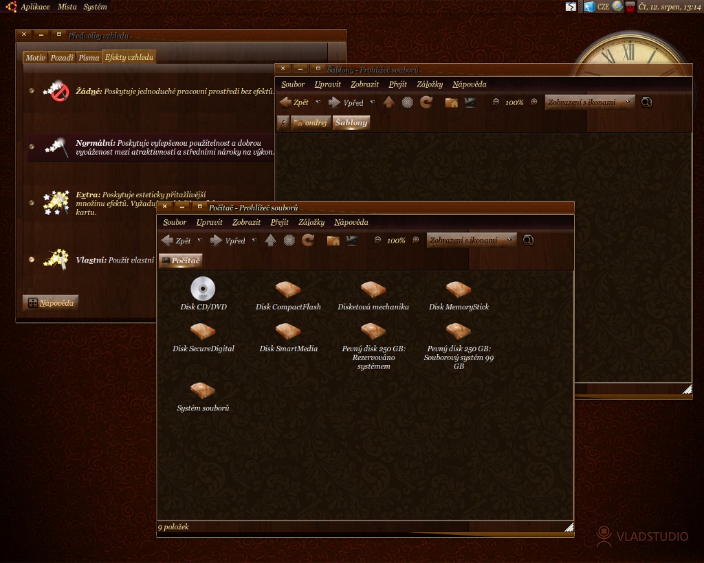
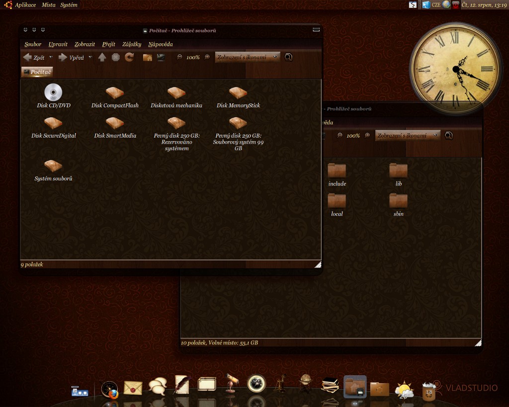
For wallpaper, clock theme, and dock info check my other "artwork"
...on Xfce, this theme has issues, big-time. The alternating-color list rows go from white to the dark wood background while the text remains black in both cases. There were also several other instances in which I had black text on a dark wood background, making it hard to read. There were also some irregularities with the panel background as well.
Before y'all gripe at me for not using GNOME, the reason I don't use GNOME anymore is because of what the GNOME developers, in their (cough, cough) infinite wisdom (cough), did with GNOME 3 -- in other words, it's an even bigger pain than KDE 4 was, which is why I now use Xfce. As far as I'm concerned, if a theme works in GNOME, it should also work in all other GTK-based desktop environments and window managers, too. This one, sadly, fails that test, which is quite a shame, because I like the way the theme looks in your screenshots. I just wish it could work out in real life for me. :-(
However, I will say thanx for bundling the Woodbuntu icons with the theme, though. I've been looking for those for quite some time. :-)
What is the theme of the icons in your dock (cairo dock)? Because my icons haven't changed in my dock just the Controls and Window Border. And my font hasn't changed eather...
Of course, this is just GTK/metacity theme, these icons are from one user on DA, and theyre not avaiable for linux yet (just in png files version)
For info check my other artwork
Great work!!
Whatever cyberdimension Sabco resides in I hope that s/he receives many accolades!!
Question:
Do you have the means to adjust the font appearance so that within an app like Claws Mail the font appears either against a dark background or the font becomes darker upon a light background?
I've noticed that in some cases a the font becomes so dark that it appears against a "dark wood background" which makes it very difficult to read.
Suggestions would be appreciated. Otherwise I'd work in Antique all the time.
I am not sure if I understand you well. You mean that in some applications the text is dark - not readable?
I know about this problem. It happens to me for example in Open office writer, the text (of the OO menu) is so dark that I can´t read it.
But unfortunately, I don´t know how to fix that. And if anybody know how to, I will be glad.


Ratings & Comments
17 Comments
...on Xfce, this theme has issues, big-time. The alternating-color list rows go from white to the dark wood background while the text remains black in both cases. There were also several other instances in which I had black text on a dark wood background, making it hard to read. There were also some irregularities with the panel background as well. Before y'all gripe at me for not using GNOME, the reason I don't use GNOME anymore is because of what the GNOME developers, in their (cough, cough) infinite wisdom (cough), did with GNOME 3 -- in other words, it's an even bigger pain than KDE 4 was, which is why I now use Xfce. As far as I'm concerned, if a theme works in GNOME, it should also work in all other GTK-based desktop environments and window managers, too. This one, sadly, fails that test, which is quite a shame, because I like the way the theme looks in your screenshots. I just wish it could work out in real life for me. :-( However, I will say thanx for bundling the Woodbuntu icons with the theme, though. I've been looking for those for quite some time. :-)
I see. Thanks for the answer.
What is the theme of the icons in your dock (cairo dock)? Because my icons haven't changed in my dock just the Controls and Window Border. And my font hasn't changed eather...
Of course, this is just GTK/metacity theme, these icons are from one user on DA, and theyre not avaiable for linux yet (just in png files version) For info check my other artwork
you can upload them on gnome-look and or deviantart.com ;) cheers
Personally, http://www.2shared.com/ is always the easiest and seems to be quite reliable.
Aaarrrghhh!!! Damn both rapidshare and megaupload to hell!!! Try this one. I will upload it on Deviant Art soon. Sorry for problems folks
this really nice theme ? better on deviantart
fucking megaupload and rapidshare shit we must ban such filehosters !
Great work!! Whatever cyberdimension Sabco resides in I hope that s/he receives many accolades!! Question: Do you have the means to adjust the font appearance so that within an app like Claws Mail the font appears either against a dark background or the font becomes darker upon a light background? I've noticed that in some cases a the font becomes so dark that it appears against a "dark wood background" which makes it very difficult to read. Suggestions would be appreciated. Otherwise I'd work in Antique all the time.
I am not sure if I understand you well. You mean that in some applications the text is dark - not readable? I know about this problem. It happens to me for example in Open office writer, the text (of the OO menu) is so dark that I can´t read it. But unfortunately, I don´t know how to fix that. And if anybody know how to, I will be glad.
I did really like sebco's themes and especially his emeralds.
Thank you , is perfect for my E17Theme Siglo XIX. Greetings: Agust
An upload of this on another site would be helpful. The current one has 'been temporarily suspended'
Oh, well I will add a rapidshare link in the description.
your links are not working rapidshare only allows download ten times megaupload says there is no such a file
very nice