

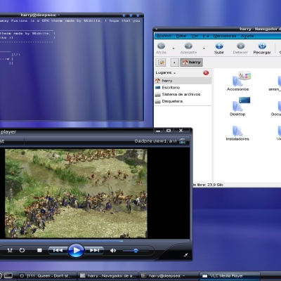
Just a Dark theme
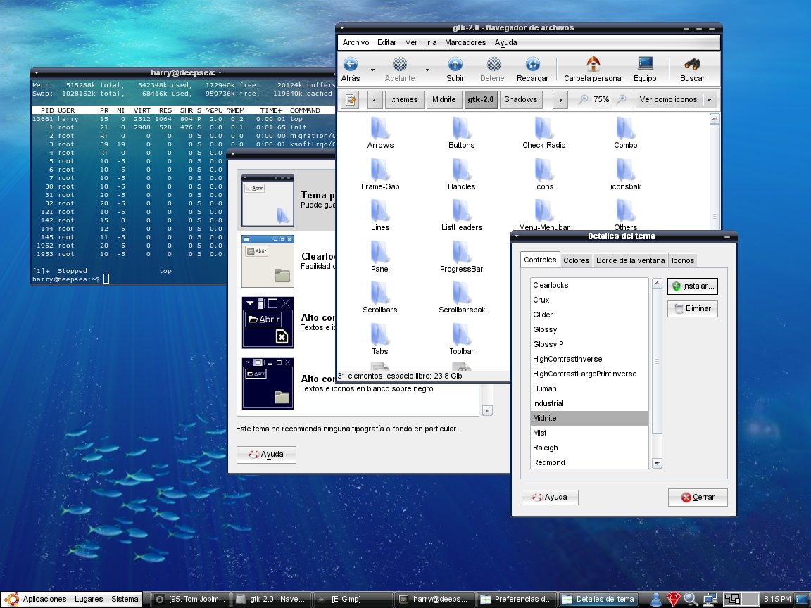
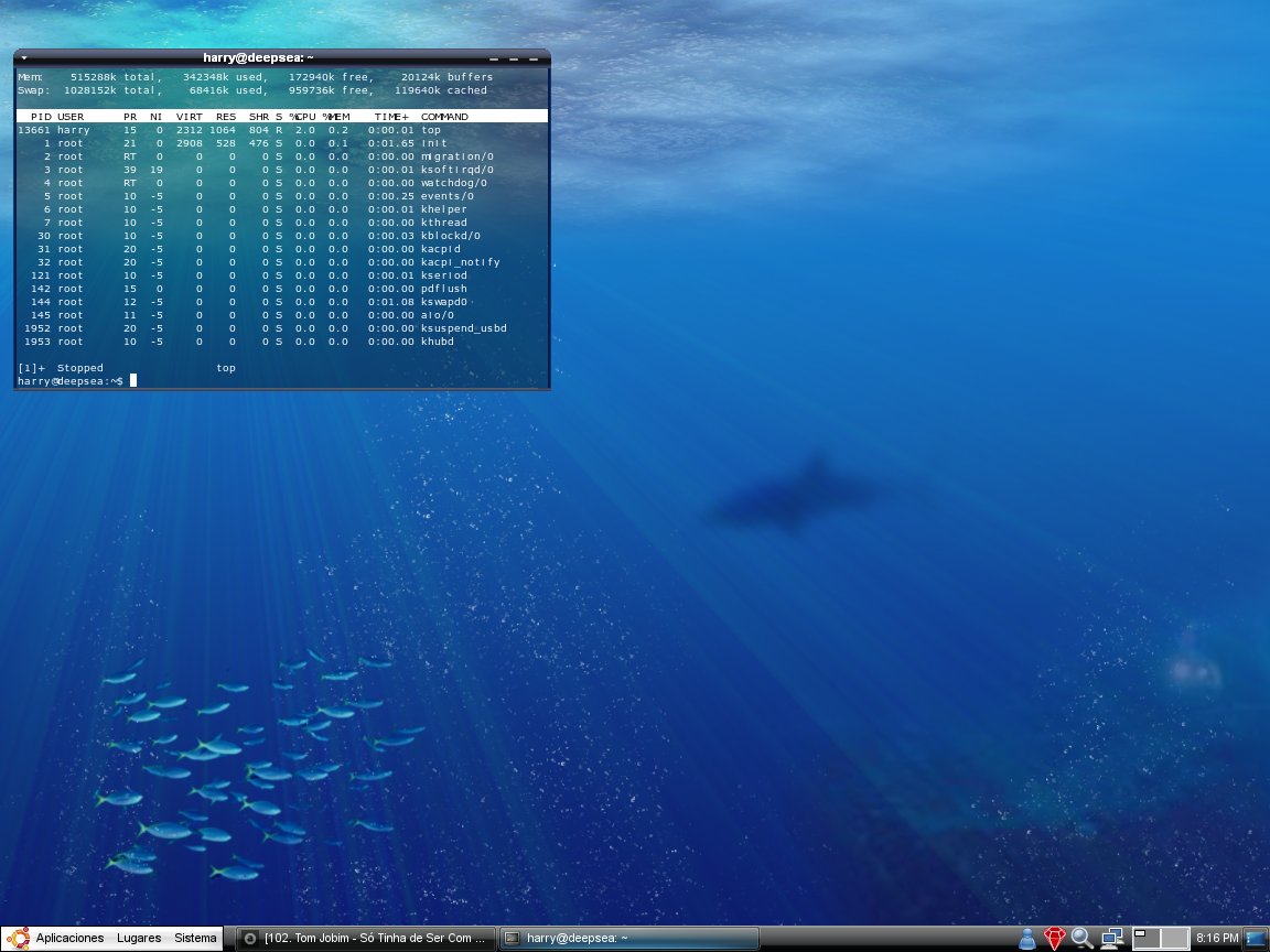
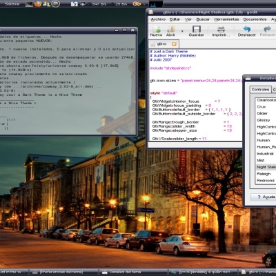
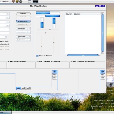
Midnite


Source (link to git-repo or to original if based on someone elses unmodified work):
v1.0: Fixed the Metacity Theme.
v0.9: Change the texture of the Buttons and the texture of the Toolbar.
v0.7: Modified the texture of main panel for one Not to dark.
v0.5: Modified some textures
v0.4: Change the Tabs Texture for one more soft. Change the Menú Buttons for one more Elegant.
v0.3: Change the Menubar item texture and menuitem texture for one more soft. Change too the scrollbars for one more soft.


More GTK2 Themes from Midnite:
Other GTK2 Themes:


Ratings & Comments
22 Comments
Excellent work, I just love it. mm.. I think there is an error in this part: bg_pixmap[NORMAL] = "efefef" It requires an image not a color so if you want to use the color #efefef you can just comment the line or make an image full with that color. #bg_pixmap[NORMAL] = "efefef" //commented or bg_pixmap[NORMAL] = "bg.png" //image file IF THE BUG HAS ALREADY BEEN FIXED THEN NEVER MIND.
sorry, but this do not work here. thanks!
I try use midnite in the xfce-4.4.1 and gtk+-2.8.20 and get this problem with taskbar and widgets! see a pic. http://imgserv2.imagehigh.com/imgss/5788020_telaErro.jpg thanks!
Redownload and reinstall the theme, I made it several changes.
I reinstall the theme but the problem continue. thanks.
If you continue updating this theme, midnite, hehehe, I won't be able to enjoy it properly ;)! (kidding) Awesome theme, superb work. Continue like this, pleaze!
Just found a bug in the window borderlines, have a look at this: http://img515.imageshack.us/img515/9876/pantallazotk3.png I cannot distinguish borderlines when a window is displayed just over the bottom one at the same place.
Fixed.
Good job mate, one of the best themes on the net so far. :)
Hey, nice theme. May I know where you acquired the wallpaper from? Thanks!
http://www.deviantart.com/deviation/7958651/ From there
very good looks abit macish for my likin but still good
What's the Icons theme your using?
this -> http://www.gnome-look.org/content/show.php/AER-OS-XK?content=49990
... kewl! I've installed it and it looks great! Thanks!
At the beginning I want to say - f** great! GREAT idea with the highlits on the taskbar - soft and beautiful. But honestly - I don't like colors of the menu bar, tabs etc. They just don't match this great theme. Buttons are good, but they look different in nautilus and ff for example. The "path" buttons in nautilus are looking like the ones in ff, but when they are highlited they look like not highlited normal buttons in nautilus. Also the scrollbars - please, change it to more soft color. Sorry for such critisism, but for me this theme is great, and just wanted to tell you what should be changed to make this theme more beautiful. PS. I know I wrote this before but the highlits on taskbar are looking damn good:) PLEASE, keep up good work!!!
sorry, ff is for Firefox
beautiful theme, i starting to belive that the best themers come from spain ;) mfg
Very nice, beautiful, will test (Muy bueno amigo, saludos desde españa)
great theme, superb.
I like this theme, but i have some isues for you. For example try to crete a new luncher on the Desktop.
I really like the direction that this theme is taking. The only thing that I can think of wrong with it is that it's too dark and one other thing. Lighten up the black and lighten up the blue make the metacity theme use the gradients of the GTK theme and apply that semi-metallic look universally to said GTK theme.