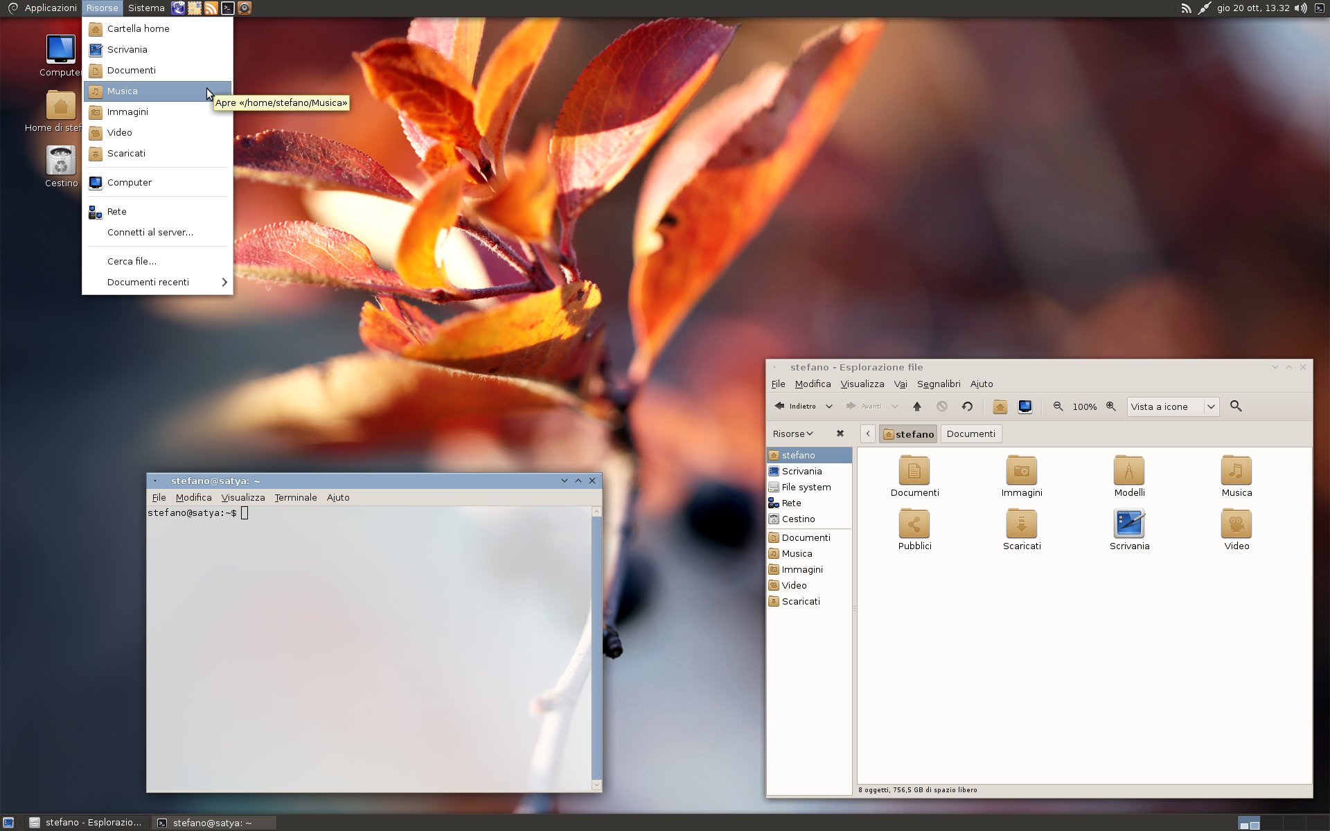
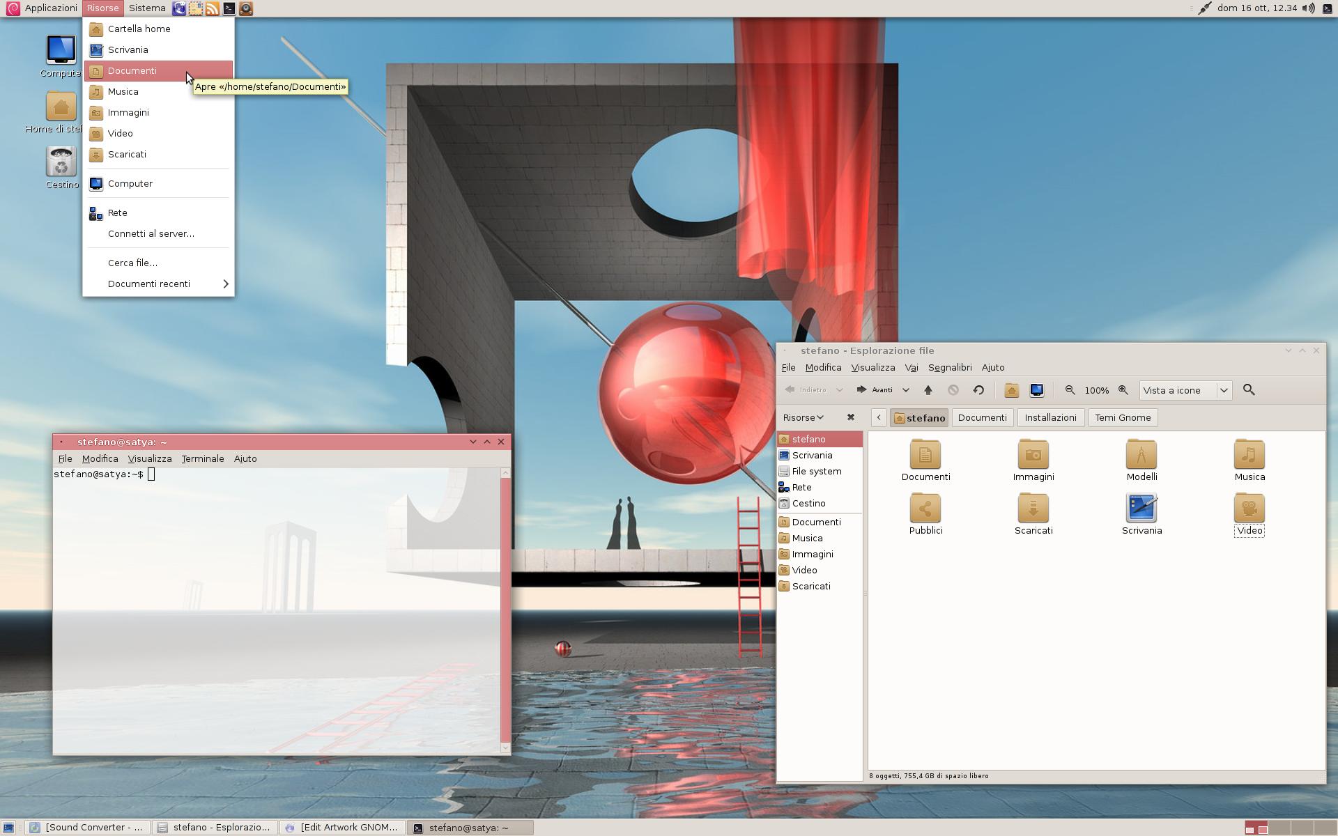
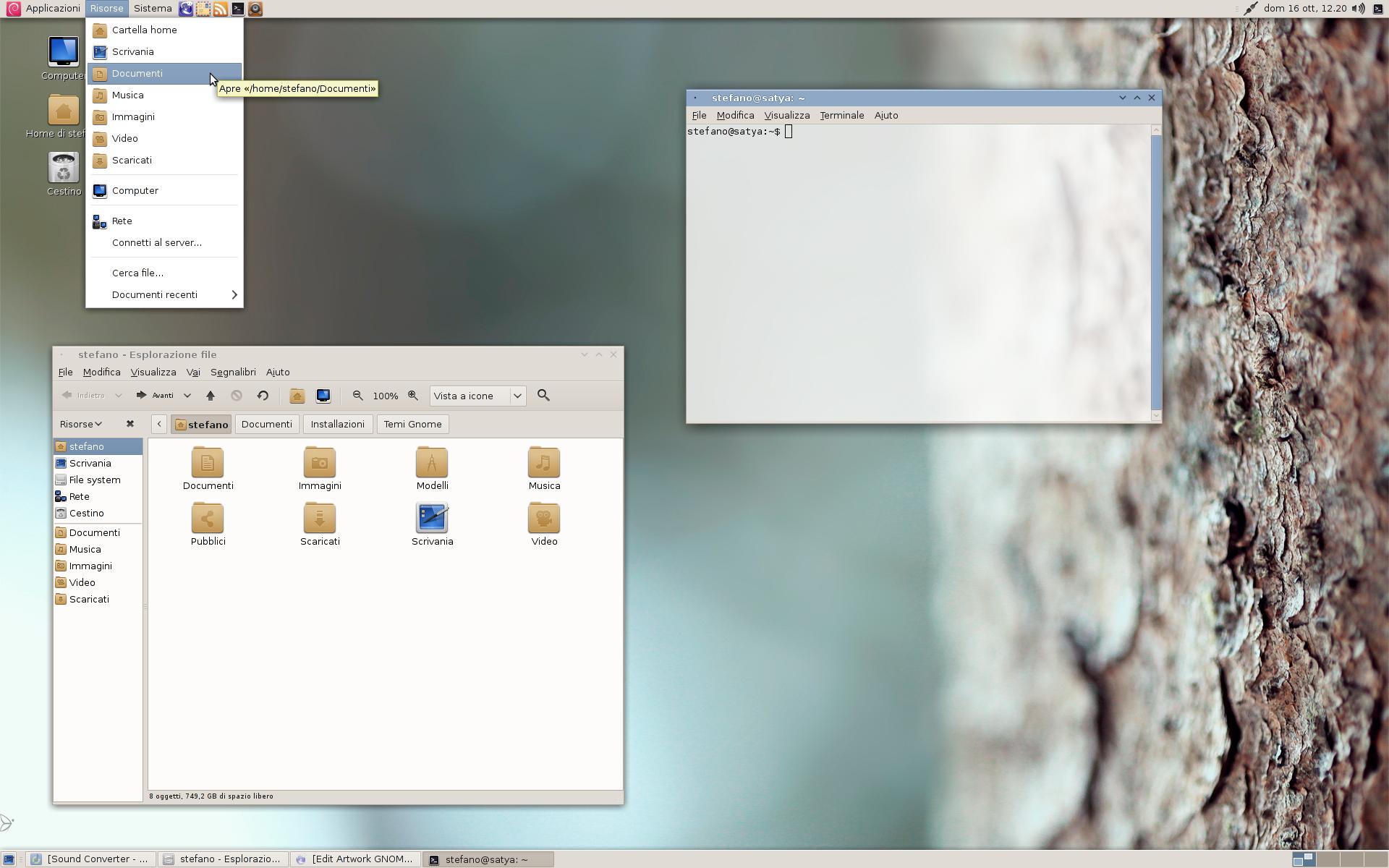
Description: This theme, is based on 2sev's Absolute. Initially, I made it for myself to use. I decided to release it afer many months.
It depends on murrine and metacity. In my setup, I'm using Faenza icon set.
Works with the murrine gtk engine that comes with Debian Squeeze and is compatible with all the newer versions. The idea was to have a sligtly moden looking alternative to the classic Clearlooks, but equally usable and easy looking.
NB: This theme is called "Luna" because, when I created it, I was using a wallpaper with a moon. It's not related to Elementary OS.
The differences between Absolute and this version:
- Removed some features in gtkrc that required the new versions of murrine engine. This version works with murrine 0.90.3.6, the one that comes with Debian Squeeze. - Changed some colors and the iconset requred (now Faenza) - Changed metacity theme to have the focused window title coloured as gtk selected_bg. This gives it a less modern look (no menubar-titlebar unification), but makes it easier to distinguish which window has the focus, expecially whith focus following, looks good even without composing, and the user can change it's colour. - Changed the window buttons to let them adapt to the different colours - The menu background is white, like in clearlooks. - Buttons and menu items are more squared. - Maybe something else that I can't remember...
17-10-2011: - Fixed the invisible menu checkbox problem that apperared in the newer versions of murrine
16-10-2011: - Default iconset is now Faenza - Default cursor is no longer DMZ-black - Made unfocused window text border less bright - Maybe some minor colour changes that I made after the last release... I cant'remember and I didn't keep a track of the changes
01-10-2011: - Made expander icons smaller - Improved contrast between active and normal buttons
I'm sorry, but I think I don't have time to do this. Since I switched to a tiling wm, awesome, I'm not using this theme, and even gnome, anymore.
I tried only once to adapt a gtk3 theme and it was a hell... Gtk2 were quite chaotic and disordered, but I could manage them with a 200 lines gtkrc, but with gtk3 I have to edit various chaotic and disordered ~1000 lines css...
I can't do it... at least, not now. :(
However, anyone more experienced with gtk3 could take this theme and do whatever he wants with it. ;)
Recently I'm trying your desktop look on my debian squeeze and I have to say it became very clean and professional,just was thinking in my mind not so far from clearlooks style but modern .Compliment
Thank you for the update. There is an issue in Menu I don't know if this is related to the theme.
On some menu items, there is sometimes a checkmark in in front of the menu text to denote that the option has been set. Example: right click on an applet in Gnome panel, the "Lock to Panel" menu. You must hover the mouse over the menu item to see the checkmark.
Or Nautilus, menu "View". move the mouse on each of the menu items, you will see plenty of checkmark or dot which were hidden because they are displayed in white on white.
This is what I get:
http://i.imgur.com/6wUwe.jpg
Maybe, the newer versions of murrine draw the checkbox in a different way?
Try this gtkrc and tell me if it works:
http://pastebin.com/FP14JP6G
The changed part is in the style "murrine-radiocheck" section, at row 275.
Can you show me a screenshot before and one after the patch?
Hi,
Here is a screenshot showing a comparison of the clock display: http://i56.tinypic.com/vqqv74.jpg
Top is AbsoluteLuna, Bottom is LambdaMod 0.4
Panel size = 36 pixels.
The Application Font has no effects. I have reduced the font size to a small value, I see the display shrinked but it is still on 1 line with AbsoluteLuna. There is no change in the clock settings when I switched from one theme to the other. So the text wrapping is probably something coded in the theme settings. Hope you can figure that out.
Ok. I found it. It's not related to any setting of the theme. It works alredy in every theme. Try to set a smaller font and a bigger panel.
For example:
http://oi51.tinypic.com/35hhbif.jpg
Oh wow, that's true. Increase panel size to 48 or setting Application Font to 6 did wrap the text in the Clock applet. This looks weird however (unacceptably small text or panel larger than necessary).
But that doesn't explain why themes like MintX, LambdaMod, FusionBlue, Orta know how to wrap the Clock text without me changing anything in Panel size (36 pix) et Application Font (Ubuntu 11 or 10). May be they redraw the panel?
I'm using LinuxMint 11 x64. Folllowed instructions in the link you gave. Set Custom format to use the "stacked" version. Has no effect. The Clock still displays in 1 single line.
I give up. It's not big deal, that consumes a little bit the space in the panel but it's Ok. Sorry for all the troubles and thanks for taking the time to help me.
Thanks for the update. The new triangle icon is still too big. It stands out a little bit too much compared to the folder beside it.
Can you have a look at this theme: Lambda-Mod 0.4 http://gnome-look.org/content/show.php/Lambda-Mod?content=141058
It has a smaller triangle icon which I think is well balanced.
Regarding the taskbar in Absolute Luna, I think some improvements might be possible:
- Set panel size to 36 pixels. Absolute Luna, the clock displays Date & Time in one single line. This take more space. Have a look at Lambda Mod 0.4, it can display Date & Time in two lines.
-There is not enough contrast between active / inactive tasks.
I hope these comments makes sense. Looking forward to the update.
I was wrong with the expanders. It is possible to click them even outside the arrow icon. Making them 8 pixels size, like in Lambda-Mod, works normally.
I changed the ACTIVE colour status of the buttons. Now the selected task stands out better. Thank you, this was a good point.
Regarding the panel, maybe, I didn't understood what you mean. You can change the layout of the date applet with a trick in gconf-editor: http://www.omgubuntu.co.uk/2010/10/how-to-customize-the-clock-applet-in-ubuntu/
In the Lambda-Mod screenshots, he uses a different panel, named Talika: http://www.webupd8.org/2010/05/finally-ubuntu-ppa-for-talika-gnome.html
You could also use a smaller font, but I prefer the classic Dejavu sans 10, for better readability.
Now I'll upload the new version with smaller arrows and more contrast on the selected buttons. ;-)


Ratings & Comments
30 Comments
It would be great, if you port this theme to gtk3
I'm sorry, but I think I don't have time to do this. Since I switched to a tiling wm, awesome, I'm not using this theme, and even gnome, anymore. I tried only once to adapt a gtk3 theme and it was a hell... Gtk2 were quite chaotic and disordered, but I could manage them with a 200 lines gtkrc, but with gtk3 I have to edit various chaotic and disordered ~1000 lines css... I can't do it... at least, not now. :( However, anyone more experienced with gtk3 could take this theme and do whatever he wants with it. ;)
Recently I'm trying your desktop look on my debian squeeze and I have to say it became very clean and professional,just was thinking in my mind not so far from clearlooks style but modern .Compliment
Thanks! :) My purpouse was to have a simple and nice theme for Debian Squeeze. I'm very happy you are using with it and like it :)
Very good job!!!!!!!!!!
Thanks :)
Thank you for the update. There is an issue in Menu I don't know if this is related to the theme. On some menu items, there is sometimes a checkmark in in front of the menu text to denote that the option has been set. Example: right click on an applet in Gnome panel, the "Lock to Panel" menu. You must hover the mouse over the menu item to see the checkmark. Or Nautilus, menu "View". move the mouse on each of the menu items, you will see plenty of checkmark or dot which were hidden because they are displayed in white on white.
This is what I get: http://i.imgur.com/6wUwe.jpg Maybe, the newer versions of murrine draw the checkbox in a different way? Try this gtkrc and tell me if it works: http://pastebin.com/FP14JP6G The changed part is in the style "murrine-radiocheck" section, at row 275. Can you show me a screenshot before and one after the patch?
I'll upload the fixed version in minutes. :)
Fix confirmed. Finally the menu now looks much better. Thank you very much.
Excellent - good idea and color combination ! i like it and very good description on your intention. I am using with Lubuntu 11.04 !
Thanks :)
Hi, Here is a screenshot showing a comparison of the clock display: http://i56.tinypic.com/vqqv74.jpg Top is AbsoluteLuna, Bottom is LambdaMod 0.4 Panel size = 36 pixels. The Application Font has no effects. I have reduced the font size to a small value, I see the display shrinked but it is still on 1 line with AbsoluteLuna. There is no change in the clock settings when I switched from one theme to the other. So the text wrapping is probably something coded in the theme settings. Hope you can figure that out.
I'll try to figure it out in the gtkrc of Lambda Mod. I hope this is not related to some features in the newer versions of murrine.
I looked through all the gtrkrc, but I can't really find where this trick is done... Do you know some other theme that do this?
Orta 1.41 http://gnome-look.org/content/show.php?content=134123 Fusion Blue: http://gnome-look.org/content/show.php?content=144058
Ok. I found it. It's not related to any setting of the theme. It works alredy in every theme. Try to set a smaller font and a bigger panel. For example: http://oi51.tinypic.com/35hhbif.jpg
Oh wow, that's true. Increase panel size to 48 or setting Application Font to 6 did wrap the text in the Clock applet. This looks weird however (unacceptably small text or panel larger than necessary). But that doesn't explain why themes like MintX, LambdaMod, FusionBlue, Orta know how to wrap the Clock text without me changing anything in Panel size (36 pix) et Application Font (Ubuntu 11 or 10). May be they redraw the panel?
I think it could be related to the border thickness of the buttons. You could use this trick, to change the clock applet font alone. http://www.omgubuntu.co.uk/2010/10/how-to-customize-the-clock-applet-in-ubuntu/
I'm using LinuxMint 11 x64. Folllowed instructions in the link you gave. Set Custom format to use the "stacked" version. Has no effect. The Clock still displays in 1 single line. I give up. It's not big deal, that consumes a little bit the space in the panel but it's Ok. Sorry for all the troubles and thanks for taking the time to help me.
Thanks for the update. The new triangle icon is still too big. It stands out a little bit too much compared to the folder beside it. Can you have a look at this theme: Lambda-Mod 0.4 http://gnome-look.org/content/show.php/Lambda-Mod?content=141058 It has a smaller triangle icon which I think is well balanced. Regarding the taskbar in Absolute Luna, I think some improvements might be possible: - Set panel size to 36 pixels. Absolute Luna, the clock displays Date & Time in one single line. This take more space. Have a look at Lambda Mod 0.4, it can display Date & Time in two lines. -There is not enough contrast between active / inactive tasks. I hope these comments makes sense. Looking forward to the update.
I was wrong with the expanders. It is possible to click them even outside the arrow icon. Making them 8 pixels size, like in Lambda-Mod, works normally. I changed the ACTIVE colour status of the buttons. Now the selected task stands out better. Thank you, this was a good point. Regarding the panel, maybe, I didn't understood what you mean. You can change the layout of the date applet with a trick in gconf-editor: http://www.omgubuntu.co.uk/2010/10/how-to-customize-the-clock-applet-in-ubuntu/ In the Lambda-Mod screenshots, he uses a different panel, named Talika: http://www.webupd8.org/2010/05/finally-ubuntu-ppa-for-talika-gnome.html You could also use a smaller font, but I prefer the classic Dejavu sans 10, for better readability. Now I'll upload the new version with smaller arrows and more contrast on the selected buttons. ;-)
Sorry, Talika is a panel applet :)
Nice theme you've done!
Good job!