Description: Evolution from T-ish-Black. Old black themes are also included.
Metal accented version of T-ish, a fast OSX Tiger-ish lookalike Clearlooks theme for Gnome
Looks great with compiz ) Just use T-ish compiz themes (link below).
Additionally, contains two old variations: classic (really fast) and aquastyle with black decorations and aqualike scrolbars (but not so fast). Also it contains two metacity themes: one with b&w buttons other with colored.
WORKS WITH LATEST CLEARLOOKS-CAIRO.!! If you want cairo animations uncomment 'animation=TRUE' in gtkrc
Based on Clearlooks engine, Ish GTK theme with additional buttons from Expose and GlossyP metacity borders.
Requires clearlooks engine.
And yes: For best results use OSX icons, available here on gnomelook.org
IMPORTANT: In order to install both of the themes you'll have to manually extract to ~/.themes dir.Last changelog:
0.1 - initial release ------------------ 0.2 - color adjustments ------------------ 0.3 - metacity theme trimming in order to achieve more elegant presentation, added aquastyle version that features aqualike scrollbars ----------------- 0.4 - new metacity borders, black icons changed to white again, many updates from other T-ish themes ----------------- 0.5 - fixed statusbar color, fixed metacity lower-left rounded corner, added metacity with colored buttons (choose it through theme details window) ----------------- 0.6 - some changes in order to work well with lately popular compiz window manager ----------------- 0.7 - a few more tweaks for Compiz ----------------- 0.8 - small color correction ----------------- 1.0 - merged improvements from T-ish-Pack ----------------- 2.0 - name change to T-ish-Metal, T-ish-metal theme added
Adding extra version with coloured file bar? (File, Edit ..)
It sounds bad, but I see a better Tish theme with a bar similar, but not equal, to Rezlooks. A bar on its own style.
Maybe it will look a little re-charged for your taste... I drop the lines, you make the choice.
Finally: I don't love themes resembling mac, but yours are awesome.
>Adding extra version with coloured file bar? (File, Edit ..)
>It sounds bad, but I see a better Tish theme with a bar similar, but not equal, to Rezlooks. A bar on its own style.
Well, actually I can see valid reasoning behind this idea. It will give more weight to the menubar which is good since gnome does not allow menus to be on the top of the screen.
However, I don't know If I'll be able to do it right. I'll try and see what comes out :))
>Finally: I don't love themes resembling mac, but yours are awesome.
Thanks. In fact I did those themes while both impressed and frustrated by mac themes. Tiger have so many good points but it annoys by inconsistency (one app is brushed, other is gray, the third is aqua). I believe a good gui has to be consistent and balanced. So I picked some ideas from tiger and did it my way.
Gnome on the other hand had engine that allowed consistency but it's mostly not elegant and streamlined enough, so I merged those two things... and to honest I'm pretty satisfied by results :))
Thanks for commenting about. I'll keep in touch so I would note some posible-future changes to T-ish.
Actually it is one of the best themes; time ago I was sure it was the only one (You said: elegance is not an easy thing in Gnome. I feel the same thing. I get very frustrated trying with my own themes).
Take care, and Thanks for your time again !!
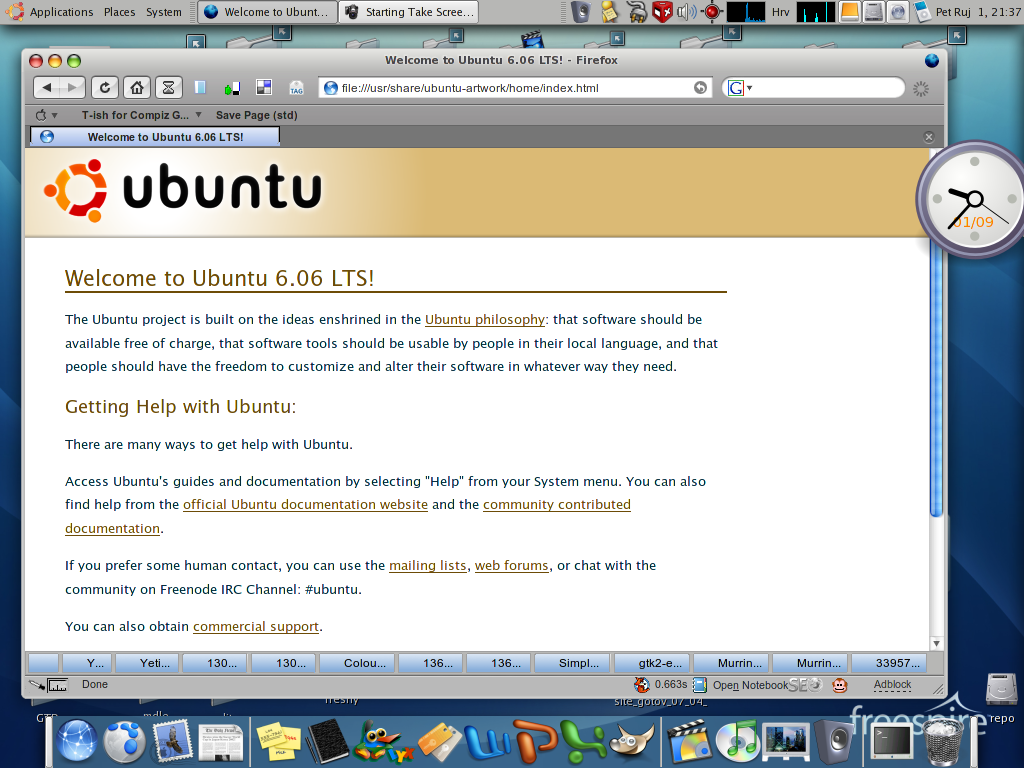
Sorry if this is not a place for this question but i can't find anywhere else. What i want to know is how to get that app launcher on the screenshot. I have tried the Candy Bar desklet but it doesn't really come out like that. If someone can let me know if there is a way to do that with GNome i'll appreciate it. I have ubuntu.
It's just plain gnome panel.
Go to top gnome panel -> right click -> new panel. Go to newly created panel -> right click > propertes.
Choose orientation bottom then: turn off expand, turn on autohide, turn on "show hide buttons", turn off "arrows on hide buttons", ste size 48. Go to background tab choose solid color and tweak transparency to your liking.
Now this is important: on yor newly crated panel put the following applets:
- any launchers you prefer or use frequently
- desktop swithcer applet
- trash launcher
- desktop button
Now if you choose OSX icons you have the bottom panely exactly the same as on screenshot.
Hope it helps.
Hi man, the new theme variation is perfect, and waiting for so long time. could you change the stock icons to be more calm all stuff, i sugest for a gray and black palette.
thanks for all
...I would lose the brushed Nautilus background. It's overdoing the whole 'brushed metal' thing - at that point it's everywhere, all over the UI. Too much for my tastes. I know it's not hard to change, though.


 ) Just use T-ish compiz themes (link below).


Ratings & Comments
16 Comments
Adding extra version with coloured file bar? (File, Edit ..) It sounds bad, but I see a better Tish theme with a bar similar, but not equal, to Rezlooks. A bar on its own style. Maybe it will look a little re-charged for your taste... I drop the lines, you make the choice. Finally: I don't love themes resembling mac, but yours are awesome.
>Adding extra version with coloured file bar? (File, Edit ..) >It sounds bad, but I see a better Tish theme with a bar similar, but not equal, to Rezlooks. A bar on its own style. Well, actually I can see valid reasoning behind this idea. It will give more weight to the menubar which is good since gnome does not allow menus to be on the top of the screen. However, I don't know If I'll be able to do it right. I'll try and see what comes out :)) >Finally: I don't love themes resembling mac, but yours are awesome. Thanks. In fact I did those themes while both impressed and frustrated by mac themes. Tiger have so many good points but it annoys by inconsistency (one app is brushed, other is gray, the third is aqua). I believe a good gui has to be consistent and balanced. So I picked some ideas from tiger and did it my way. Gnome on the other hand had engine that allowed consistency but it's mostly not elegant and streamlined enough, so I merged those two things... and to honest I'm pretty satisfied by results :))
Thanks for commenting about. I'll keep in touch so I would note some posible-future changes to T-ish. Actually it is one of the best themes; time ago I was sure it was the only one (You said: elegance is not an easy thing in Gnome. I feel the same thing. I get very frustrated trying with my own themes). Take care, and Thanks for your time again !!
I like it... :-D
Sorry if this is not a place for this question but i can't find anywhere else. What i want to know is how to get that app launcher on the screenshot. I have tried the Candy Bar desklet but it doesn't really come out like that. If someone can let me know if there is a way to do that with GNome i'll appreciate it. I have ubuntu.
It's just plain gnome panel. Go to top gnome panel -> right click -> new panel. Go to newly created panel -> right click > propertes. Choose orientation bottom then: turn off expand, turn on autohide, turn on "show hide buttons", turn off "arrows on hide buttons", ste size 48. Go to background tab choose solid color and tweak transparency to your liking. Now this is important: on yor newly crated panel put the following applets: - any launchers you prefer or use frequently - desktop swithcer applet - trash launcher - desktop button Now if you choose OSX icons you have the bottom panely exactly the same as on screenshot. Hope it helps.
Thank you very much, that works! Now I am going to create a nice panel for my 11yr-old sister who would appreciate it very much:)
good job, but I prefer to keep color to window system buttom -- minimize, maximize and close. could you give me a colorful buttom editon ?
I copy the T-ish themes buttom to replace current theme buttom.
Thanks, I'll add another metacity to the package for the next release.
Hi man, the new theme variation is perfect, and waiting for so long time. could you change the stock icons to be more calm all stuff, i sugest for a gray and black palette. thanks for all
Well, I think you are right this time. :)) Will do it for the next release. Thanks.
...I would lose the brushed Nautilus background. It's overdoing the whole 'brushed metal' thing - at that point it's everywhere, all over the UI. Too much for my tastes. I know it's not hard to change, though.
Nautilus background is not configured by this theme, user have to do it manualy. It is entirely user choice.
the cairo animations work in xfce-4.2.3.2?
Oh yeah... I just LOVE the volume applet with cairo themes :)