


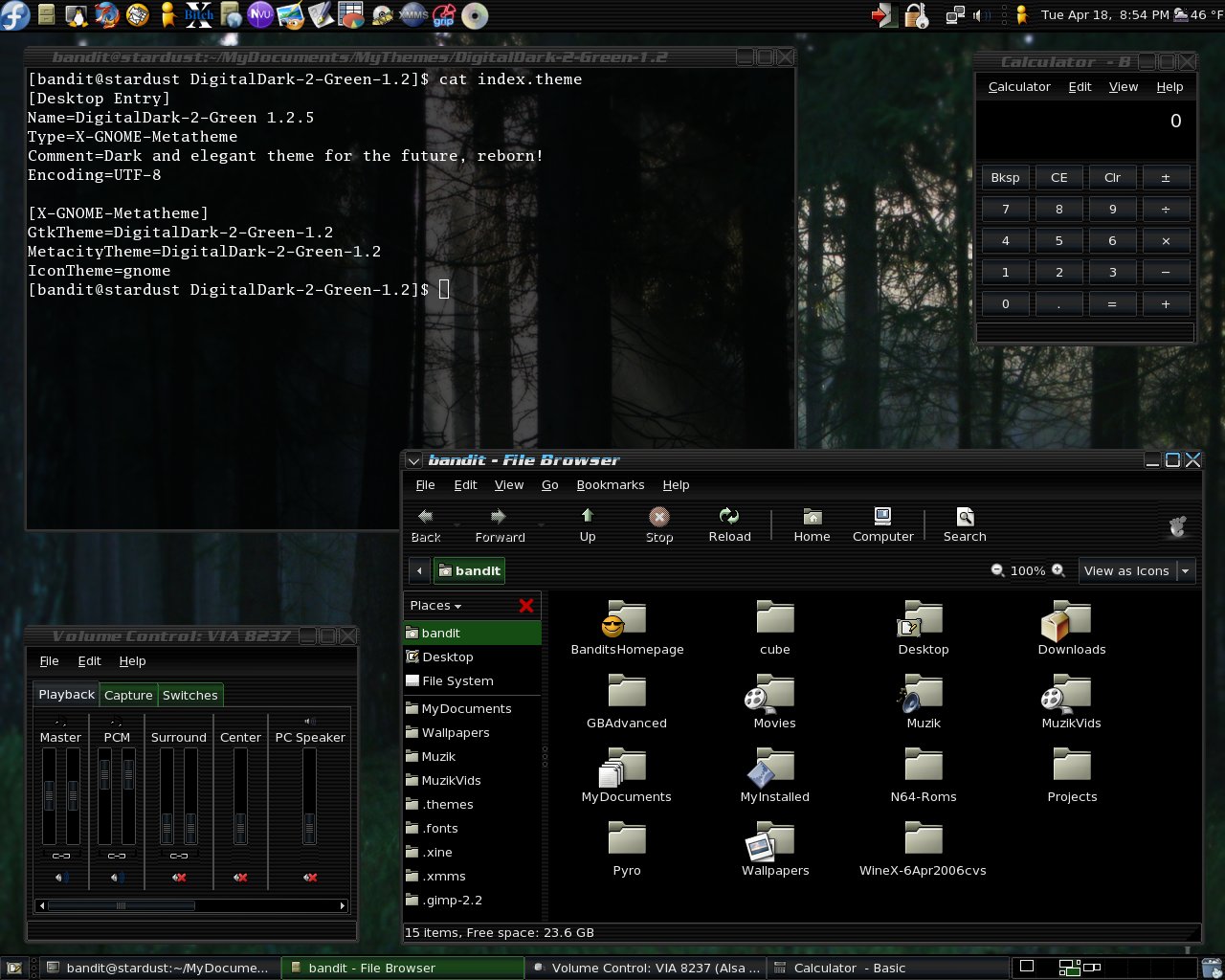
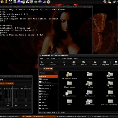
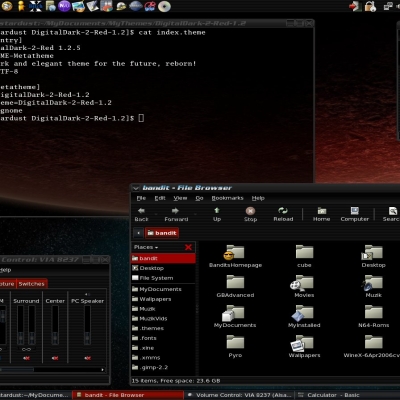
DigitalDark-2 Metal Theme Pack
bigbandit2004


Source (link to git-repo or to original if based on someone elses unmodified work):
V1.2
-Added theme and two previews.
!!update!!
v1.2.2
-Corrected Metacity colors so it can now be easier to see and uploaded new screeny. You may have to refresh your broswer to see the new screenshot.
!!update!!
v1.2.3
-Adjusted Button colors, now brighter.
-Added Menu graphic.
-New screenshots uploaded.
*Notes:
Noticed on some monitors that colors didnt show well and looked dirty. That should be corrected now. Also these themes show best in dark rooms.
!!update!!
v1.2.4
-Fixed Tab alignments.
-Adjusted Button colors.
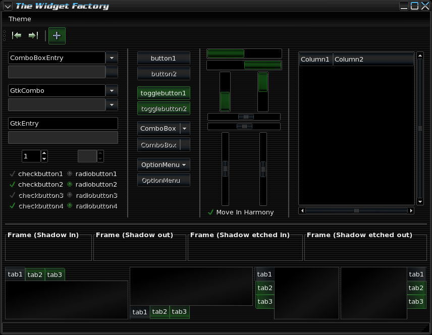
-Added Notebook Graphic.
-Code Optimized.
-Adjusted Text Entry color.
-Adjusted Slider Trough color.
-New Widget Factory screeny uploaded.
*Notes: Speacial thanks goes out to BVC for his assistance on helping get the notebook backgrounds working.
!!update!!
v1.2.5
-Fixed Left and Right tabs display error.
-Adjusted background 2% lighter.
-New screenshots


More GTK2 Themes from bigbandit2004:
Other GTK2 Themes:


Ratings & Comments
5 Comments
i like it except for 2 things. 1) on the top of the active window where it has the name it is half white half teal. that should be half whit half green. 2) gmail.com got messed up haw do i fix it. http://i91.photobucket.com/albums/k315/endo666/Screenshot-GmailEmailfromGoogle-Moz.png
I like very much your DigitalDark-Blue theme. It is under-rated. But, IMO, this one have a little problem: That green color is ugly, very dirty. I see you here giving your best, but people here have very, very light color tendencies. IMO-Sugestion: Metacity: Rip something like NeOs theme - only metacity, this is getting better (Blue) For gtk2 (Not the blue) change colors, make it more vivid. Example: Give more yellow to this green if you like it. Stay in the dark side !!
Thanks for the compliments. I will play around with the color mixing and see what I can come of with. I agree the buttons just might need a little brighting up.
I took your advice on the colors looking dirty. I tried viewing the screen shots from work on some older monitors and well.. Ehh.. So I fixed it. :) At least I hope I did. Please take another look at them and let me know how they look now. I also added a graphic for the menu bar.
i like it.