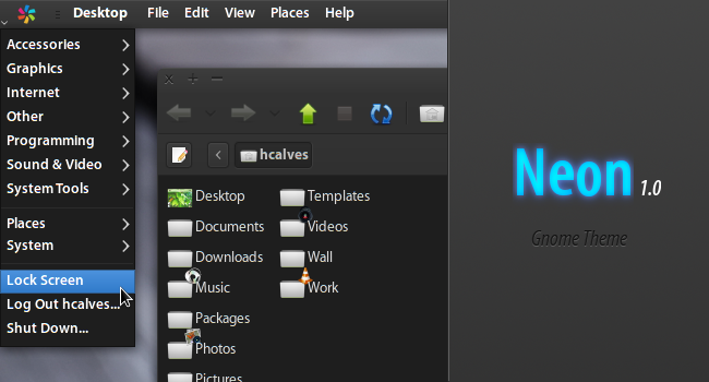
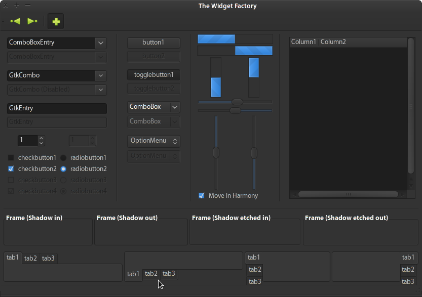
Neon Theme by Henrique C. Alves is licensed under a Creative Commons Attribution-Noncommercial-No Derivative Works 3.0 Unported License.
See COPYING for the full license.
---
You may contact the author or find other works at http://hcalves.deviantart.com
If you liked this work and feel like contributing back, consider a donation, of any amount. It will be greatly appreciated, in the same way I appreciate sharing this work with you.
---
Credits:
- The "Gnome" authors and contributors of any sort (http://www.gnome.org/)
- Andrea Cimitan, original author of the "Murrine Gtk+ Engine" (http://www.cimitan.com/murrine/)
- "deviantArt", a great community for GUI customization and art in general (http://www.deviantart.com)
---
Enjoy! And a Happy 2009!
---
IMPORTANT:
* Make sure you have the latest versions possible of both the Murrine and Aurora engines installed.
* You can get the icon collection I'm using in the screenshot at http://drop.io/hcarvalhoalves/asset/neon . Please note that those icons were NOT created by me, they were just collected from here, deviantArt and other places.
I love this theme, should at least be available for other people to download, so here it is: http://www.mdn.fm/files/168245_9tvkq/Neon.tar.gz
Also, I made an Openbox theme that goes well with it: http://box-look.org/content/show.php?content=140717
Not developing this theme anymore. This one is a similar attempt at a dark/blue theme:
http://gnome-look.org/content/show.php/Deep+Gnome+Theme?content=113878
Your theme is beautiful also with light or silver colors. One problem: when i change colors to grey the icons' background in the panel remains black. I have a transparent background for my panel, so it seems a lil bit ugly. Also menus are too dark, even if I change colors. I know that this theme was thought to be a dark theme, but can you fix this please, i like lighter so much!
P.s. sorry for my english :)
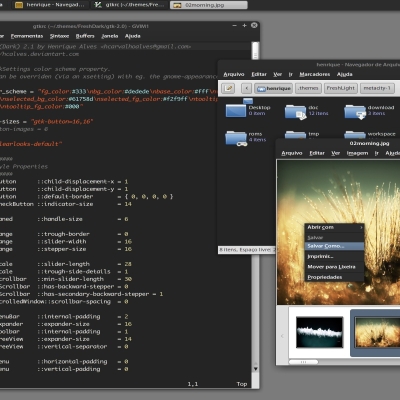
Screenshoot of how it appears:
http://img35.imageshack.us/img35/2285/schermata1.png
I agree to this. I like the bold headers of the menus but I would like to have the possibility to get the applications in it not to be in bold font.
Thanks for your work :)
The bold fonts will only look good if you're using a quality font, with what is called "true bolds" (like Lucida, Myriad Pro, Liberation Sans, etc.), otherwise it will look blurry.
So I recommend using a good font anyway, as the bold helps increasing contrast. If you still want to disable bold on menus, edit the file ~/.themes/Neon/gtk-2.0/gtkrc, and remove the line at 15.
See also the included README for more tips on getting better fonts.


Ratings & Comments
10 Comments
mdn.fm is down, here's another one :P http://www.fileden.com/files/2006/8/16/169791/neon.tar.gz
I love this theme, should at least be available for other people to download, so here it is: http://www.mdn.fm/files/168245_9tvkq/Neon.tar.gz Also, I made an Openbox theme that goes well with it: http://box-look.org/content/show.php?content=140717
Not developing this theme anymore. This one is a similar attempt at a dark/blue theme: http://gnome-look.org/content/show.php/Deep+Gnome+Theme?content=113878
The link for download the theme is broken.
Your theme is beautiful also with light or silver colors. One problem: when i change colors to grey the icons' background in the panel remains black. I have a transparent background for my panel, so it seems a lil bit ugly. Also menus are too dark, even if I change colors. I know that this theme was thought to be a dark theme, but can you fix this please, i like lighter so much! P.s. sorry for my english :) Screenshoot of how it appears: http://img35.imageshack.us/img35/2285/schermata1.png
hey dude, one of the best themes and no link? will u provide one? cant wait thx
Surprised just how modern and aesthetically pleasing this theme and color scheme are. I did not expect that. A+
Hi, thanks for the Wonderful theme...One question though! Is there a way i can change the menus to normal? Its a little too bold to my liking.
I agree to this. I like the bold headers of the menus but I would like to have the possibility to get the applications in it not to be in bold font. Thanks for your work :)
The bold fonts will only look good if you're using a quality font, with what is called "true bolds" (like Lucida, Myriad Pro, Liberation Sans, etc.), otherwise it will look blurry. So I recommend using a good font anyway, as the bold helps increasing contrast. If you still want to disable bold on menus, edit the file ~/.themes/Neon/gtk-2.0/gtkrc, and remove the line at 15. See also the included README for more tips on getting better fonts.