Very good, I love the bamboo look. Maybe I should now get a bamboo case and monitor to match? ;)
A couple of bugs and possible improvements...
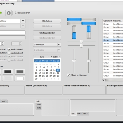
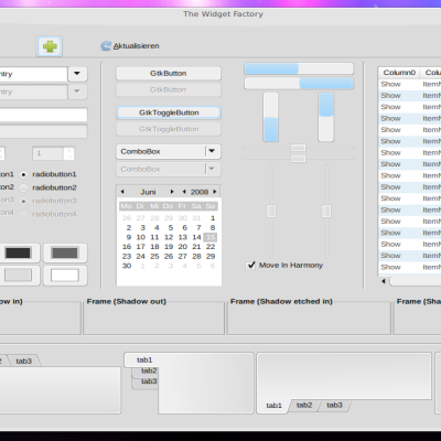
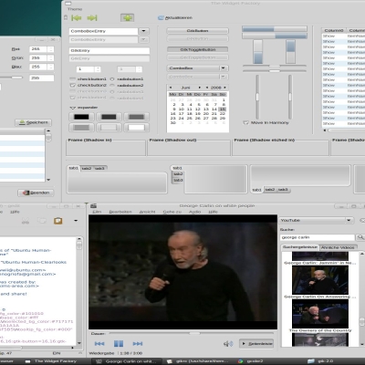
The background of things like properties dialogues and the shutdown dialogue looks wrong. It seems to be using the same background as the panels and so it comes out in ugly stripes. Also the buttons in those dialogues are missing until you mouse over them, when they highlight as blue.
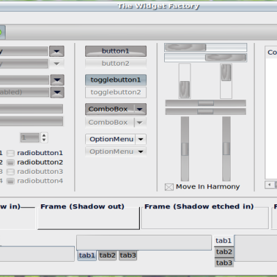
The grey highlights for button widgets are quite large, giving everything a chunky look and spacing tool bars out unnecessarily. Perhaps you could shave a few pixels off them? There's a similar issue with tabs, although not as pronounced.
But other than these few things really good port of a sexy theme! Thank you.
I forgot to mention: sometimes the drop down menu widget (the one with the little arrow) the grey background is sometimes split with a white band in the middle.
"The background of things like properties dialogues and the shutdown dialogue looks wrong. It seems to be using the same background as the panels and so it comes out in ugly stripes. Also the buttons in those dialogues are missing until you mouse over them, when they highlight as blue."
I know this, but I don't know why this happens. :(
"The grey highlights for button widgets are quite large, giving everything a chunky look and spacing tool bars out unnecessarily. Perhaps you could shave a few pixels off them? There's a similar issue with tabs, although not as pronounced."
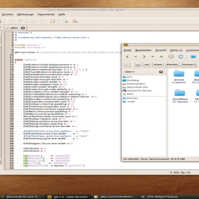
I made this theme for very small font sizes, I'm using font size 8 in applications (HandelGotDLig 8 looks very good with this theme).
>>I know this, but I don't know why this happens. :( <<
Damn, we'll have to work it out - I've seen it happen in other themes too.
>>"The grey highlights for button widgets are quite large, giving everything a chunky look and spacing tool bars out unnecessarily. Perhaps you could shave a few pixels off them? There's a similar issue with tabs, although not as pronounced."
I made this theme for very small font sizes, I'm using font size 8 in applications (HandelGotDLig 8 looks very good with this theme).<<
I'm speaking about the grey rectangular blobs underneath graphical buttons, Not text at all. For example the back and forward buttons on my browser, or all the tools on GIMP. The grey back that appears when you mouse over a button is very wide and could be a little slimmer. (IMO)
But like I said, this is a stylish theme. Thanks for your work.
BTW - I've since installed the walnut metacity theme. It gives a nice contrast between it and the bamboo. Sexy. :)
http://gnome-look.org/content/show.php/Walnut?content=57232
This is definitely better than the original aqua from os x!Thanx man!Although I don't know if Apple is going to sue people who rip off their interface or not(except Microsoft who had bought parts of Apple).
Hope Steve Jobs won't foind out about this though lol!:)


Ratings & Comments
15 Comments
Your Tarbal isnt working for the gtk and icon theme. cannot extract it
Very good, I love the bamboo look. Maybe I should now get a bamboo case and monitor to match? ;) A couple of bugs and possible improvements... The background of things like properties dialogues and the shutdown dialogue looks wrong. It seems to be using the same background as the panels and so it comes out in ugly stripes. Also the buttons in those dialogues are missing until you mouse over them, when they highlight as blue. The grey highlights for button widgets are quite large, giving everything a chunky look and spacing tool bars out unnecessarily. Perhaps you could shave a few pixels off them? There's a similar issue with tabs, although not as pronounced. But other than these few things really good port of a sexy theme! Thank you.
I forgot to mention: sometimes the drop down menu widget (the one with the little arrow) the grey background is sometimes split with a white band in the middle.
"The background of things like properties dialogues and the shutdown dialogue looks wrong. It seems to be using the same background as the panels and so it comes out in ugly stripes. Also the buttons in those dialogues are missing until you mouse over them, when they highlight as blue." I know this, but I don't know why this happens. :( "The grey highlights for button widgets are quite large, giving everything a chunky look and spacing tool bars out unnecessarily. Perhaps you could shave a few pixels off them? There's a similar issue with tabs, although not as pronounced." I made this theme for very small font sizes, I'm using font size 8 in applications (HandelGotDLig 8 looks very good with this theme).
>>I know this, but I don't know why this happens. :( << Damn, we'll have to work it out - I've seen it happen in other themes too. >>"The grey highlights for button widgets are quite large, giving everything a chunky look and spacing tool bars out unnecessarily. Perhaps you could shave a few pixels off them? There's a similar issue with tabs, although not as pronounced." I made this theme for very small font sizes, I'm using font size 8 in applications (HandelGotDLig 8 looks very good with this theme).<< I'm speaking about the grey rectangular blobs underneath graphical buttons, Not text at all. For example the back and forward buttons on my browser, or all the tools on GIMP. The grey back that appears when you mouse over a button is very wide and could be a little slimmer. (IMO) But like I said, this is a stylish theme. Thanks for your work.
>>I know this, but I don't know why this happens. :( << Damn, we'll have to work it out - I've seen it happen in other themes too. >>"The grey highlights for button widgets are quite large, giving everything a chunky look and spacing tool bars out unnecessarily. Perhaps you could shave a few pixels off them? There's a similar issue with tabs, although not as pronounced." I made this theme for very small font sizes, I'm using font size 8 in applications (HandelGotDLig 8 looks very good with this theme).<< I'm speaking about the grey rectangular blobs underneath graphical buttons, Not text at all. For example the back and forward buttons on my browser, or all the tools on GIMP. The grey back that appears when you mouse over a button is very wide and could be a little slimmer. (IMO) But like I said, this is a stylish theme. Thanks for your work.
BTW - I've since installed the walnut metacity theme. It gives a nice contrast between it and the bamboo. Sexy. :) http://gnome-look.org/content/show.php/Walnut?content=57232
Thank you so much for the metacity!!ati drivers don't like my laptop so no beryl for me
Unbelievable!!! Finally a port! :D
WAY TO GO!!!!!!!!!!!!!!!!!!!!!!!!!!!!!!!!!!!!!
Can you make metacity theme?
I'm an idiot. Good theme though.
The links are broken. It's nice to marvel at the screenshot, but there ain't no product man!
Looks great, any chance of a metacity?
This is definitely better than the original aqua from os x!Thanx man!Although I don't know if Apple is going to sue people who rip off their interface or not(except Microsoft who had bought parts of Apple). Hope Steve Jobs won't foind out about this though lol!:)