
Munics
Source (link to git-repo or to original if based on someone elses unmodified work):
So, what I did is:
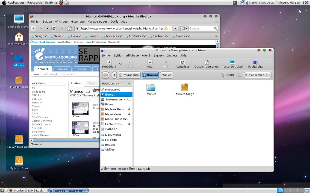
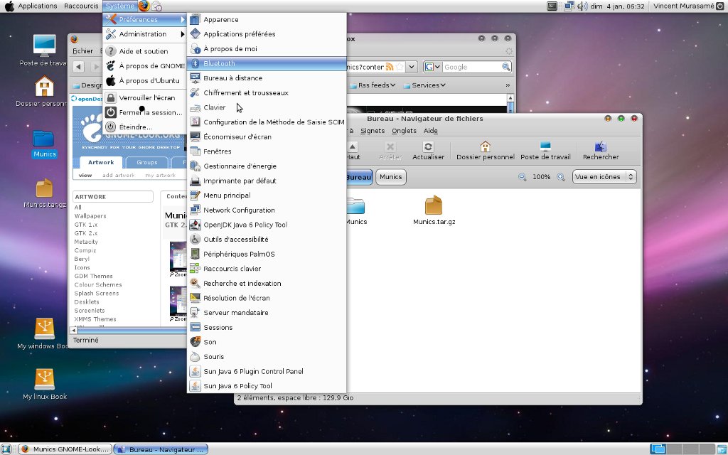
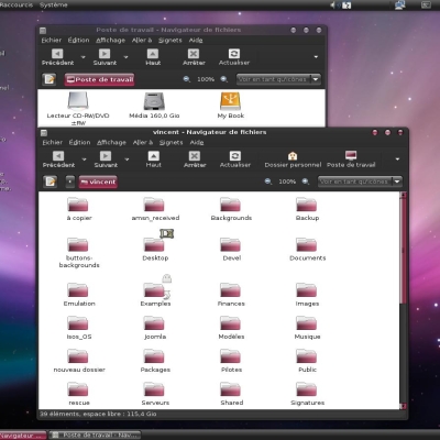
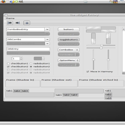
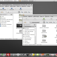
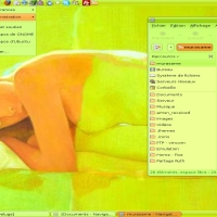
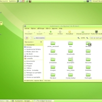
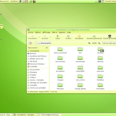
1-Design a brand new pixmap/clearlooks theme based upon the latest standards (I also took a lot of screenshots, and a lot of inspiration from the Gran Glossy P theme for the pixart).
2- I designed from scratch a new metacity theme based upon the human hardy metacity engine. All buttons were designed with inkscape and are thus in SVG format.
3- I chose not to make this theme entirely based upon the pixmap engine (clearlooks engine did the rest !) as I love to use a number of apps that actually don't like the pixmap engine so much...
As a conclusion, I'm happy with the result and now glad to share it. (Edit 21-04-2008 - I'm actually really proud of it !)
Logos, design and anything that make this theme look like the real deal are owned by Apple. Thus, not GPL at all !
2.5: Changed the metacity theme to a less 'obvious' one. In the eternal style. Also changed the scrollbars to squared ones.
2.4: Relased a matching iconset
2.3: Adjusted metacity title text color. - Fixed issues with some panel applets.
2.2: Slightly resized the check and radio buttons.
2.1: Major update. In the process of designing the matching iconset, I ended redesigning every single bit of graphic from scratch using inkscape.
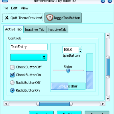
ALSO, added notebooks graphics.
















Ratings & Comments
22 Comments
It seems to me I found a tiny but unpleasant bug. You can see it on the screenshot (the link below). This is a part of Mozilla Thunderbird's "Preferences" window: http://pic.ipicture.ru/uploads/090417/d7zAhvFZY7.png The interesting effect is in NetBeans 6.5 IDE (which is Java application, but uses GTK+ look-and-feel). There are both normal and "blanked" tabs: http://pic.ipicture.ru/uploads/090417/lcRDtzwTP1.png Thanks for cool theme anyway! %)
Well... Well done ! Never seen that one before ! Matteroffactly, I'll upload this weekend a new version of Munics rather more based on the new default ubuntu GTK2 engine. I fear it won't be compatible with a few systems but it is rather faster (not pixmap based) and I expect a lot of feedback from the community to address most of the system-related issues... We'll see...
I love it! =) Have you made more Themes.. being the same way of this one.. not needing any Engines.. nore anything, to work perfectly as simple from installing normally Ubuntu 8.10 ... Working exactly how this very same theme you made works?
I expect all my themes to work natively on ubuntu 8.10 as the engines I use are already packaged in it as default engines. Thank you for your appreciation.
cool thanx to know that I've downloaded all your themes and icons =) I love them, simplicity .. its all I need.. the combination I'm using currently using is Lemon 2, Lemons 2 Background & shinning black icons ;) Simple combinacion con verde
Is there an Emerald theme out there that will duplicate the Metacity theme you've designed here? I love the look, but I also prefer Emerald.
Looks very nice, long time since oyu've put something up, or else i just missed it. :-)) Kind Regards MikeDK PS still love your old Bluesy theme :-P
Well... You haven't missed anything ! In fact, I was quite busy moving houses and making a lot of changes on a personal level. Additionally, I didn't have internet for nearly 2 months... Well, About theming, I'm trying to understand how engines are evolving and how one can come up with decently new designs as well as compatible on most linux distros...
There is something wrong with the notebook graphics. It seems the top side picture of the inactive notebook is missing. Is there anyone with the same problem?
Great theme, mac-ish look without altering the functionality (other mac themes with the close, maximize and minimize buttons at the top left instead of top right really irritate me). One small niggle that I might even try and modify myself, the titlebar text of windows is a little rough to read, could stand a bit more contrast. Otherwise top points. Best mac theme I've used so far.
Thank you ! You're actually right ! I've been thinking of doing it some day but I've been busy with the icon set ! I'll quickly fix this and post the updated archive by tonight !
Done !
It seems that the edges of the main buttons are not sharp enough compared to other widgets ?
I don't know what you mean, could you be more specific ?
Sorry, I didn't see your reply. It is better now imo.
Nice work !!!
Thank you ! Apparently, not too many seem to agree... I only get an apauling 48% good... Which is ok as I like it and glad a couple of people also do !
Hi Vincent !
Salut Jip ! Quoi de neuf ???
Quoi de neuf ? L'Odyssee de la mer ! What's new ? : Sea Odyssey !
Installed both clearlooks and pixmap, with no result. Are you using cutting-edge builds not immediatly available for us regular mortals?
No Cvs here. I've got 3 computers running gnome 2.20 (ubunut 8.04, Archlinux, Debian Sid) and I'm just using the regular clearlooks and pixmap engines. I'm suprised it doesn't work... what are you using ?