


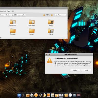
Winter
AlexR1


Source (link to git-repo or to original if based on someone elses unmodified work):
Version 1.1
Range sliders horizontal and vertical now prelight on mouse over.
Gave active tabs mid rounded style
Change scrollbars to better fit theme and have more elegant look.
Version 1.0
Initial release


More GTK2 Themes from AlexR1:
Other GTK2 Themes:


Ratings & Comments
10 Comments
Hello. Why don't I this wallpaper and this Desktop icons ?? it's this that I love. Can you help me ?
Hi..really nice theme!! Can you tell me what about the wallpaper? Where I can find it?? THANKS VERY MUCH!!!
I like the action-button icons (back, forward, etc.), the lack of bright colors is quite refreshing. BTW, where'd you get that font?
Font is HandelGotD,and unfortunatly is a payware font.
Nice theme! Where can I find that wallpaper? Tks.
Very nice theme, but my gnome panels don't get shiny-black like in the first screenshot. Instead they stay grey... What am I doing wrong? (Debian etch, Gnome 2.14)
You are not doing anything wrong panel supposed to be gray.On my screenshot i changed the panel and panel button(one that says Menu on it),and for that user intervention is required.It can`t be done simply by loading theme. In the next update i can add those files,and read me where i can explain how to change panel and menubutton.Until that gray panel is default.
You can definitely set the panel background in your theme...I did it in my Smoked Glass theme here.
Panel Background is not a problem,problem is menu button,plus users that don`t use menu button,instead they are using menubar would have differnet colors for panel and menubar,that`s why gray is default,beacouse this way is unified look eather you are using menubar or main menu.
It is awesome except for that the buttons, tabs, and dropdowns, etc. don't match the scrollbars and progressbars and that stuff. Maybe darken them and add a little color then make them shiny instead of a flat gradient. I voted you up btw.