


GrayWin
marcozanger


Source (link to git-repo or to original if based on someone elses unmodified work):
Added metacity based in Aurora Elegant (based in Blend)
This metacity is similar to Aurora's but color independent and with some bug fixed!


More GTK2 Themes from marcozanger:
Other GTK2 Themes:


Ratings & Comments
40 Comments
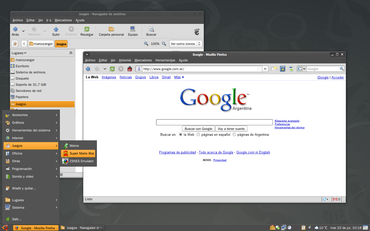
is there way to improve these ugly horizontal lines that show up on menus in programs like OOO and Sunbird? http://img299.imageshack.us/img299/9070/screenshotlx0.png Thanks
I'll see what I can do... but I think that it's a problem only happening in not 100% GTK applications.
Where I can find Icon theme Freezy? Thanks for the nice theme.
There u go! http://www.freezylinux.com/ Thx for the comment.
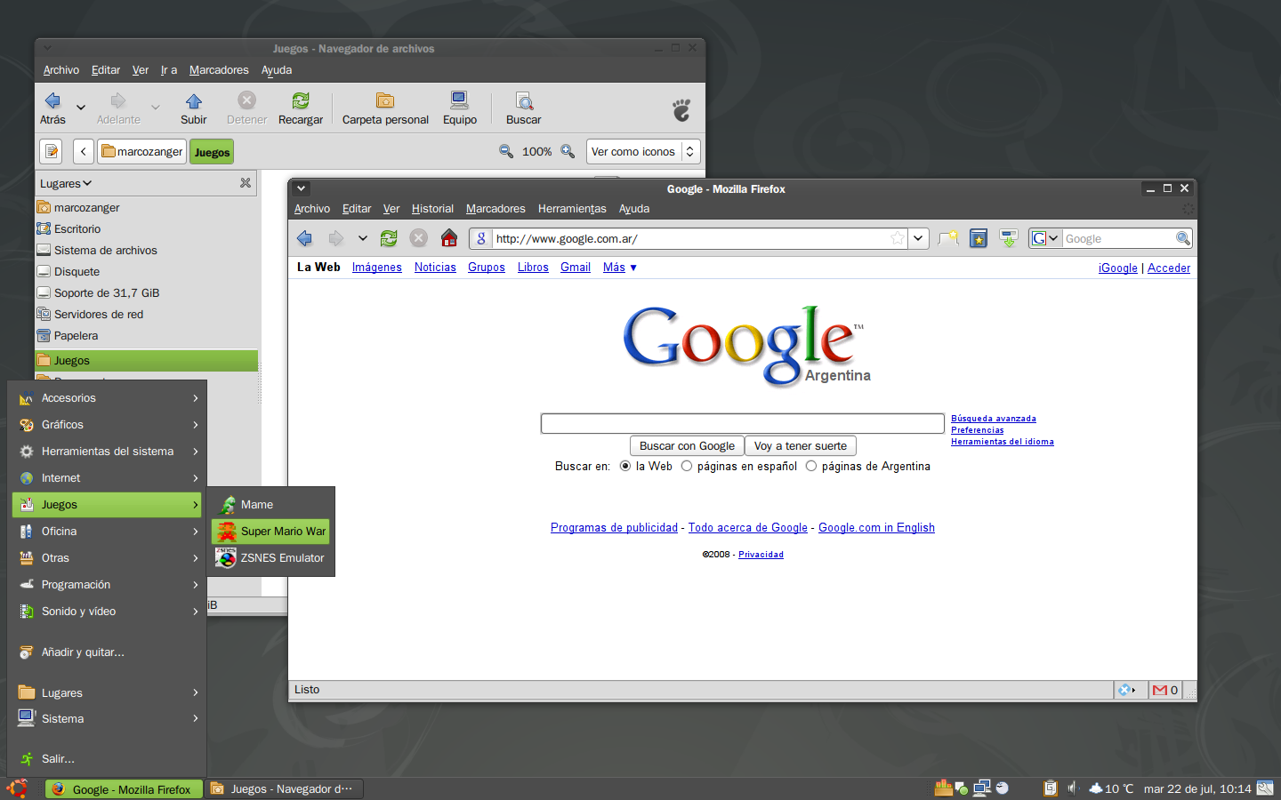
OK, in your screenshot with google up. If you look at the search box on their web page there is a small rectangle behind it. look closely at the search box and you will see. I don't think there is a way to get around this but if you could this would be the greatest theme ever made! :D
now I'll have to kill you... uhm, I've been doing some research. I don't know yet how to solve it. But I will have a look if it's an engine limitation or true bug. Thanks for your comments.
Lol. its cool. I think its a true bug. It works if you have a squared theme but no one likes that :( Hopefully GTK3 fixes this.
Yeah, but squared textfields don't have to be transparent in it's borders; rounded borders do. And I think Clearlooks do not have a way to solve that. Do what I did. Choose Ubuntu Human Clearlooks Theme. Now change the background to darker gray. Open ff3, go to google and if u see the textfield you'll see the same behavior of this theme. So it's not a theme bug, it's an engine limitation. Thanks, for your comments.
:D :D :D you fixed it! They top right corner problem is gone! XD
yep, I had to include the metacity and made some modification in it. And made it color configurable! (haha I'm obsessed with that)
Ah ok didnt realiced that :) Stay on your color independent way. This is a "feature" that not very much themes have but it makes it so flexible. I dont have to change theme to fit the rest of my desktop if I want to change some wallpaper and icon stuff. Its great!
Sorry something is going crazy here with my comments. Everytime i visit you site i add same comment again and again. Some bugs in code here hah? :P
Ah ok didnt realiced that :) Stay on your color independent way. This is a "feature" that not very much themes have but it makes it so flexible. I dont have to change theme to fit the rest of my desktop if I want to change some wallpaper and icon stuff. Its great!
Ah ok didnt realiced that :) Stay on your color independent way. This is a "feature" that not very much themes have but it makes it so flexible. I dont have to change theme to fit the rest of my desktop if I want to change some wallpaper and icon stuff. Its great!
Hey where is the small colored line to seperate main window from window top. You can see it in GreyWin Preview. Its a blue line. I liked that very much and now it is not implemented =( Hope you know what i mean. Maybe you can upload an alternative Version for that. Sorry 4 my bad english. And btw: Very very good work. Like it so much!
As I said in the RC revision I took the line away because it was made by loading an image, and I wanted a color independent Theme (this mean that u could change it's color to make it look like u want). So, I'm still searching for a way to draw that line with the clearlooks engine and not the pixmap. Thanks for your comment!
Thanks for your work ! It's looks pretty nice in blue, and I didn't see any bugs for the moment. So...I like it a lot =)
here is the screenshot :) http://img371.imageshack.us/my.php?image=screenshotcf8.png
Oh! I thought you were referring to the GTK theme. Yeah I saw that weird thing too, but it's the metacity border that do that. You should tell to the one who made the metacity theme (Aurora Elegant), I think it's based on the Blend metacity theme. I'll make a metacity for this theme soon. But thanks anyway.
there are some small things as already said. I'd like to know what font are you using and what icon theme. But... what to say... thank you, i love it. Kindly elvisd
Icon theme Freezy (from Freezy Linux) Font Undotum, and Undotum Bold for metacity and the Desktop. Thanks!
First, in firefox at the top right next to the exit button there seems to be a white line that makes it look a little uneven. Second and most importantly, if you notice in almost every theme that behind text boxes in firefox there is a gray rectangle that just kinda sticks out there. go to google and look closely at the search box, you will see. If you could fix that this theme would be the greatest!
could u send me screenshots of those things. I didn't get what u were saying. Thanks!
what's the metacity theme on your screenshot's? thanks!
Aurora elegant http://www.gnome-look.org/content/show.php/Aurora+Elegant?content=85195